
In short
Y Combinator Startup Podcast: Episode Summary
Episode Title
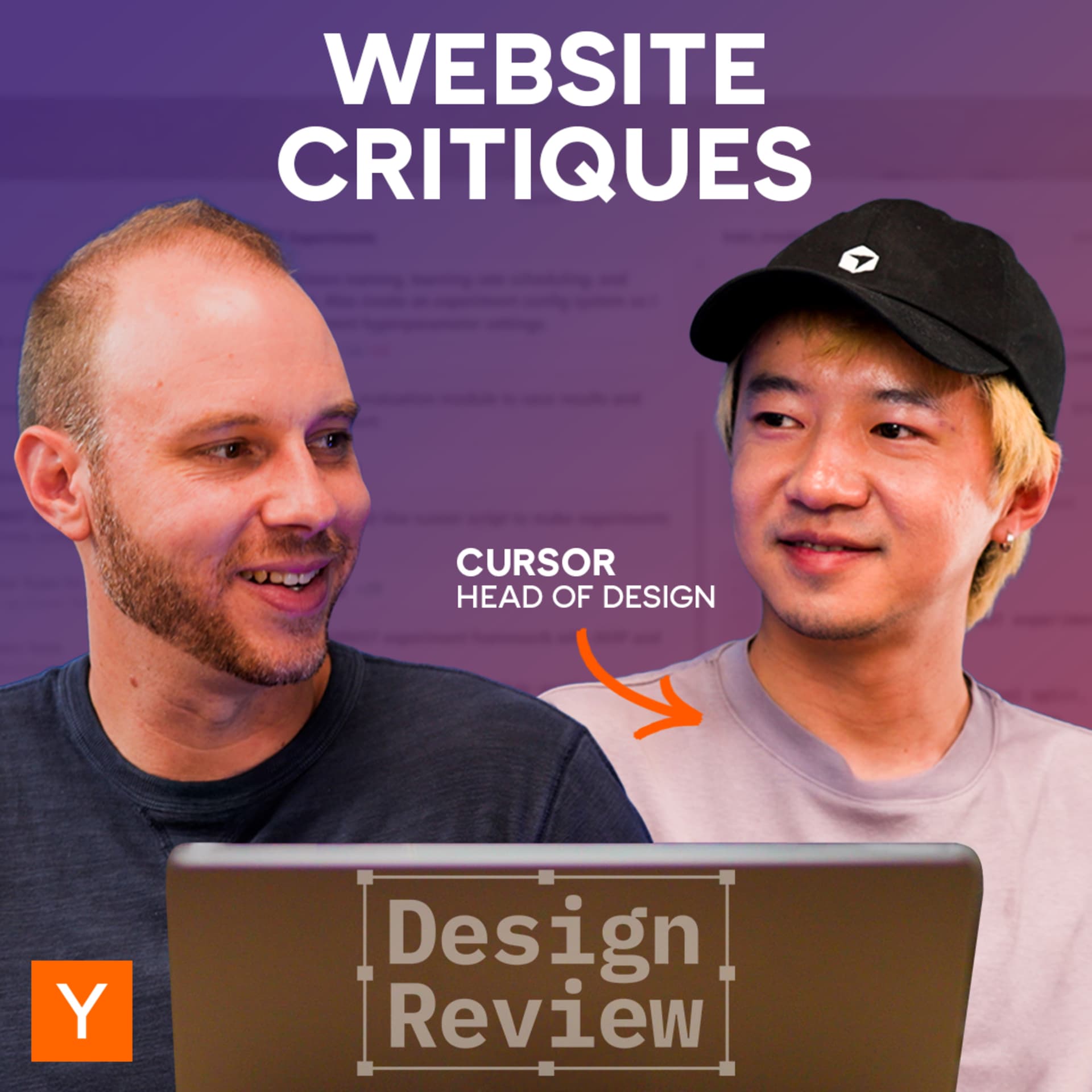
Cursor Head of Design Reviews Startup Websites
Episode Description In this episode, Ryo Lu, Head of Design at Cursor and former product designer at Notion, Stripe, and Asana, discusses the essential elements of effective product websites. Joined by Aaron Epstein from Y Combinator, they review user-submitted websites built with Cursor, highlighting both successful design choices and common pitfalls that hinder user understanding.
---
Key Takeaways
Importance of Clarity and Structure
- A well-structured product website should succinctly communicate what the company does.
- Avoid jargon or overly complex language that may alienate potential users.
Design Elements Reviewed
- Visual Engagement:
- Use of motion can be engaging but also distracting.
- Ensure that animations serve a purpose and do not detract from core messaging.
- Messaging:
- Clear communication is vital. Websites should immediately convey their value proposition.
- Subheadings and explanations are often necessary for clarity.
- User Targeting:
- Websites should directly address their intended audience, avoiding vague statements.
- Avoid trying to appeal to everyone; focus on specific user needs.
- Design Consistency:
- Maintain a consistent style and design language throughout the website.
- Disjointed elements or sudden design shifts can confuse users.
---
Detailed Website Reviews
- Crunched
- Observations:
- Confusing messaging with unclear terms like "Excel native AI analyst."
- Distracting animations; logos did not highlight properly.
- Suggestions:
- Include a clearer subheading that explains the service.
- Reduce unnecessary animations that detract from the message.
- Velvet
- Observations:
- The purpose of the service (brand video creation) was unclear.
- Logo was small and less prominent.
- Suggestions:
- Increase visibility of the logo and establish credibility.
- Clarify service offerings and differentiate from competitors.
- Clavis AI
- Observations:
- Confusing naming (two names for the same product).
- Too many calls to action cluttering the homepage.
- Suggestions:
- Simplify to one product name.
- Ensure a singular focus on the main call to action.
- Code Crafters
- Observations:
- Generic design and unclear product identity.
- Messaging was negative initially, which is off-putting.
- Suggestions:
- Clearly define the service offered (project challenges for software engineers).
- Use positive language to convey value.
- Finta
- Observations:
- Confusing time reference (5:12 PM) without clear context.
- Sections felt disjointed and disrupted visual hierarchy.
- Suggestions:
- Remove ambiguous references and focus on primary messaging.
- Ensure sections flow logically to avoid confusion.
- Vibe Flow
- Observations:
- The interface felt clunky and disjointed.
- Lack of clear instructions and feedback for users.
- Suggestions:
- Provide clearer pathways for user engagement without immediate sign-in barriers.
- Enhance visual feedback during loading states to keep users informed.
---
Conclusion Ryo Lu emphasizes that the most effective websites are those that manage to convey their value proposition quickly and clearly. By reviewing these startups, he provides a roadmap for founders to refine their online presence, ensuring that users understand what the product does and how it fits their needs. Design choices, messaging clarity, and user targeting are crucial for the success of startup websites.
Written by AI. May contain mistakes. Listen to the episode to check what was said.
Transcript
Automatic transcript. May contain errors.0:00Today, I'm excited to welcome Ryo Lu. He's the head of design at Curser, the leading AI coding tool used by more than a million people worldwide. Before that, he was a founding designer at Notion and a product designer at Stripe and Asana. Today, we're going to review a bunch of user-submitted websites, all built-in cursor. And Rio is not going to hold back. Oh, we got the purple gradients. They're here. Scary. What is this? What is that? Oh, wow. This chart. Sad. Oh, whoa, whoa, whoa. Whoa, whoa, whoa. It's like distracting. Oh, yeah. It is very jargony. Yeah. Let's kill all of this. Welcome to another episode of Design Review.
0:46Rio, welcome to Design Review. Thank you. Yeah, thanks so much for joining. These are all user-submitted websites from YC founders in the YC community, and they were all at least fully or partially built with cursor. Nice. So let's take a look. First one we've got is Crunched. Mmm, logo looks like a replica. It does, yeah. Okay, so AI reimagined for Excel, yet started enterprise. Why is there like a New York City thingy? I don't know. I guess there's a lot of finance people in New York. I see, I see. Oh, maybe that's why. Set the scene for the finance people. Yeah. Oh, some buttons jumped out.
1:21Oh, maybe you should do that after these things go over. Yeah. Yeah. Too early for that. Too early. It got my attention though. It does, but not in the right time. Yes. But it is interesting. Like that's a good use case for motion is it can steal your attention and it can be either distracting or it can be helpful. Yeah. Not sure what I'm getting from the hero at all. Yeah. And there's tiny text here that says Excel native AI analyst. Not sure what it means. Okay. Used by professionals at. Okay. Recognize BCG. There was a Harvard there. NSEAD. Okay. So it's like consulting and universities. Did you notice when you hover, the logos are not showing the right highlight?
2:10Oh, yeah, you're right. And then when it goes to 100%, it snaps. The right way to do it is you're slotting more things up. Right, right. It should just be a continuous stream, right? Okay, so they're trying to build some credibility around who uses it. Does your work. What's the work? Transform your workflow with autonomous Excel agents. What does it mean? what is the workflow what is this i guess something financial analysts do this is moving too fast i can't tell what's happening here yeah okay it can build anything dcfs discounted cash flows market models and more wow i didn't know what dcf mean well these are things where like they're probably speaking to their user and here you see it again build a full dcf um so their users will probably I understand, but we are not their target.
3:00Yeah. There's tabs here that just because we happen to be here, I noticed them. Otherwise, I don't think I would have even. Yeah, I have not noticed them at all. Yeah. Okay, let's see. They had a question that they sent in. So they said, looking for input on overall quality of messaging and core sections, should appeal to high-end investment banks, investors, and consultants. And the site was built using cursor and vibe-coded by the non-tech parts of the team. Oh, interesting. Maybe that's why the hovers didn't work. Ah. so messaging wise i'm just not getting the message and maybe that's just because we're not the target they should talk to the target more and more directly not less like in this vague level yeah i mean a common pattern is like a sub headline under here that you know sometimes people have like a cute kind of marketing headline but then if you do that you should have like a literal sub headline that explains exactly what the thing is and you should talk to the people you want to talk to yes yeah otherwise like i don't know it seems professional enough it's not that horrible yeah i would say say like the styles and stuff is a little off sometimes say like you see like here versus here and they all they do still feel a little sloppy yeah like the icons that are used maybe like this is like the what what is it like one of the most popular like ai like AI will just pick that one.
4:22Yeah, yeah. Tight Helvetica. How do you break out of that? You know, the AI has a lot of default styles that it likes to go to. And especially for people that are, you know, not as well-versed in design. How do they create something that doesn't feel like it's been vibe-coded? Right. I think one of the key things is to avoid using like sloppy styles or like the core tokens of your designs. You should probably think about it a little bit. if you're not sure actually go go safe say like you just use system fonts you let others decide for you instead of like you deciding you want to avoid say all the typical ai slop say like massive shadows purple gradients bad typography yeah um just clean the the basics up then And with a really robust foundational set of tokens and components, AI is able to compose them pretty well.
5:22Cool. Well, thank you, Crunch. All right, next up we've got Velvet.video. Create detailed brand videos with AI. Interesting logo choice. It's like a little face. You can't really see it. I can't even see it from here. So obviously the model changing here gets my attention, which I guess makes me think like oh this must be made with AI. What do you think about like what do brand video mean? I just assume like brand marketing type videos that are not trying to like convert you like by now but more trying to like set a tone establish a brand feeling maybe you know some of what you were going for with the cursor website.
6:01Like I'm not sure what I'm looking at what is this for is it for like a e-commerce thing is it for like a ad and the guy changes his face as they like the the head lifts up it's kind of weird yeah this one's being choppy for some reason but yeah it seems like either people are changing yeah or a background is changing yeah seems to be the common pattern like different variants of the same thing yeah here the clothes right right right right what is this how is it different from other video models yeah i'm not sure it is true like they don't give a lot of information up here um they try to let the videos who they're talking the videos are striking yes they seem like high quality pretty good yeah but it's not clear what's exactly happening and like what what if this is their product and what if this is somebody shot a video yeah like i want to know like what's special about it what's different from your video thing versus say like sora like what what kind of brand videos can i do just here versus other places yeah and then their their book a demo uh button which i assume is the main call to action is below the fold here click on it see what happens let's see i don't hate it it's like kind of cute yeah but even here you know no no detail yeah there's no information about like what's going to happen or who you're going to talk to or anything like that right it's very like obscure yeah okay and now you're asking for money yeah and i'm not even sure what it is yet yeah so i think my biggest takeaway here is there's not enough information here to understand what this is yeah i almost thought like this was yc because that's the more prominent logo than than their logo which is tiny and off yeah yeah yeah they should probably like make a better logo slash just use like a word mark yeah yeah or at least make it bigger make the logo bigger nobody's ever heard that oh yeah all right so main takeaways what is this what is it do a better job of explaining what it is yes more content why is it different from the other why is it different and be a little more clear around who is it for.
8:03A lot of times when people hit a site, you know, they're asking themselves the question, what is this? Is it for me? Does it work? Is it credible? And I have to work pretty hard to figure out the answers to those questions. Yes. And don't scare them with like money too quickly. Yeah. Let's go to their question here. Let's see what they have to say. I would like to make sure that the words put on the website correctly emphasize the value of the product. I'm not sure. I'm sorry. Yeah. Seems like that was our main focus. Is that, is that now? I guess the keywords are detailed brand videos. What is brand videos?
8:37What is detailed? What is it? And there's literally only six words on the page that describe what you do. Everything else is about sign up. There are some hints in the quotes. Yeah, exactly. But yeah, you don't want people to have to work that hard. Actually, those quotes are from artists. Awesome. Add more content velvet, then that will improve. More words. Next up, we've got Clavis AI. Why is it introducing Strada? Yeah, I thought this was Clavis. Why is there two names when you're just starting? Like, why? Okay, so my first impression here is that this looks like a template. Yes. It almost looks like old school bootstrap or something like that.
9:16And then there's a lot of things that look like buttons. Yes. Yeah, join our Discord, check out GitHub, Backed by YC, Product of the Day, Start Free, documentation sign up button up here there's a lot of things yeah so kill all the distractions make sure that like every single scroll there is only one main cta there's always like a priority your main message what the hell is it the cta is and then it's like the proof or like i want to see what the hell is this like gray box here right it's just a gray box i'm not sure what it is. Why is there a gray box and I can't see it? Yeah, what's going to happen, right?
9:57Okay, so one MCP server for AI agents to use tools reliably at any scale. And it seems like maybe this started as an open source project. And now this is their productized version of it. I have seen that sometimes where the open source thing is maybe called Clavis AI. And then their productized version that they're trying to get people to pay for, they give it a different name. So I'm kind of curious. Maybe, maybe. I'm going to click through here and see. It is called Klavis. Klavis. Oh, man. So I've seen this before and I think it just probably adds confusion. Yeah. They should probably just call it the same.
10:34Just Klavis. Okay. And so here we've got a video. Oh, it doesn't autoplay. Tells us tap to play. AI agents struggle with too many tools leading to wrong API calls, context overload, higher costs, and limited tool coverage. Meet Strata by Clavis AI. This music gives me like a old like TV. Yes. Yeah. It's like we just watched an 80s sitcom. Yeah. Okay. So powering experiences from next gen startups. I actually don't know any of these companies. Connect any AI tools on modern MCP infra. Okay. So they integrate with a bunch of these. Maybe this is more important. Yeah. Maybe just show all of them like up there.
11:12There's cursor. Yeah. I feel like you might actually want like a more stable way to see these things. Yeah. Maybe you just show them all and then there's like quick filters. Maybe you actually show them all like here, here, you know? Then you can get a sense of what you can do. How Strata works. Progressive discovery, smart navigation, precise execution. Not sure what they mean. That explains it all, right? What are the problems? I don't know, but here's why Strata is better. Better than what? Like using individual MCPs? Using individual MCPs, I assume, yeah. Then maybe show that. Like the old world, the new world, what are the problems?
11:47How do you solve the problems? The thing I hate for a lot of companies, what they do is they love talking in their own words and with their own concepts that they came up that nobody else understands. Right. You just throw these big words there, but then they don't really mean anything to me. Yeah, the best way is to talk to your users and use the words that they understand. Yeah, you talk in their language, in their problems. The world they are used to now and the new thing, how is it different? Yeah. What are the problems that you solved? Yeah. So if users are like, I need a tool for progressive discovery, then like, great.
12:23But nobody's going to say that. I've never heard anybody say that. It's more like, I have so many MCPs, I don't know how to manage them. We're like, I don't even know what's there that can help me integrate my agent to other things. Yeah. Oh, wow. Those charts. This looks like a screenshot from Excel or something like that. Yeah. Sad. Some dashboard. Oh, whoa, whoa, whoa. Whoa, whoa, whoa. Everything's kind of moving. Yeah, I don't like moving things when I'm not moving. And when you're trying to read. Yeah. It's like distracting. I also don't like lines when you don't need lines like this one.
13:02Yeah. And, you know, headlines. What most people do is they come down and they're going to read the headlines. They're going to say, okay, what our customers say. Compliance. Investors. Choose your plan. And like you got to be explicit and assume people are not going to read the subheadline. They're only going to read the subheadline if they're intrigued by the headline. Why is that even there? Doesn't make sense. Trying to build credibility, I assume. But yeah, it's not clear what you're saying. More like us money off front patterns. Is it too early for that? Probably. Yeah. You should get them to sign up and start trialing.
13:42Don't scare people. Let's see what their question was. Does our homepage above the full hero section headline subheadline clearly explain our value proposition in five seconds? We're worried it's too jargony. Oh, yeah. It is very jargony. Yeah. Let's kill all of this. Yeah. Kill the video. Just show all the MCPs you can connect. That is just one thing. Yeah. And that's probably pretty easy to show that visually, right? Just kind of all of them coming into like one Strata logo or something. Yep. And then maybe like you can actually like keep the little filters there and then you can filter between different sets of tools.
14:14Then you can kind of find the thing. Yep. But I think this sub-headline helped. I think we read this and we understood what they do. Yeah. Maybe make this like the only headline. Yeah, yeah. And then kill your name in confusion. Just pick one. Pick one name. That's it. Yep. Thank you, Clavis. All right, Code Crafters. Oh, we got the purple gradients. They're here. Scary. become a better software engineer stop following tutorials designed for beginners start working on projects that actually challenge you become a better engineer through deliberate practice interesting they don't have the name of the company up here and i said it but then i forgot it already and i was looking for like what is the name of this company again and i couldn't find it anywhere on the page yeah logo's also very generic doesn't tell me anything yeah this was a lot to get through here and it was it started out with the negative stop doing this thing so instead of saying what they do in the positive it started out with don't do this yeah which is not informative for for what they actually yeah i do like keeping things a little like aspirational but you do want to communicate clearly what the hell is this yeah i still don't get it yeah it seems like learning it's a bunch of practice projects to become a better engineer.
15:35I see. So I guess if you don't have side projects you want to work on, you would use this and this gives you a bunch of projects to build. I see. That's my guess here. Maybe. Pick a challenge. Let's see what happens. Pick a challenge. Oh, I see. That's cool. The whole website changed when we clicked through to this too. There's no continuity from the marketing page to those things yeah and like if i get a pricing if i get a roadmap like even all the colors style yeah like the green yeah and then the other one is what like purple purpley purple everywhere do they actually work with these companies uh enjoyed by developers oh really is that true i don't know i guess we'll take their word for it oh wow this clipping thing is kind of crazy backed by incredible engineers okay so i guess these are some of their investors wait wait wait wait these are actual well he's at uh anthropic now right yeah yeah right so that's out of date i would not like modify other people's pictures like this it was like kind of intrusive yeah yeah and they're all kind of a different style right this one's like a professional head shot this one's like a phone photo or something like that probably one trick you can do is like maybe like you knock down all their backgrounds but keep them like white maybe you add a filter so that they're all like black and white.
16:59Then it kind of standardized the thing without like butchering the picture too much. Yeah. Hear it from our members. Engineers and top teams love this. Okay. Okay. Right now, projects that go way beyond the basics. Be in the company of prolific developers. Use your favorite tools to code, no limits. The world's best got better by doing. Okay, and try now. Okay. I'm curious if I click on other links through here, does it go... That goes to the YC site. Okay. Um, changelog. Whoa. Okay, it goes to their... Look, they don't use their name. Yeah, build your own X. Why is that? I don't know, I guess because people can make a Twitter X kind of thing?
17:49The X means like anything. I think the X means like build your own like X, like build your own Twitter. See, your own Redis, your own good. Yeah, I was wondering if they're saying build your own X because it's people on X and maybe, I don't know. Maybe, maybe. Maybe one of the projects is rebuild X. Okay, so here Perks looks like the homepage. How about about... Wait, what is Perks? Is that like another product or something? Their members get priority access and preferential pricing on learning and building products. Interesting. So this is like a learning subscription rather than a tool, maybe.
18:28Makes me think it's more like a community or something. Where's the community? How do I talk to other people? Oh, and this pricing one takes me to this page, like in this design. Oh, and this just changed too. Now we're in like black and white. What is this? Are they like doing their own like expense card? Yeah, is this a credit card company? Wow. I think it's some kind of like learning thing to do projects. That's like, that's what I've come up with after spending a few minutes looking at all of this. And I can't tell. But there's the perks thing. Yeah. That makes me think it's a community to do something.
19:06Okay. So be more clear around literally what this is. Cause it's not clear right now. Yeah. Um, less purple gradient. Yes. This looks vibe coded. It's got all the hallmarks. So, um, something that feels a little more custom, custom I think would be great. Yeah. We somehow kept getting to different versions of the site that all looked wildly different. So I think consolidating all of that would be good. Yeah. And then, you know, like a main thing is like the about page and it links off to their YC launch, which is a little bit jarring. It feels like, you know, talking about who's behind this product is something you should have a dedicated page on your site about.
19:43Right. Otherwise it makes me seem like this company is so early they haven't even had time to like build their own. Yeah. One thing I noticed is like I think a lot of them pride on being backed on YC but that is actually not the main thing you're doing. Like make people focus on what the hell is the thing. Yes. Yeah. Yep. That's about the backing. Right. Number one is what is this? Number two is is it for me? Three you can focus on the social proof and credibility and things like that but yeah a lot of people are kind of putting it right in front. Yeah. Yeah. To the point where you look at it quickly and the YC logo looks like their logo.
20:16Yeah. Thanks Code Crafters. YC's next batch is now taking applications. Got a startup in you? Apply at ycombinator.com slash apply. It's never too early and filling out the app will level up your idea. Okay, back to the video. Okay, for this next one, let's do more of a lightning round and do some initial impressions. Let's do it. When we first pull it up here. Slashy. So this is slashy. Oh, it's so slow. Also, it looks like Notion Mail. Yeah. Okay. You obviously have a lot of experience with Notion and cursor. What's your initial impression here? A lot of details are not there. What's missing?
20:55So like if you look at this part, it almost feels like it's the raw like markdown output. The UI doesn't really fit with the rest of the thing. The video is like clipped wrongly. There's like an extra step here. Yeah, it's like a white border. I think the first impression really matters. And anything above the fold, just make them as good as you can. Like... no obvious detail bugs. Power of chat GPT inside your email. I would say like the messaging and stuff is pretty clear. Actually not bad. It's more like how you present it. Look at all the, like say this thing is like not aligned in the same spot.
21:37These images and the previews all have different sizes. Some of them have shadows, some of them don't. Yeah, this one's got a border. around it. There's a screenshot with a border and the window and then a border around the screenshot. There's a lot of boxes and boxes and boxes. Yeah. I mean, it seems like there's some inspiration taken from the latest cursor site as well, right? Showing some of these screenshots and calling out. It's like the structure is fine, lacking some details. Yeah. Oh, wow. They're actually stealing a Notion picture here. Yeah. Another thing that resonates with me immediately is like they're using cursor to describe what they do so cursor for email yeah and then you and then power of chat gpt and then you come best of super so they keep calling out all these other products yes that people may know to describe what they do rather than just literally explaining what they do true and owning it themselves yeah they almost look like notion agent and cursor in one but lacking all the details yeah the details are what matters and it's interesting you can pick that out from the screenshot too because you've used those products so much right yes cool thank you slashy all right next up we've got freya oh voice ai that sounds human for enterprise how can i hear it uh it has to start freya what does it do what's is it a phone number let's say freya safely handles inbound and outbound calls from support and service to sales and beyond fluently in dozens of languages 24 7 should we talk to freya yeah let's try it all right Hi there, I'm Freya, the voice of Freya Voice.
23:15We're an AI platform that helps businesses automate voice-based customer service. Our AI agents handle full conversations, end-to-end, and sound completely natural. Freya Voice is perfect for tasks like scheduling, answering common questions, or managing claims. Available 24, 7, and over 40 languages. You can speak Chinese? If it sounds like my response may have seemed unclear or cut off, let me try that again. Freya Voice is a platform that automates voice-based customers with AI agents.
24:09Okay. Minus five points. Yeah. Yeah. Don't hijack the scroll. But the communication... Messaging, pretty good. Yeah. Demo, really accessible. Pretty good. Replace entire call center operations. Custom use cases end-to-end. Lead qualification. Turn every lead into revenue opportunity. Okay. Resolve customer issues before they escalate. built for accuracy you can trust results that speak for themselves okay yeah I mean it seems like overall the messaging here is very clear and I think we understand what they do and I think if we ran a call center an enterprise call center we'd probably consider this and we'd know that this is for us alright let's see what their question is curious how to very clearly convey the information of what we should focus on and give a smooth and simple experience.
25:10I felt like they did that. Yeah. I don't think that's the thing to change. It's not bad. I would wonder how to make the demo even more obvious. Maybe you can just start right here. Right. Yeah, that's a question, right? It's like, do you want to talk to Freya or meet the team? What's the main CTA you want to drive people to? Yeah. It seems like meet the team because that's a button up here and that's the blue button here. um but meet the team is kind of weird too like yeah i want to do yeah like who is the team yeah and then what does this take us there we go alan lee again yeah brea team meeting okay yeah maybe like book a demo yeah book a demo would be better that's the main thing awesome not bad nice job bro okay finta magically simplify accounting and taxes automate bookkeeping, effortless, tax filing, real-time insight, set up in 10 minutes, back to building by 5.12 p.m.
26:08Very detailed. Not sure what's the reference. I don't understand the rule 5.12 p.m. either. Wait, is it like... Oh, it matches the time. It's 10 minutes from now. That's cool. That's cute. But, you know... Now it's 5.13. Took a little bit to get. Yeah. Okay. All right. That was clever. Very cool. Okay. Okay. So what? Taxes? Pricing gets started. Yeah. It's something around simplifying accounting and taxes. For like individuals where? Yeah. So this was not clear to me. And then when I go a little bit deeper, it's like automate bookkeeping. Right. And so that makes me think more businesses. Maybe for companies, startups.
26:44Oh, here we go. Right down here. Ah. Really think. Ha ha ha. For US-based C-Corps, LLCs, and PBCs. Uh-huh. Maybe like kind of fold that with the primary messaging. Yeah. And then maybe kill the time thing. Yeah. And I think, you know, we're seeing a lot of consistent patterns as we've gone through a few of these, which makes me feel like a lot of these are building effectively the same template. Right. We got the little thing up here. Some people put the back by YC here. Some people put we're hiring. We got the blue buttons. We got two buttons next to each other. We got a headline. We got something else here.
27:19We got a logo here. We got a screenshot here. Yeah. And so sometimes for a lot of businesses, that might be good enough. You know, just clearly it's like a pattern that users are used to. They know where to go. But, you know, sometimes it's helpful if you want to build your own brand and identity and be different and memorable is to break out of that box and come up with something that's like really unique and focused to what you're trying to communicate and get across around how you're different. I actually don't mind keeping things like simple and plain. Just let people scroll, have the messaging be the primary thing, have the product be the primary thing.
27:56As you scroll, there's like little punch points. Boom, boom, boom. Maybe you're just like scrolling and seeing some pictures that vibe with that idea. So it's not that bad. Yeah. And I like this too, like tax season with zero stress. You know, that probably appeals to the type of person that would be their customer. And to file our taxes and claim$17 ,000 in credits process was easy. Cool. Not bad. Yeah. I got live chat. How the sections break is a little weird to me. Like, I kind of want these things to be, like, more under the text thing. Yeah. Like, you get this, like, white section, and then some grays, and then some whites, and then some cars on top.
28:37Yeah. It kind of fucks up the hierarchy. Yeah. Yeah, it seems like the full width is like a headline. Right, it's like a boom. Yeah. And then you have little spots. But then the line that goes across makes it feel like it's breaking up the section. Like, why is this car, like, sliding on top? Yeah. It looks like it's supposed to be a card sticking out. It's like there's some cool visual treatments, but they actually cause some confusion. Yeah. But generally, like visually, it looks nice. It looks well organized. It's like if you look at each of the pieces, it's actually pretty well built. Yeah.
29:10Like there's a lot of little details in there. Right. Yeah, the temptation is to show a big screenshot from far away and you can't tell what's going on. Instead, they're honing in on the very specific thing. Like if I were to do this, it's almost like I want to, just make these like maybe shrink them and make them more cardy make them more like parts of the same hole instead of like uh there's like a lot of things in like flat that's all like kind of moving and doing stuff yeah all right let's see what their question is does it convert i don't know they're gonna have to answer that for us but um i don't know i think it indicates what it does my sense is if i were in the market for a product like this this would appeal to me and i would probably want to check it out so my hunch is probably yes maybe just making this more prominent the who it's for yeah uh and making that like ram that home a little bit more i think would be good i would steal the little trick to hide this button until say you're here and then it kind of animates and then you know where it is right you pay attention to it yeah because like i feel like main issue with like say i think hero is pretty good Once you pass here, it's like a little disorienting.
30:20Not sure what to do now. Cool. Thank you, Finta. Last one. All right. Last one. Vibe flow. Vibe flow. Let's check it out. Prompt and visually. Okay. Nice. Where's the visuals? Projects, explore your projects. Sign in to see projects. All right. Well, clearly they want us to engage with the prompt box. Why don't you give it a shot? Okay. Okay.
30:49Okay, a spinner. It's thinking. Ah. Okay. Oh, wow. Showing us something. Charging the electrons. Is that some kind of preview? What is that? Is it like a mini-map of a whole page or something? Maybe, maybe. It's like the canvas. Yeah. This is one of the core... I'm curious how you think about this, Cursor. You know, so many products that use LLMs today have this weight. and what do you do when the user has to wait to keep it engaging or make it feel like it's going faster? I think you want to almost like show every single state that's happening. So like, you know, I thought for like 29 minutes, what did it do?
31:33Yeah. And if it does like tool calls, like just show them. But you do want to control, like you don't want to show too many things at once where like it just becomes like a wall of text. you want to control like the things that are running you show them in the more like focusable spot and as the progress is it kind of shows you like these are the things that are running these maybe are the actions i need to confirm this is my input you kind of ship people's focus um and i don't want these like random empty states with spinners everywhere or like ah in the preview you saw like it was like looping some random messages but they weren't really helpful right they were actually cute messages kind of distracting right so you need to figure out like when things are happening where do i want people to focus their eyes on yeah it's hard too because you don't know is it going to come back in five seconds or is it going to come back in 10 minutes yeah okay so this one we hit an error
Read the full transcript
32:35let's see
32:41It feels very like vibe coded, the whole thing. What gives it that impression for you? If you look at all the little details, they don't melt together. So everything feels kind of disjointed? Yeah, like there's like weird hover states, like with little radius on top, but not on the bottom. If you look at all these different views, like some of them are like, I don't know, portals into like iframes of something. This is almost like a vibe coded VS code. mm-hmm that's just pure AI generated you know there's not even like a like not even say you're not using Shazian or whatever yeah like it's just raw AI right output yeah what do you think this toggle button does in the top no idea the mystery toggle button no tooltip either ah what does it do what does it near it looks like it goes full screen and I assume that's the preview oh yeah I guess we can't really see much yeah is it still working or where is it at i think it failed failed again interesting okay no luck sad this is what i do ah that's cool like a little like suggestions i might still do this why is there two spinners right why can't I open to thinking why is there just spinning and not telling me what it's thinking yeah also the suggestions came before I did anything yeah okay so it looks like the core issue is we don't have 3D libraries so it's going to try to do a CSS based oh oh okay whoa that's a very interesting attempt yeah it's creative all right let's see what their question is general advice on how to improve the design okay i think we touched i guess the problem was before i came in i couldn't even do anything or see anything you remember like there was the prompt box and then when you scroll down is like all your projects sign in right why not just show people like other people's projects yeah and then we tried to make something and we got hit with a sign up wall yeah just give them like even in real os you can send three free messages before you sign in that just let people play yeah and maybe make sure that maybe the initial demo is more constrained so that it gives you better output awesome thank you vibe flow rio that does it for the reviews thank you thank you Thank you so much for joining.
35:21This was incredible, really great feedback and really appreciate you joining us today.
From the publisher
Cursor Head of Design Ryo Lu has spent his career at the intersection of design and engineering—from building fan sites as a kid to designing products at Stripe, Asana, and Notion. Now he's rethinking how software itself gets made.
On this episode of Design Review, Ryo joins YC's Aaron Epstein to break down how great product websites communicate what a company does. They walk through sites from early-stage startups, calling out the small choices in structure, clarity, and brand that help users understand a product instantly — and the ones that get in the way.


