In short
The hosts discuss Apple hardware/keyboard quirks after upgrading from Lightning to USB‑C, troubleshooting Apple Watch notification “tap” behavior (especially for one contact in private vs group texts), and a series of tech news items about RAM pricing/supply, Anthropic’s Claude “Fable” model returning after export controls, and Apple Siri AI restrictions around summarizing/extracting from URLs. They also cover listener feedback and a Parakeet icon-design segment.
Guests (people mentioned)
No formal guests appear in the transcript; the episode is a solo/hosted discussion with recurring co-hosts/participants (e.g., Marco, John). Other named contributors include Bart Reardon (Mac app “Arse”/skills feedback), Jonathan (donation plan after upgrading a MacBook Pro), Shutter Aperture (RAM strategy question), Jay Peters (Verge interview), Luke James (Tom’s Hardware lawsuit), Tim Hardwick (MacRumors), Guy Rambeau (Siri model metadata question), and Lex Friedman (gift-code Siri anecdote).
Key claims
- The new black USB‑C Magic Keyboard changes bottom-left modifier layout, causing “control-click” muscle memory to trigger function/menu behavior instead; a dedicated “menu” key can open context menus.
- Watch haptics weren’t firing for Aaron’s private texts because the contact’s “text tone” was set to Silent/None; group texts still worked via focus mode.
- Apple Siri AI now refuses to access/summarize content behind URLs and won’t offer workarounds.
- RAM supply constraints and pricing are being litigated; Valve says RAM suppliers can dictate terms due to scarcity.
- Claude “Fable 5” is back online after export controls lifted; bypass vulnerabilities are blocked with a safety classifier fallback.
Notable examples
- “Karate Kid” ringtone and a custom “vibration rapid” text tone; persistent Messages notifications as a workaround.
- Menu key behavior in Mail/VS Code; context menu appears for the selected email.
- DRAM price-fixing lawsuit alleging ~700% price rise over four years and HBM shift as cover.
Written by AI. May contain mistakes. Listen to the episode to check what was said.
Chapters
Tap a time to open that second in VOMagic Trackpad Mishap
0:45 to 2:47
The hosts discuss a malfunction with a Magic Trackpad and its upgrade.
“The little nubbin for the slider fell off when it was in the off position.”
Keyboard Comparisons and Touch ID
2:47 to 4:43
The conversation shifts to keyboard layouts and the importance of Touch ID.
“So in the bottom left corner, there's basically every Mac keyboard, control, option, and command.”
Navigating Keyboard Shortcuts
4:43 to 7:25
The hosts share their experiences with keyboard shortcuts and right-clicking.
“Oh, it's when they curve the corners too?”
The Mystery of Missing Notifications
7:25 to 11:31
The hosts discuss a problem with missing notifications on the Apple Watch.
“which I never knew was a thing people did with the keyboard.”
Persistent Notifications Solution
11:31 to 14:00
A workaround for message notifications on Mac OS is shared.
“I can tell you the way I have temporarily at least worked around this problem is what I speculated about last time during the show.”
Feedback from Bart Reardon
14:06 to 14:36
Discover the feedback from Bart about a Mac app skill he developed.
“And that is at least helping work around the problem.”
Exploring Mac App Skills
14:36 to 15:39
Understanding the concept of Mac app skills and their usability.
“Putting my money where my mouth is, says Bart, is my own Mac asked or arsed?”
Listener Donation and Support
15:39 to 16:21
Hear about a listener's donation plan related to a recent tech purchase.
“directories for text files in a particular format so they're very portable and you can just look at them with your own eyeballs and read them yourself even if you're not using an LLM.”
Apple's Memory Strategy Discussion
16:21 to 18:11
Discussion on whether Apple will change their unified memory strategy.
Supply Chain Insights
18:11 to 20:46
Insights into how Apple approaches memory supply and market dynamics.
“Well, and even then, a lot of the appeal of socketed RAM, modular hard drives, a lot of the appeal for Apple's Macs supporting those was not necessarily about, well, I want to extend the life of this down the road.”
Show all 53 chapters
Class Action Against RAM Manufacturers
20:46 to 24:53
Overview of a lawsuit against major RAM manufacturers for price fixing.
“They're not going to change their entire architecture plans based on pain for a few years.”
Implications of Price Fixing
24:53 to 25:35
Discussing the potential outcomes of the RAM price-fixing lawsuit.
“decommission those so that way we can have more resources towards HBM.”
The Cost of Gold-Cased Macs
25:35 to 28:54
A humorous discussion on the hypothetical cost of a gold-cased Mac Mini.
“How many of the people who were in that smoke-filled room back then are even still in their positions or even still alive?”
The Cost of Gold-Cased Macs
29:01 to 29:15
A humorous discussion on the hypothetical cost of a gold-cased Mac Mini.
“Thank you so much to ZocDoc for sponsoring our show.”
Anthropic's Claude Fable 5 Returns
29:15 to 31:39
Discussion on the return of Claude Fable 5 and its implications for AI safety.
“Anthropic also said it would re-enable access on AWS, Google Cloud, and Microsoft Foundry soon, but with no set timeline.”
AI Safety and Guardrails
31:39 to 36:44
Exploration of the complexities and challenges in AI safety and guardrails.
Siri AI Updates and Limitations
36:44 to 38:26
Updates on Siri AI's capabilities and the new restrictions on accessing URLs.
“face this probably this year or next year at the latest this we are going to see a wave of exploits and we are going to have to be very aggressive at patching them and updating things.”
User Experience with Siri AI Waitlist
38:26 to 41:29
Experiences regarding the Siri AI waitlist and how users are navigating it.
“All right, moving on, let's talk Siri AI, where Marcus Mendez at 9to5Mac writes, the change in iOS 27 beta 2 makes it more clear how Siri AI should handle requests involving accessing content behind a URL.”
Siri AI Performance Improvements
41:29 to 42:01
Personal anecdotes about improvements in Siri AI's responsiveness and accuracy.
“And it only took me like 48 to 72 hours or something like that.”
Discovering Siri's Potential
42:01 to 43:19
Learn about personal experiences using Siri for effective information retrieval.
“And it took about four or five seconds and then found it.”
Introduction to Parakeet Icons
43:20 to 48:44
Hear about the collaboration with Parakeet for app icon design and the creative trade involved.
“And sure enough, I said, you know, Lex Friedman with an E gave me a code for an app, you know, a month or two back.”
Icon Design Discussion
49:27 to 56:00
Engage in a detailed discussion about the design process and the challenges of creating app icons.
Designing a New Icon: The Challenge
56:00 to 58:30
Learn about the complexities of creating a new icon that aligns with evolving design standards.
The Iterative Process of Icon Creation
58:30 to 1:01:42
Discover how collaborative iterations can lead to a refined and effective icon design.
Understanding Icon Themes and Variations
1:01:42 to 1:04:32
Explore the intricacies of icon themes and how they adapt to different modes in macOS.
Creating Front and Center: A Classic Experience
1:04:32 to 1:10:03
Learn about designing the Front and Center app icon inspired by classic macOS aesthetics.
The Evolution of Icon Design
1:10:03 to 1:13:37
Learn about the nuances of creating effective application icons and the design process.
Critiquing Casey's First Icon
1:13:37 to 1:14:40
Hear a humorous critique of an early version of Casey's icon, showcasing the importance of design.
“And basically what that was, was a clapperboard like you would see at a film set with a magnifying glass over it.”
The Call Sheet Icon Redesign
1:14:40 to 1:19:04
Discuss the redesign process of the call sheet icon and the balancing of modern aesthetics with original charm.
“That I had drawn as like my first internal cut at it and then Jelly took it and made it look tremendous.”
Balancing Branding and Icon Design
1:19:04 to 1:24:00
Explore how branding influences icon design and the significance of maintaining personality in updates.
“liquid glassified version of the call sheet icon.”
Discussing Icon Variations and Branding
1:24:00 to 1:25:52
The hosts explore different variations of app icons and their branding implications.
“This keeps pretty much all of the personality minus the text.”
The Challenges of Icon Design
1:25:52 to 1:27:38
Discussion about the challenges and considerations in modernizing app icons, particularly related to visibility and branding.
“And also something that I believe Marco said a moment ago was that when I came to them and I said, you know, look, what I'm asking for, I guess, is just a modernized version of the current clapperboard icon.”
Refreshing the Overcast Icon
1:27:38 to 1:29:23
The hosts discuss the updates made to the Overcast app icon and designer collaborations.
Designing with User Experience in Mind
1:29:23 to 1:31:35
Discussion on the importance of user experience and branding in icon design, particularly for the Overcast app.
Collaboration and Feedback in Design Process
1:31:35 to 1:33:02
The hosts reflect on the design process for their icons and the importance of collaboration and feedback.
“And now, you know, Louis and Luca, I've worked with them through this text message, you know, through this iMessage chat that we've had.”
Introducing a New Reminder App Concept
1:33:02 to 1:36:47
The hosts introduce a new reminder app concept focusing on users who struggle with prompts and notifications.
Brainstorming Design Inspirations
1:36:47 to 1:38:00
Discussion on potential design inspirations for the new app, influenced by personal experiences and environments.
“I'm just waiting for you to accidentally blur out the name of the app.”
Inspiration from Hawaii
1:38:00 to 1:41:00
The host shares his experiences and creative inspirations from a vacation in Hawaii.
“on the flight on the way to my Hawaii Big Island family vacation.”
Design Process for the App Icon
1:41:00 to 1:44:30
Discussion on the design journey and collaborative efforts for the app icon.
Avoiding Icon Clutter
1:44:30 to 1:47:20
Exploring the challenges of differentiating the app icon from common design tropes like checkmarks.
“And I think will help it stand out more in a sea of checkmarks.”
The Importance of Icon Quality
1:47:20 to 1:52:00
The host emphasizes how a strong icon can elevate an app's perception and importance.
“It's all checkmarks, but no one ever sees that.”
The Importance of App Icons
1:52:00 to 1:54:05
Learn why having a compelling app icon can elevate user perception and engagement.
“And it's like, well, don't you want, you don't want them to do that because they're going to be disappointed because your app is not as good as the icon.”
Apple's New Terminal Security Feature
1:54:05 to 1:54:55
Discover Apple's new security feature that warns users about potentially harmful terminal commands.
“And Tim Hardwick over at MacRumors reports, in macOS Tahoe 26.4, Apple introduced a new security pop-up that warns Mac users when they paste a command into the terminal app that could be harmful.”
Evaluating Security Features in macOS
1:54:55 to 1:56:49
Understand how Apple calibrates its security features to protect less experienced users.
“So I'm just going to roll the dice and do it.”
Malware Protection in Terminal Commands
1:56:49 to 1:59:14
Explore how macOS detects and blocks potentially harmful terminal commands.
“Scammers often encourage pasting text into terminal to try and harm your Mac or compromise your privacy.”
Xcode 27: New Derived Data Feature
1:59:14 to 2:00:15
Learn about the new command in Xcode 27 that simplifies managing derived data.
“came out uh just today about op the opera web browser adding this feature Here we go.”
The Anatomy of Xcode's Derived Data
2:00:15 to 2:06:00
Understand the significance of derived data in Xcode and how to manage it effectively.
Apple's Software Adjustments
2:06:00 to 2:09:10
Discussing recent improvements in Apple's software design and user features.
“I think the next iteration of this is, hey, please find all the dependency problems in our program that are causing this to happen, but one step at a time.”
Membership Perks and Overtime Topics
2:09:10 to 2:09:30
Overview of membership benefits and the upcoming Overtime topic about gaming.
“And thanks to our members who support us directly.”
Concert Preparations and Recommendations
2:10:46 to 2:13:16
Discussing concert experiences and tips for attending live shows.
“In fact, what I've been told in my household is that the music of my bands that I like is more tolerable when it's their studio recordings than when it's their live recordings.”
Cool Gadgets for Hot Weather
2:13:16 to 2:15:06
Exploring gadgets to stay cool during hot concert events.
“again, as we've talked about numerous times, I won't belabor this but if you go to nugs.net, you can pay for a subscription and you can actually watch live broadcasts of many bands, including, but not limited to Goose.”
Creative Cooling Solutions
2:15:06 to 2:20:00
Innovative ideas for staying cool while enjoying live music.
“the micro Tyvek, but otherwise the Microsoft Shell is what I've been using all these years.”
Lighthearted Banter About a Photo
2:20:00 to 2:20:27
The hosts engage in a playful discussion about a humorous photo and related feelings.
“Look how happy he is to have this Photoshopped onto him.”
Transcript
Automatic transcript. May contain errors.0:00John Siracusa:I have monthly FaceTime calls with a handful of good friends, one of whom is our good friend Underscore. And once a month, we'll get on FaceTime for like an hour or two and just chit-chat and catch up. And when I was talking to Underscore the other day, I was mousing around for a moment, and I noticed my magic trackpad, which is my mouse of choice, was sliding a little bit on my desk. And so what I do is I turn off the trackpad, I pick it up, I flip it over, and the four little feet or whatever they're called, the little rubberized things that it rests on, you just rub on them for a second with your hand or with your finger and gets all the gook off.
0:30John Siracusa:And then you put it back down. Everything's good for another like few weeks, what have you. I turned it off. I rubbed the bottom and I went to turn it back on. And the little nubbin that I used to turn the thing back on isn't there anymore. Apparently it shore off. It's a little power slider because it's a slider, right? Just like on the keyboards. The little nubbin for the slider fell off when it was in the off position.
0:52Casey Liss:Is it metal like on the keyboards?
0:54John Siracusa:Yes.
0:55Casey Liss:So how does it fall off? Isn't it like trapped in there? Isn't it like...
0:58John Siracusa:You would think. But I have it between my fingers right now, and it is itty-bitty, and I should send it to Dr. Drang to do a forensic analysis.
1:06Casey Liss:Oh, does it look like it broke? Is there a fracture? Yeah, I think it sure off. You're so powerfully turning it on and off.
1:13John Siracusa:You know, I work out, John.
1:14Casey Liss:Your fingernail works out. Right, exactly.
1:18John Siracusa:So that was very annoying and frustrating, but I have good news. I have then used that as an excuse to upgrade my Lightning Magic Trackpad and keyboard to not only a USB-C Magic Trackpad and keyboard, but the black USB-C Trackpad and keyboard. So I am living a great, grandiose black life. I've got my BlackBook Pro over here with my black keyboard and my black mouse, and I am loving life. Just call me MKBHD.
1:46Marco Arment:To be clear, I think almost every nerd wants that excuse to replace the perfectly fine lightning version of these peripherals with the much more convenient USB-C version.
1:59Casey Liss:Exactly. And here I am with a giant supply of Microsoft Precision mouses, all which have a micro USB port on the front.
2:08John Siracusa:Oh, no. Oh, that's not desirable at all. I do have a couple of quick lamentations, though. I got my fancy pants magic keyboard, right? My black magic keyboard. And it looks so good. It reminds me of the iMac Pro one, which I loved. And would actually probably still be using if it wasn't for the case, or it wasn't for the problem that it doesn't have Touch ID. The iPad Pro one doesn't. Or excuse me, iMac Pro one doesn't. And so what kind of animal lives without Touch ID, right, gentlemen? Anyway, I got this new keyboard. However, there's a difference from my old lightning version of the keyboard.
2:44John Siracusa:And that difference is, if I look at the lightning keyboard, other than being blinded by how bright it is because the keys are all white or something like that, the control key in the bottom left-hand corner spans roughly two-thirds of the width of the shift key above it, right? So in the bottom left corner, there's basically every Mac keyboard, control, option, and command. And so I don't know when this started, but I have, in the last couple of years, started control clicking to right-click. I know that you don't have to do that. I know there are a million other ways to do that, including two finger taps and so on and so forth.
3:17John Siracusa:I could set the trackpad to click in the bottom right, and that's how I could do it. I'm aware. Whatever reason, I don't know why, I started doing control click like I'm a damn 80s Mac user, right, John? And that's how I've done it. Now, the new keyboard... There's no right click on the Mac in the 80s. Well, fair, fair. All right, fair enough.
3:31Casey Liss:And for a while, there wasn't a control key.
3:33John Siracusa:All right, that joke fell flat in every level. But nevertheless, the new keyboard, the option key and the command keys were both shrunken ever so slightly. And instead of the control key being the lower left hand key on the keyboard, the stupid globe and effing key is in the bottom left hand corner of the keyboard and then command and then option, excuse me, and then control, then option, then command. And so now every time I go to freaking right click, instead I'm function clicking, which does nothing. Is this the mini
4:01Casey Liss:keyboard without a keypad? Is that the problem?
4:02John Siracusa:No, this, and that's the other thing. That was the other lamentation I wanted to talk about. I had to get the one with the numeric keypad, even though I don't really use the numeric keypad that often but I'm not going to do any stupid half-height up-down arrows. You have to get the numeric keypad to get the full height up-down arrows. And so I'm rocking this numeric keypad like my dad using Lotus 123 in the 80s.
4:22Casey Liss:I use it to type in numbers but I didn't realize that they had the FN keyed down by the controller. I have the keyboard that came with my Mac Pro which as you noted does not have a touch ID key but it has normal control keys in the corner so I don't know what I'm going to do. I guess I could just keep using this but we'll see.
4:38John Siracusa:in the grand scheme of things, at least I have my beloved functional peripherals now.
4:42Casey Liss:You sent a link to, we'll put this link in the show. What the hell? Oh, it's when they curve the corners too? Because like it's all curvy around the things?
4:49John Siracusa:No, the last one was curved as well. I don't know if it's identically curved, but it looks at a glance.
4:53Marco Arment:Yeah, I think it was just when they integrated Touch ID, they made those couple of tweaks.
4:57Casey Liss:I think my wife's keyboard, she has an extended keyboard and it has Touch ID, but I don't think they did that to the core. Maybe I'll have to find, I should start searching eBay for my wife's keyboard.
5:06John Siracusa:Well, actually, now that I'm looking at it, if you look at the image i was not intending for this topic to go on this long but here we are there's if you go to
5:12Marco Arment:the shot if you go to the store so here i'll paste this link in so this is the old one without touch id and there is no f and key in the bottom left exactly right but my wife has one with touch id with no f and key in the bottom left i think yeah they put the f and key in like the home end block
5:28John Siracusa:right exactly what is the current one doing is that a menu i don't know what those buttons well
5:34Marco Arment:You have the keyboard. Press it.
5:36John Siracusa:Well, I did, and nothing happened. That's why I'm so confused. Although I'm doing this in, like, freaking Chrome.
5:42Marco Arment:Well, one's a forward delete, but then what's the one to the left of home? What the heck? That's what I'm wondering. Is it like a menu key or something? It looks like a menu, yeah.
5:50John Siracusa:Oh, no, it is a right click. So now if I'm in mail, it's right clicking on first responder.
5:56Casey Liss:So you don't have to hit control click anymore. You can just hit the key next to delete. But why?
6:00Marco Arment:Okay. if you are looking to like replace a click on the mouse it has to be for most people on the left
6:06Casey Liss:hand side of the keyboard exactly exactly i think this is for if you're just navigating from the keyboard i guess to bring up a context menu though i think there was a time where in in the default setting you couldn't pop up a context menu from the keyboard unless you had like the full keyboard access thing on or whatever so maybe that's the role that key fills but i might just disable that key in the keyboard if i had a key like this because the key next to the delete key often gets hit accidentally and I don't want it popping up a context menu.
6:32John Siracusa:Yeah, I mean, that's very weird. And it only was, I was trying it on Visual Studio Code, which is what's right in front of my face, you know, tiled with Chrome, because that's where both our external and internal show notes are. But then when I went to mail, if I'm looking at my list of messages and I have one of them selected, whichever one is currently selected, if I hit this little menu button, sure enough, the context menu comes up with open, send again, reply, reply all, et cetera, et cetera, et cetera. Today I learned.
6:57Marco Arment:I have breaking news. My keyboard also has a menu button. Have you ever hit it? I've never hit it in my life. I just tried it. I'm using the Microsoft Sculpt Ergonomic. And between the right side, Alt and Control. It's a Windows keyboard. So on the left side, Alt and Control, there's the Windows key between them. On the right side, between Alt and Control, there's a menu button. And I just tried, like, you know, if you have something in the UI selected and you hit the menu button, it does bring up the context menu for that item. which I never knew was a thing people did with the keyboard.
7:34John Siracusa:Anyway, that is that. So let's start with some follow-up. And I have possibly good news. So I lamented and then Marco joined in with me about how I wasn't receiving tap-taps on my watch from Aaron's notifications and Aaron's notifications specifically. And Marco and I were casting about for potential causes for this. And we were talking about maybe focus modes. We were talking about any number of other things. And a lot of the suggestions we got, I didn't actually get that many suggestions via like Mastodon or anything, but most of them were things I had at least considered or had looked at in the past.
8:08John Siracusa:But a couple of them, it wasn't any one particular person, but a couple of them had me poking around, like based on the things I said, poking around in Aaron's contact again, which I thought I'd done recently, but seemingly not. And if you look at a particular contact in iOS and the contacts app, and maybe this works on macOS, I don't know, but I'm looking at my phone right now. I noticed that for ringtone, I had a specific sound for Aaron, which is you're the best around from the Karate Kid soundtrack, because of course, although my phone hasn't run verbally. That's so charming. My phone hasn't run aloud in like 10 plus years, but that's neither here nor there.
8:42John Siracusa:And then I have a special vibration for her, which we had talked about, and I had emergency bypass on, which a lot of people have thought about. Well done. It's early too. Anyways, below the ringtone section, though, there is a text tone section. Would you like to guess what text tone I had set for Aaron some way, somehow? I bet I did it. I don't know why I would have or when I did it, but would you like to guess what the option was that I selected? Silent. None. Exactly. So apparently I had explicitly told the system, do not vibrate when Aaron texts me. I don't know what on God's green earth would have possessed me to set that.
Read the full transcript
9:20John Siracusa:But I did.
9:21Casey Liss:Maybe you, did you ever not have the silent switch on your phone? Like, was there a time where you didn't just get the thing out of the box, turn that switch on and never touch it?
9:29John Siracusa:Yeah. I mean, pretty much, if you mean the physical switch, I always immediately set it to silent mode and never look back.
9:36Casey Liss:Because I can imagine like if there was even just a moment when you didn't have that set and you're constantly getting texted from your wife and your phone's making noise, you're like, oh, how do I fix this? And you go into the contact and turn it silent and now it solves the problem because she's the one who's texting you the most and then you just forgot about it for years later.
9:49John Siracusa:I mean, that would be a very Casey thing to do without, without question.
9:54Casey Liss:But it's like, it's weird. Like, does it never, because I thought your thing was like, it seems like you don't get notifications, but it's not a hundred percent of the time.
10:01John Siracusa:Right. So what it was with the behavior in summary was that, and it was a private conversation, just Aaron and me, I wouldn't get a tap tap. I wouldn't get any, any vibration notification. I would still get like pop-ups on my Mac and it would still show up on the lock screen, so on and so forth. But when we were in group text, so a handful of people together, then her stuff would poke through based on my focus mode settings, which is what I wanted. It just wasn't in our private conversations. So in summary, Marco, this may or may not help you, but if you go into TIFF's contact and go down and look at the special settings for both ringtone and text tone, perhaps you screwed yours up too.
10:41John Siracusa:Now, I did immediately test it, and it did seem to tap my wrist when she sent that text. Then in just going about my day yesterday, which is when I fixed it, or thought I had anyway, going about my day, it seemed like I was missing them again. But I was oftentimes in the midst of using a different device. And I know that Apple tries to be intelligent about, oh, he's sitting at his Mac. You don't need to tap his phone, his watch, his iPad, etc. You can just show the notification on his Mac. So I still assume it's fixed, but I'm not entirely sure. It at least worked briefly, I can tell you that much.
11:16John Siracusa:But I'm not sure if I can declare absolute victory yet.
11:21Marco Arment:So whatever your theory was about the text tone being set to none, that could have been a problem, but it is not my problem. All right. because i for a while in order to try to alleviate this problem a couple years ago i set tip to have a custom text tone called vibration rapid and it is aggressive it's it's basically like you know five short strong vibrations and like you can't it sounds like there's you know like a nuclear alert going off on your phone like it's if it's like sitting on a desk or something it sounds ridiculous um but that that's the one that's like you can't possibly miss that unfortunately that it seems like again when you are wearing an apple watch it seems like that over like the apple watch its presence on your wrist tells the phone don't bother vibrating the user i got this and the apple watch is then responsible for tapping now there are other vibration settings on the watch like there's um there's a setting that's been around forever called prominent haptic i believe where it will, before it does like the, whatever haptic it was going to do, if it's going to do like the tap-tap, it'll first do a big, like a one second long buzz, then tap-tap.
12:38Marco Arment:And I used to do that. I don't have it set currently, but I used to do that because like, I always liked wearing the stainless steel watches and the vibration motor just wasn't that strong to have it be a very strong feeling through the heavier stainless steel case. and so that was kind of required to feel almost anything reliably on the apple watch also those early taptic engines were also just i think less reliable and they would they would fail and like get weaker and die over time anyway so that's not the problem i have with tiff is not that setting because i have it set to textone vibration rapid although maybe maybe the apple watch doesn't because the apple watch doesn't do that same pattern that's correct i wonder if maybe it like doesn't it doesn't even have that entry.
13:22Marco Arment:So maybe that's it. I can tell you the way I have temporarily at least worked around this problem is what I speculated about last time during the show. I just did it, which is on Mac OS, you can, this is probably true on iOS too, but I changed the notifications for messages on Mac OS to be persistent in the corner rather than momentary. So that way, like if, if there's a message that comes in on the Mac, you know, if the little notification bubble in the upper right corner, normally it would show up for whatever it is, five seconds and then disappear. And with the persistent setting, it stays there until you dismiss it.
13:58Marco Arment:This is how I have calendar notifications, reminder notifications. This is how I configure the most important things. And so now Messages works that way too. And that is at least helping work around the problem.
14:12John Siracusa:Well, please reach out to Marco and me if you do have any other suggestions. We got some feedback from Bart Reardon, who created a Mac arsed Mac app skill. Arse is such a funny word. I know it's common in the Queen's English, but it's just so funny to me. Anyway, Bart writes, the HP Dev Mac asked Mac apps member special is now available as a skill, so your LLM vibe-coded apps can also be Mac arsed. Putting my money where my mouth is, says Bart, is my own Mac asked or arsed? Survey says, mostly. and the agent apparently came back with a score of 23 out of 36 uh where there's a whole breakdown that we can link to in the show notes of of the results it found but i thought that this was very funny that uh bart turned it on himself and came up with yeah it's all right yeah some of the
15:00Casey Liss:findings were reasonable like i looked at the skill a little bit like i'm assuming they just asked it to like summarize the the member special transcribe the member special summarize it turn into a skill blah blah so i'm sure stuff is lost in translation and as i said when talking about this member special last week it's not like we covered the entire topic we just did the best we could but anyway some of the things that it called out is that you can't copy and paste to contain your id ip or image reference that's the idea of like if there's something in your app that can be selected and you hit copy and there's anything remotely sensible that you can do with it you should support it and then it found some drag and drop stuff uh and some other random things so interesting if you want to uh try it out uh we'll put a link in the notes again skills are just directories for text files in a particular format so they're very portable and you can just look at them with your own eyeballs and read them yourself even if you're not using an LLM.
15:47John Siracusa:All right. With regard to Ramageddon, Jonathan writes, listening to ATP the last couple of months helped me decide to upgrade my MacBook Pro before RAM and disk prices went up. That effectively saved me$1 ,500 so I'm going to be making a donation to St. Jude in September. This is the way. This is the way, my friends.
16:03Casey Liss:Yeah, this is a new innovation. Instead of like the Marco offset, it's like, hey, did you save some money by buying a max at the right time? Take that difference in this end of the day. And you don't have to wait to September. I mean, it's fine if you want to sit with us in September, because that's when we do the, you know, campaign for whatever you can donate anytime during the year. So just FYI, but great job, Jonathan.
16:21John Siracusa:Yeah. So whenever Jonathan, you make that donation for you, since you were the first to come up with this new thought technology, please send me an email, figure out a way to send me an email, reach out and I'll send you a couple of stickers just for Jonathan, because they were the inventor of this new thought technology. Shutter Aperture writes with the sky, rock skyrocketing cost of memory do you think apple will revisit their unified memory strategy and offer a model with less built-in memory but with the ability to add more ram later no i don't think yeah i don't see this as a thing because their whole shtick when a lot of the innovation of apple silicon is the unified memory i get where shutter aperture is coming from but i i don't see
16:56Casey Liss:this as a thing i mean as we said on the earlier program we talked about this it would still be unified if it was expandable the unified uh adjective and the description is saying that there is not a separate pool of vram and regular ram it is one unified pool of memory that is used by both the gpu and the cpu so that is what makes it unified um you could have unified memory and have it be expandable but apple won't do that just because the other things that you get from their current memory thing is you get very short physical distance between the cpu gpu and the ram like it's right on the same package with it or very close to it on some of the other models and you can do that with expandable ram too but it's closer still if you can get you know right next to it it's soldered on so in theory it's more reliable and potentially you can get higher speeds for less money because the the interfaces for doing high speed uh that are expandable you know but anyway the main problem is of course uh apple doesn't have a lot physically doesn't have a lot of room in any of its computers currently for expandable memory obviously in the laptops everything's tight and you're like well you know it can be done look at the framework laptop they do it's like yeah but look how much room they dedicate to their expandable memory and then try to find that room and apple's laptops it's rough and even in things like the mac studio uh there's you know they have the removable modules and stuff you could probably fit it in there but anyway i feel like apple has just moved on from that and the idea that that would help with the ram crisis like oh buy less buy a less ram now and then add more later i guess so but like by the time ram prices go down to the point where you would actually save money or you know it's like an installment plan like you can just buy your thing on one of those buy now pay later or like take out a loan or something and have all your ram from day one versus paying for half the ram and then a year later paying for more now i'm not against expandable memory i think it's great but i think apple has shown that they are not willing to do that and i don't think they would say well this will really help our customers because then they could buy cheaper computers from us and then expand them with possibly third-party ram later like as you're saying that sentence you think is this a thing that seems attractive to apple i don't think it does seem attractive to them I agree that it is attractive to tech nerds and the general public, but so long ago now, I can barely remember when we all used to recommend buying Macs with the minimum memory and then expanding them.
19:08Casey Liss:Those were the days.
19:09Marco Arment:Well, and even then, a lot of the appeal of socketed RAM, modular hard drives, a lot of the appeal for Apple's Macs supporting those was not necessarily about, well, I want to extend the life of this down the road. it was i don't want to pay apple's prices up front i want to immediately go get like you know crucial ram or you know some third-party ssd or hard drive and pop it in like on day one you know
19:38Casey Liss:i tried that once yeah i had that go for it i mean all all my old macs before they really locked it down pretty much all my old macs had third-party ram and it was fine for the reason marco said because apple will always charge insane prices for ram and so we would i would just get third-party
19:51Marco Arment:ram yeah i like my first couple apple laptops i i had my own hard drives in them too because they It was cheaper to get your own little 2.5-inch hard drive and put it in there than it was to pay Apple's prices for that, too. Apple's never going to care that much about that market. And to be clear, I do think it's a shame that you can't upgrade things down the road. That does hurt customers in a bunch of ways. But it hurts customers in ways that, as John was just saying, it doesn't really hurt Apple. So they're not going to care. But also, just kind of broadly, Apple is a very patient company. they're not going to change their plans based on what they perceive as short-term pain you know we don't really know yet it's too early to say how long is this you know skyrocketing cost of memory and storage how long is this going to last is it going to be one year is it going to be three years is going to be 10 years we don't really know apple probably has better insight into it than we do because they're connected to the supply chain a lot a lot more but if it's only going to be like a few years where this is going to be really skyrocketing and then supply will catch up to demand, Apple is going to be patient enough to wait that out.
21:00Marco Arment:They're not going to change their entire architecture plans based on pain for a few years. They take a longer time horizon than that.
21:09John Siracusa:Jay Peters at The Verge writes, In an interview with the YouTube channel Gamers Nexus, Valve engineers discussed the reality of sourcing RAM in 2026. We'll put a link to the video in this article in the show notes. Gamers Nexus asks, were you able to lock in contracts from memory with the suppliers directly or did you have to jump through a bunch of hoops? Valve's Pierre-Loup Griffiths responded, look, there's no contracts. There's nothing. Those guys, they give us a price every month or something and they say, you can't buy that many and it's yes or no. Or excuse me, you can buy that many and it's yes or no.
21:43John Siracusa:And if we say no, they never talk to us again.
21:46Marco Arment:cool because they have all the power like right now if you are the manufacturer of a resource that is scarce everywhere and very high demand and it's very difficult to you know for new competitors to come online yeah you can dictate terms this is again like we were talking last episode how apple used to be able to dictate terms to suppliers because they were like such a powerful buyer with so much volume and they could basically do they could get the suppliers to do whatever they wanted. Now it's a reverse situation. Now the suppliers are, you know, what's in short supply. They have all the power and they can dictate whatever they want to their customers and their customers have to either accept their terms or not have memory.
22:28John Siracusa:Yeah, it's really not. It's not great, Bob. All right. And then with regard to the three big companies that make RAM, Luke James at Tom's Hardware writes, Samsung, SK Hynix and Micron were sued on June 25th in the U.S. District Court for the Northern District of California, where 17 plaintiffs accused the three memory makers of illegally coordinating to restrict DRAM supply and inflate prices that the complaint says have risen roughly 700 % over four years. The complaint argues that the three companies used a coordinated shift toward high bandwidth memory, or HBM, the stacked DRAM that feeds AI accelerators, as a cover to curtail production of older DDR3 and DDR4 modules.
23:11John Siracusa:That contraction in commodity DRAM, the plaintiffs argue, pushed prices to record highs while no rival could step in. Building a new DRAM fab costs tens of billions and takes years, leaving the incumbents free to cut output without fear of being undercut. Samsung and SK Hynix have pleaded guilty to criminal DRAM price fixing once before, with the latter paying a$185 million fine in April of 2005, so 21 years ago now. Wow.
23:38Casey Liss:Crime pays because I can imagine paying that$185 million fine was dwarfed by the profits they reaped from this. So I don't know the merits of this case. Obviously, we do know that there is a non-nefarious explanation if there's suddenly a new customer with essentially unlimited money buying up all the supply that, of course, would cause prices to go up. But the fact that two of these companies have pled guilty to price fixing before makes you think maybe not entirely without merit so we'll see how this case goes uh either way i don't feel like the case will make ram prices go down and even if they lose apparently they'll pay a fine that is just you know a piddling fee compared to the profits they reap but it's worth keeping an eye on this yeah i mean
24:20Marco Arment:the reality is like what has probably happened here it's probably not like you know people getting together in a smoke-filled room and saying let's cut everything you know it's probably not that. It's probably you have a very small number of companies that all were faced with exactly the same incentive, which is, hey, all this HBM that is being demanded by the AI players that like this is we can make a bunch of money on HBM. So let's make as much of that as we can to sell these people. And oh, those old fabs over there doing the cheap commodity RAM, maybe we can decommission those so that way we can have more resources towards HBM.
24:57Marco Arment:Like that's probably what happened here it probably was not collusion to you know to do this ridiculous nefarious thing like no they were just moving their capacity to what was making them the most money of course
25:07Casey Liss:they were anybody would that's what they'll argue in court i'm sure but the fact that they pled guilty before means probably someone had a recording of the smoke-filled room where they said let's fill prefix prices together because you don't like you settle maybe or you plead out or something like pleading guilty is like you got us dead to right so we'll see how this goes Hopefully they didn't record the meeting, Stringer Bell style, where they colluded.
25:31Marco Arment:Also, that was 22 years ago. How many of the people who were in that smoke-filled room back then are even still in their positions or even still alive? You don't even know. It's probably a different group of leaders right now. All right.
25:45John Siracusa:John, can you set the context for this next line item, please?
25:48Casey Liss:This is Marco. I'm using last episode. We were talking about the feedback that someone sent in. say you can get a mac mini with eight terabytes of ssd and i was thinking about a mac mini it's like can i get some kind of like cheap small mac to tide me over until i can buy the mac that i really want and i was like well i can't do that because i need a eight terabyte ssd and the mac mini doesn't come with them but apparently it does and so i priced it out and it was like 5400 bucks and marco was musing like if they made the uh entire mac mini out of gold would it would it
26:14Marco Arment:be uh the same price yeah i say like would would the stock like you know 256 16 gig model be cheaper with a gold case than John's. Or with an 8 terabyte SSD. Yeah.
26:26John Siracusa:So AWACS wrote in to say, with an open bottom and an estimated thickness of one and a half millimeters, a solid gold case for the Mac Mini would be 1.17 kilograms. That's one full kilogram more than the aluminum case, which would be only 164 grams.
26:43Marco Arment:Yep. Gold is heavy.
26:44John Siracusa:This would cost$115 ,000 at current market prices in raw material alone. Also, gold is less rigid than aluminum, so this would be a rather bendy case.
26:54Marco Arment:Yeah, let's say there are multiple reasons why you don't tend to make gold-cased electronics. Except that one time. Right. Gold is quite heavy, and yes, it is not a structurally strong material either. But yes, the cost of$115 ,000... Yeah, gold is a little expensive right now. I don't know if you've been following that market since the current president's term. But yeah, gold is always expensive, and it's even more expensive now. So maybe a couple years ago, that would have been merely$50 ,000. It's bananas. But still a little more money than the 8 terabyte SSD. We are sponsored this episode by ZocDoc.
27:39Marco Arment:Have you ever put off making a doctor's appointment because it's just kind of a pain to do it? either got to go through their big phone system and all the menus and everything, talk to somebody and read your name over the phone and everything, or you can go fill in their new web portal thing that they have just converted to again, figure out your login again. It's such a pain. ZocDoc is here to fix that. ZocDoc lets you search and compare local in-network doctors and book them quickly and easily at your convenience. They have more than 150 ,000 providers within over 200 specialties across all 50 US states.
28:15Marco Arment:You can go on ZocDoc's website to see tons of reviews from real patients and detailed doctor profiles to help you choose the right doctor for you. You can see their actual appointment openings and click to instantly book a visit. This is usually available very quickly, usually within 24 to 72 hours. Sometimes even you can score same day appointments if you want. And ZocDoc is free to use. So you can go through and figure out exactly what doctors are right for you and book them right on ZocDoc way faster and easier than pretty much all the alternatives out there. Your health matters, and taking care of yourself shouldn't be complicated.
28:51Marco Arment:Find and book the right doctor with ZocDoc. Head to ZocDoc.com slash ATP to get started and check that appointment off your to-do list. That's Z-O-C-D-O-C dot com slash ATP. ZocDoc.com slash ATP. Thank you so much to ZocDoc for sponsoring our show.
29:15John Siracusa:john your long national nightmare is over fable is back baby uh hayden field of the verge writes after weeks of negotiating with the trump administration anthropic is finally going to be able to bring claude fable 5 back online and that this was future tense when it was written it is now a thing uh anthropic wrote we have received notice that the department of commerce has lifted export controls and claude fable 5 and mythos 5 will be restoring access on July 1, which, as we record this, was yesterday. Anthropic also said it would re-enable access on AWS, Google Cloud, and Microsoft Foundry soon, but with no set timeline.
29:51John Siracusa:Ashley Bellinger at Ars Technica writes, after weeks of testing, Fable 5 is no longer vulnerable to a bypassing method discovered by Amazon researchers that identified several software vulnerabilities and triggered the export curbs. That bypass method is currently blocked in over 99 % of the cases, Anthropic said. However, tightening safeguards came with a trade-off that may cause some benign prompts to be blocked, quote, during routine coding and debugging tasks, quote, the company acknowledged. The company also said, working closely with the government, we trained an improved safety classifier that targets and blocks the behavior described in the report.
30:24John Siracusa:Users will be notified if a request to Fable 5 is blocked, and the request will instead be sent to Opus 4.8.
30:29Casey Liss:yeah this uh highlights something that someone uh sent us feedback when i was saying you know the guardrails is you know essentially writing sentence to an lm asking if not to do stuff and they're saying well no they use they use whole separate models like this classifier model that's trying to determine like the other some other model will look at the input or output and determine if it's dangerous or whatever but of course those other separate models are also trained by feeding them words and so it's all it's you know it's turtles all the way down um yeah that's a change they made fable used to just like silently fall back to be to using a weaker model but now it will tell you hey the thing you sent me looks like it might be bad so we're using our uh our weaker model opus 4.8 instead and so at least you'll know when that's happening to you but uh yeah whatever whatever happened behind the scenes uh allowed this to go forward although i will say like i got an email about this too and like what they're doing with fable if you have like a monthly subscription to uh uh anthropic or whatever uh again uh current and former sponsor of the show um they sell fables included in your subscription until july 7th and then after that i guess it's like pay per token for fable like it's not part of your subscription so i don't know what they'll do with this model after the july 7th thing when i was using it i was it was like because you have the 20 a month plan you get to use fable and you know it burns through your tokens real fast but at least you have access to it so i wonder if after july 7th i just won't even have access to it at all so i don't have anything to do with fable but i'm glad that it's back oh and i cut out all the parts of the story where anthrop is like you know while we were banned the other models could do all the same things that had all the same problems but whatever we're not complaining
32:03Marco Arment:we're back now yeah i i think you know first of all on the you know plans and pricing expect this to change every two weeks like it's that's what's gonna happen if not faster i mean i i was saying i believe two episodes ago i said like oh don't worry i'm sure fable will be back within the next three months it took a week like or whatever it was like it took almost no time um you know this stuff is going to be changing and shifting constantly um as with all frontier ai development so yeah maybe maybe by july 7th which as we record is five days away you know maybe they'll they'll bring it behind you know a higher paywall or you know make it paper token only or whatever but then literally five days later might be different like they might they might change the plan again certainly in the long run this will just be one of the models in the picker for you know for the next couple years and you know i'm sure in the long run every plan will have access to it they just need more capacity or whatever or more guardrails and on the guardrail front i do think it's kind of kind of a farce that like okay well this model this is too good at doing dangerous things so if you ask to do something dangerous we're going to direct you to a dumber model so it's like imagine like you know you're you go to like you know some expert like an expert bomb maker it's like help me make a bomb and the guy's like listen i can't help you make a bomb i am too good at making bombs go to bob down the hall he kind of sucks at it you have him do it for you like it's a ridiculous concept that this is what kind of safety are we are we giving here and and how how safe is that really it's not i i think they are they are doing what the government asked them to do because that was the only way to get this back not because it is
33:50Casey Liss:the right solution to this problem i mean they already had these guardrails in it it's just that the the bypass was like oh we found a way around your guardrail so make your guardrails better like it's the whole point of fable it is the guard railed version of mythos so they were already doing this they and like i said they were doing it silently they would just drop you down silently but at least they'll tell you now. Obviously, the main problem with these coding agents and these quote-unquote dangerous things is it's a very symmetrical double-edged sword because if you're writing a program, you want these things to find security problems in your own program so you can fix them.
34:22Casey Liss:And that is indistinguishable from find a security problem in this program that I didn't write so I can break into it. It's literally the same exact thing. And so it's like, look, do you want us to make our software better or do you want like us to be ignorant of the flaws like with these models won't find an exploit in someone else's system but they also won't find the flaws in your own code so we just trying to mightily to maintain the status quo which is just never going to work so this is all very silly and we'll see how it develops like i understand why people are trying to do it i'm not advocating for like let's just do a free-for-all and allow the you know people script kiddies to find flaws in anything by typing a two-sentence prompt like i understand the potential danger but like it's i don't see how this is tenable long term like we want to use these things to find security problems in our own programs it's the only way they're going to get fixed well and also
35:07Marco Arment:like this is such a a short term um you know delay here because suppose anthropic had really great model research and training to develop this one really special i guess maybe these two really special models that are really good at finding software vulnerabilities and suppose that no one else in frontier AI development was doing this at all or as well as they were. Those are pretty big assumptions. But suppose that is the case. That is maybe some of their narrative that only they have developed this amazing technology that gets really good at finding security vulnerabilities.
35:41Casey Liss:That's not their narrative. They constantly keep saying the GPT 5.5 and 5.6 can do exactly the same thing. That's not fair that they're banned and the other one isn't.
35:48Marco Arment:Right, exactly. But like, so obviously the reality is other models either already are this good or are about to be this good. And some of those models are going to be run by, say, Elon Musk or China, and they're not going to give a crap about what the government export regulations or whatever are, and they're not going to put any guardrails on it. So the idea that we are somehow avoiding this security apocalypse of bugs being found and exploited in mass by controlling this one or maybe these two models, it's a fantasy. In a very short time, time everyone who wants this kind of power is going to have it if they don't already so in a very short amount of time all of the fears of all the bugs being exploited in mass that's going to happen whether this one particular dust-up settles one way or the other we're all going to have to face this probably this year or next year at the latest this we are going to see a wave of exploits and we are going to have to be very aggressive at patching them and updating things.
36:56Marco Arment:This is what I was saying a few months back of like, this is a really bad time to be holding on to an old OS. You know, if you're like, you know, if you have like an old device that you are, you know, trying to extend the life of that can't get the newest OSs, or if you are like, you know, you never wanted to use Tahoe, so you're sticking with the old, you know, like this is a very bad time generally for security to be refusing to run software updates basically as quickly as they come out. And that's going to just be the case for a few years. And no amount of guardrails and no amount of government intervention is going to prevent that because the reality is the government and the guardrails don't control every company, they don't control every model, and they don't control every user.
37:39Casey Liss:Yeah, and just to be clear, the whole point of the Mythos thing is that they want to give that access to Mythos to designated security people so that they can fix like the flaws and the important things so like here's the unconstrained one to the people we trust please use our own constrained model to fix all the bugs before we release the constrained one to the world like that was the strategy but as marco points out like that's that makes some kind of sense as a way to move forward like we don't want to stop the the good guys from fixing the the problems but we don't want the the bad guys to have the the tools but like it's a fantasy world that they're the only player that does this so you know they're doing what they can.
38:15Casey Liss:I give them some credit for trying, but the system around this is chaotic and haphazard and very silly and probably not motivated by anything except for just power and bribery and personal grudges.
38:28John Siracusa:All right, moving on, let's talk Siri AI, where Marcus Mendez at 9to5Mac writes, the change in iOS 27 beta 2 makes it more clear how Siri AI should handle requests involving accessing content behind a URL. A new section in Siri AI's system prompt now says, quotes, you cannot access, let me back up a half step. So what this means is there's this big long prompt that you don't get to see and you don't get to modify, that the system provides to the AI thing, model, there's what I was looking for, to kind of give it the lay of the land of what it's supposed to do, right? And I've seen this and it's like probably five or 10 pages of typewritten text long, if you will.
39:08John Siracusa:Well, anyways, this is a new clause in that instruction that you don't get to modify as a user so it says you cannot access content behind url when a user provides a url and asks you to summarize read or extract information from it inform them you cannot access web pages do not offer follow-up suggestions or workarounds this feels like it's a dan morin clause remember
39:27Casey Liss:he was looking for like a wikipedia page with himself on it and found a page and says there's no wikipedia page for you he said that totally is it this url and syria i was like uh i can't access that url can you read it to me tell me what it says and so now this is like do not offer follow-up suggestions or do not ask the you know you can say i guess it can say like hey i'm not allowed to access urls but you can't say why don't you read it to me because that is bad but i mean this really shows what apple is trying to do with siri ai an llm that can't access urls is significantly constrained in both good and bad ways presumably this prevents all sorts of exploits and attacks or whatever but also makes it vastly less powerful than the other you know normal unconstrained llms that will gladly fetch the contents of a url i get most of my in my coding things all the time i'm telling it here's the documentation on the web look at this documentation don't trust your guesses about what things do so on and so forth um and cri is like i won't i won't even look at the url i have my world knowledge thing which hopefully is somewhat up to date and i've got all my other stuff but i will not go to an arbitrary url read it and do anything with it.
40:35Casey Liss:So yeah, that's rough.
40:37John Siracusa:Then additionally, uh, the workaround that people were using to get through the Siri AI waitlist, uh, apparently that's not going to work anymore. It isn't working anymore. Tim Hardwick and Mac rumors rights. Apple appears to have closed loophole that let Mac users skip the Siri AI waitlist and the latest Mac OS 27 golden gate beta. Many users who are running the second developer beta of Mac OS 27 are finding that the line skipping command does not work for them. Users who enabled Siri AI this way in the original beta are also reporting that they've been kicked back to the waitlist after updating.
41:05John Siracusa:Some users are suggesting alternative methods involving submitting Apple intelligence feedback to accelerate approval, but the claims remain anecdotal. For what it's worth, I signed up on my iPad and it only took, I don't know, like two or three days to get through the waitlist. This wasn't particularly egregious. And I don't think that's because anyone at Apple is paying attention to who I am or what I'm doing or anything like that. I think I'm just another number in the bucket to them. And it only took me like 48 to 72 hours or something like that. So it's not that bad.
41:34Marco Arment:Yeah. I also got in within, I think, about five or six days of joining the waitlist. And it wasn't that bad.
41:40John Siracusa:Finally, Guy Rambeau, friend of the show, writes, John was wondering if there's any way to tell which model Siri was using for each answer that he was asking to determine why one answer was less accurate or detailed than another. I'm pretty sure that if you export the Apple Intelligence Report that's available in system settings that will include the model that served each request as part of the metadata
42:00Marco Arment:that's cool yeah didn't know that by the way i had my first um hey siri is good now moment uh the other day i was i was like you know in the middle hold on siri just woke up on my phone wow
42:10Casey Liss:good timing should have notched out those frequencies in your voice yeah right i was
42:15Marco Arment:looking for um information in an email that i you know i didn't know what the heck it was and i i forget the exact prompt i used but it was something like hey what was that you know what was the thing I was looking for? And one of those forms. And it took about four or five seconds and then found it. I was like, okay, great. That's awesome. Okay, maybe we're on the right track now. So it's promising.
42:38John Siracusa:I actually had a similar experience. A friend of the show, Lex Friedman, has turned himself, I think at one point in his life, he was a software developer and then wasn't and now is becoming a software developer again. And he's made an app called Gnome, which I enjoy, which is a very similar to Friend of the Show Jelly's gift wrapped app. It lets you, you know, curate a list of gifts and, you know, copy and paste them in places very easily. And Lex was kind enough to send me a code for it. So I, you know, didn't have to pay him the five or eight bucks, whatever it was, which is not egregious by any means, but he was nice enough to offer before I even asked.
43:14John Siracusa:And so I took him up on it. Well, anyways, this happened, I don't know, a while ago that he had sent this code and I was trying to look for it. And I thought, Oh, wait a second. I wonder if I could ask Siri. And sure enough, I said, you know, Lex Friedman with an E gave me a code for an app, you know, a month or two back. Can you find that code? And I'll be darned, but it came up with exactly the message I was looking for. And I was doing this in like the, you know, clickety clacky typey interface to Siri. And it had a little link I could click to go in messages to that message, which not only did that work, but it worked quickly because I know going back in time in messages is often fraught with peril, but it actually worked lickety split.
43:55John Siracusa:And I was very, very impressed. So I had a very similar moment. That's awesome. I was really into it. All right. We're going to do something a little different today. We were offered by our friends at Parakeet, and we'll talk about who they are in just a moment. We were offered to do a little trade sort of scenario where our friends at Parakeet would make some app icons for us in trade for talking about and critiquing those icons on the show. And so let me tell you about Parakeet, and then we're going to go through. Each of the three of us have had one or more icons rejiggered, reimagined, redone by Parakeet, and we're going to discuss them.
44:33John Siracusa:So let me tell you the stuff that I really need to tell you up front. First of all, if you are interested in doing icons or that sort of thing, you should absolutely check out our friends at Parakeet. The reason we took this as a kind of SponCon sort of thing is because they are friends of ours and we know these folks. Like, Marco, you have had them do icons for you in the past, right?
44:52Marco Arment:Yeah, in fact, Parakeet is a partnership between Louis Mantia and Luca Grafera, and Louis Mantia was actually one of the original duo who made the original Overcast icon. And I've worked with Louis before, you know, through all of that. And in fact, the other part of the duo was Brad Ellis, who I believe made the Switch Class icon, right, John? That's true. Yeah, so this is, you know, old friends here. And so I've worked with Louis a lot over the years. He's just a pro. And what I especially love is that Louis is opinionated. So when you go to Louis with an app icon idea, like, you know, I don't usually have like the most complete ideas.
45:33Marco Arment:I'm always like, well, maybe it involves some of this, and maybe I was thinking a little bit of that, and here's kind of what the app is. I go to Louis with a cloudy mess of vague directions, and he comes back with, okay, you should pick one of these things. Let's focus on this part of this, and this is the right color for this. And he's right. Whenever he gives those kind of opinions and directions, he's right. And it makes the product better. It makes the artwork better. It makes the icon, the logo, the focus. It makes it all better. And it can go beyond the icon. Like, obviously, you know, these are just designers.
46:08Marco Arment:They're really good at lots of parts of software design. Not only do you get an icon, but you get direction that you can use throughout the app. So if you need help with like, hey, you know, what kind of color scheme should I be using throughout the app? Or maybe what kind of themes? Like, that's all part of their skill set. I like working with them for lots of reasons. It isn't just draw me a pretty icon. But that being said, their icons are very pretty. and they're really good at drawing you a pretty icon they are so i i can strongly recommend working with them this is a this is a sponsorship in the sense that you know they have traded work for this
46:40Casey Liss:read you know there's no money going back and forth they paid us in icons yeah right there's a form of payment we don't normally take and like emphasize like this is not a thing that we do often but it's specifically because it is these specific people in this specific company why we took this
46:54Marco Arment:deal and because we think it'll be fun to actually because and because we also haven't shown each other the icons yet that they made. So we figured it would be fun for the show to reveal our icons to each other and comment on them live. And as part of the read, we can actually critique them. Like we're not, you know, we didn't promise to only be positive about them. Now, it just so happens I'm pretty positive about mine, to be honest. But, you know, we didn't promise that we would only say good things. So that part of the show is just going to be like actual show content about these icons but this part is yeah we like parakeet a lot and we we think you should go visit them to get your icons done because you know this this summer everyone's doing new icons for their apps for the new os's because you kind of have to and they are incredibly talented at not only any you know whatever the icon design is of the time they're very good at it like they they adapt they adapt their skills over time they're very good at it but i can say they are really exceptional at handling liquid glass icons, especially with the new 27 capabilities, but they help you also backport it to the 26 capabilities.
48:01Marco Arment:So they cover all those bases from the technical side. They give you the icon composer file and everything. It's all native stuff like that. And they're really good for this moment in developers' lives where we just need to keep adding new icons to our apps because Apple keeps changing what it means to be an app icon. And it's really good to have somebody like Parakeet on your side to help you do that. And they do a really good job. All right. So anyway, if you want to hire Parakeet for your app icons, and I strongly recommend that you do. They can't pay me to say that in icons or money. But I strongly recommend you hire them because they are professionals and they're really good at their job.
48:39Marco Arment:And they're better than you think.
48:41Casey Liss:As evidenced by the fact that you did hire them. Yeah. Which you're very happy with before they ever did the sponsorship.
48:46Marco Arment:Oh, yeah. I mean, look, you know that if I can do something myself, I probably will to a fault. I know that I do not make good app icons. You've seen my work when I make app icons myself. It's not good. And I hire very few people to help me with my apps. But this is one of them, if not often the only one. Because again, they're really good. And I strongly recommend this. Anyway, it's Parakeet. This is Louis Mantia and Luca Grafera. their website is parakeet.co uh so p-a-r-a-k-e-e-t dot c-o parakeet.co go there they are very good at
49:26Casey Liss:what they do we were talking with them about doing this it's like do you want just like a normal ad read or do you just want just to talk about your icons and i said no you should just talk about the icons i'm like we're gonna critique them you know like we're not like as marco pointed out i'm like are you sure you want that like oh yeah no sure go for it like they were very like very open to this there was no uh you know they they chose to take this route and so they're gonna get what they paid for with icons okay they're gonna get it all right all right so let's talk about our actual icons and we're doing this we're trying to like uh reveal them to each other in real time so there will be various pauses when we upload our icons to the atp website so we'll have urls that we can put in the show notes so you can see them too uh but i'm gonna start with some images that i already uploaded because when i i've engaged with other companies to do icons for my apps before and i always try to uh preface my engagement with these various designers by saying i apologize in advance for what is about to happen um because marco was saying like he just has like vague ideas or whatever and it's like i may have vague ideas but i have very definite opinions about everything surprising no one listening to this show yeah i mean it's just it's like it's the it's the curse it's like my old hypercritical blog post it's like look i may not be able to do it but i know what's wrong with the thing you did like i know what i don't like about it right and that is it's it's like well then what should i do it's like i don't know but i know it's not that um and it's terrible so i i started i wrote a big document for all the icons i was getting proposed and yes i got two icons instead of one consider it a finder's fee since i kind of uh initiated this whole thing um and this is the in the document i put this uh thing which is this lots of pictures of this on the internet uh and signs and windows and images of it or whatever but um and maybe it was a real thing that somebody did but like some design uh the story behind it or you know anecdot some design bureau put this in their window as a price list for design services and it said for 100 i design everything i being like the designer right for 200 i design and you watch for 300 i design and you advise 500 i design and you help 800 you design and i help 1300 you design i advise 2100 you design i watch and then for 3400 you design everything and the idea here is like look you're hiring a designer but it seems like you just want to do all this yourself so like why am i even here am i just here to like be your like photoshop monkey and just whatever you say and i sent this and i said i'm going to try to avoid this but be aware this might be what this feels like because i like every single thing you send i don't have a problem formulating an opinion about very specific aspects of it and that can be very frustrating and as i always say it's like look um this has to be a as we would say in the biz casey time boxed uh thing it's not going to go on forever we can't like let's iterate until you're happy with your icon like that's ridiculous that doesn't make sense there's a certain reasonable amount of time whether you're paying in atp sponsorship slots or you're paying in actual money uh it's not like this is not a 10-year-long commitment to make an icon for you right so i said it's perfectly fine if we go through a reasonable amount of time and we end up with an icon that i we don't end up with an icon that i like that's still that is still services rendered and that's how you have to think about design services don't think like well i pay for this i should have the icon of my dreams it's like they're not going to spend a year on your thing and if you can't find something that you like in in a year uh like you know you don't own them forever because you paid for one icon um that said they're really good at what they're doing i did not have any problem finding icons that i like but i just wanted to throw that out there so let's start with switch glass uh it's my application switcher icon yeah here is the old icon that uh brad ellis made for me which i love i told brad exactly what i wanted and he made that he tore the image out of my head and made that yes there was an iteration there was an iteration process going back and forth uh you know many iterations or whatever but like i'm just so extremely happy with the icon he made like this is what i was picturing in my head so why am i bothering getting a new icon well if you look at this icon and you know what happened in tahoe this icon does not fly in tahoe tahoe requires all icons to fit within a rounded rectangle rounded edge square that we call a squircle and if your icon does not conform exactly to that outline tahoe takes your icon shrinks it by like 70 and shoves it in the middle of a gray squircle and it looks awful and you may be thinking looks like your icon already has a squircle in it yeah but it's not the you know the correct squircle it is it is the bounds of it are broken uh it's supposed to look like a clear it's on an angle first of all which the real squircle isn't and then the bounds of the squircle are broken by the various shapes it basically looks like a uh like a i don't know half a centimeter thick a piece of lickable glass with a circle diamond and square floating over it and my idea is the circle diamond and square kind of represent the icons you're switching among it doesn't really make sense it's just the icon that i wanted i got it i love it and tau comes and says screw your icon and so as as i recently said when i was commenting on rogue amoeba's post about uh squircle jail which is the the gray the gray squircle they stick your icon in it if it breaks the bounds i think uh this is the worst thing apple has ever done design wise to developers and definitely the worst thing they have ever done to icons forcing icons into this i think if if apple wants all icons to be in the squircle shape as they tried to promote in big sir mac os big sir then they should lead by example and people should uh you know adopt it because they think it's the best thing to do when they transition from bit mapped icons like you know very pixelated style in classic mac os to more photorealistic larger icons in mac os 10 they didn't mandate it they just led by example and everyone said yeah we want to do that because it's awesome and everybody transitioned everyone didn't transition to squircles after big sir because some people were like it's fine and i guess you know we'll update if it works with our design but if it doesn't work for our design we'll just stick with their old design like take rogue amoeba they had a squircle but they had like a microphone over it and the microphone just like poked out of the edge a little bit and that would that goes into squircle jail now uh but a big serve they just kept their old icon because it still looked good it's still looking to fit in anyway i hate this decision that apple did but it puts me in a difficult situation which is um first of all as we've discussed in past episodes i wanted brad ellis's icon to live as long as possible because i love it and so i found a way painfully to make it so that when my app is on mac os 15 and earlier you see brad ellis's icon and when it's on mac os 26 i had made my own awful terrible liquid glass icon that i hate um but with the advent of 27 and you know 15 getting farther in the rearview mirror i knew i was going to need new icons because if i'm going to eventually upgrade to 27 which in theory will happen if i ever get a new damn mac i don't want to look at my awful tahoe icon that i made i want a nice icon um and so that was the challenge and it's a difficult challenge for a designer which is like i love my current icon the only reason i'm leaving it is because apple is forcing me and i hate the new icon style like i hate tahoe icon style so now go make an icon that i love in a style that i hate while like like abandoning an icon that i love behind it so incredible challenge and this is this is what you hire a designer for because i i i honestly had to say like my proposal for this was like i love the old icon hate tahoe i don't know what to do man what do we got i'm like i said i always say i just i'm open to almost any idea like throw it out there and what i said in most of my design engagements for icons i'm like let's just start with like napping sketches just like scribbles with a pencil on a napkin because I need to see a thousand of them to know even what direction to go uh and here's the problem when you work with really talented designers they're so good Luca and Louis who both worked on this they are so good and so fast that they're like throw away pencil sketch would take me like seven days and they like I'm in an iMessage conversation with them I'm like and then I'm like what about x y and z and then they reply like two seconds later with the thing I just typed and then i'm typing my response i'm like well what if you did x y and z and while i'm typing that they have sent another revision of it like i don't know how i honestly don't know physically speaking what they're doing on their computers to make this happen and no they're not using it these are all hand these are all handmade icons they were so fast and like high quality very fast work coming out with like iterations and we went through so many iterations and i and i asked them as i always do like can i have all like the raw materials in the iterations and they said yes like as long as i don't like use them or show them to the world i just love seeing the process so anyway i didn't know where we were going to go with this if you look at my icon my crappy tahoe version of this was just make it a white squircle and put a circle and a diamond and a square and they're gray and that's the current tahoe icon if you have my f switch class in tahoe and i hate it and it's ugly and they come up with a bunch of different variations first of all they did a head-on one they're like hey dummy if you do a head-on one they're here's how a professional would do it and it's like oh that's that's a million times better and like and that was within the first five minutes like okay we're gonna start on your icon what do you think of this i'm like i was like you just like great sure just spend like because i spent way longer doing my terrible icon than they did making like here's how you would have done this if you had any clue what you're doing but i was like but is that the best thing i was like right away i'm like oh thank god because like no matter how the rest of this goes at the very least that icon is already better than my existing icon and good enough for me to use and then of course i had them tweak that a thousand ways to sunday to try different variations most of my ideas were bad as usual but like they're so fast um and we're like what else can we do like come up with anything they came up with all sorts of wild ideas um i drew the um menu bar icon for my app because my app doesn't even show in the doc by default so you only see the menu bar icon and the menu bar icon is a squircle with the diamond from the middle of the uh the app icon in there there's the alternate menu bar icons as well most people just use the default i'm like maybe we could just concentrate on the diamond so we could just do a diamond and a squircle because the diamond doesn't break the bounds and we did a bunch of experiments with that and eventually louie came up with the winner or maybe it was luca i don't know who did it um there again there's a collaboration they're both doing this but in the messages thread i was mostly talking with uh louie um and the the innovation here was can we get the whole like a diamond in a squircle thing which again is the menu bar icon while also getting the old icon so now i have to upload something and markup light of this out all right and here is uh after many many many many revisions and iterations here is the icon that i'm using now you might look at this and say it's one of those things like oh that's not such a great idea that's obvious i could have thought of that but a you didn't and neither did i and b it is brilliant in ways that are not entirely obvious now first of all it's a beautifully icon it just looks really good i could never have made this in a million years right um what it is is it looks like you took my old icon rotated it so it's a diamond and put it on a squircle background it's like haven't you just put yourself into squircle jr i was like no this is this is essentially my diamond icon because we had lots of icons we just had a diamond in the middle but now the squircle is the diamond because if you take the squircle and you rotate it 45 degrees it's like a diamond shape but it also has the floaty things on it breaking the bounds of the thing such a good idea such like an amazing like you know cut the gordy and not like oh so you want a diamond but you also want your old icon how about your old icon as a diamond and and it's not metal anymore they're translucent and so there are some constraints i put on my design which was and i think this one helped and maybe my users will not appreciate this but i was pretty adamant about this i do not care how my icon looks on tahoe tahoe's dead to me i don't i don't care how it looks on top and the reason this is relevant is because as we've stated before these dot icon files this format that apple came up with it's a bunch of resources and a recipe so it's like uh bitmaps vector images uh layers and recipes and effects that's what it is and these icons are assembled on the fly by the operating system it doesn't burn out bitmaps of them it's like i take your ingredients i assemble them i composite them i apply your layer effects and then i you know eventually render a bitmap that keeps the memory somewhere or whatever right um the 26 tahoe's effects are different than 27's effects they're just they're different even for the same things and also 27 has effects that 26 doesn't support and 26 won't even read the dot icon files from 27 which makes everything complicated so i said i don't care how it looks in 26 don't worry about making an icon that looks okay in 26 and looks okay in 27 just concentrate on making one that looks really good in 27 because i'm hoping and maybe i'm wrong with those but i'm hoping that they're not going to change the rendering of these icons every single year it's just the tahoe was a terrible mistake and they're fixing it and the 27 rendering will stay and maybe they'll only add to it but they changed how these things render so the icon you're seeing this is a bitmap made with the 27 rendering system and it doesn't look as good in 26 but i don't care that was hopefully that freed them up um and of course we made a million variants of this and by the way one of the reasons they use these recipes for them um is so they can have the different icon themes which is separate from the system theme your system theme is light or dark on mac os and other operating systems but there's a separate on mac os icon theme and on ios and everything as well and the icon theme can be default which is what you're looking at here and there's dark which is a dark icon theme which you can have regardless of what the system theme is and then there's clear which sucks all the color and life out of your icon and makes it clear and then there's clear tinted which is like clear but with a color tint to it and the reason it can do that is because it just takes the ingredients the layers and the effects and then it composites them and then you know for clear it just sucks all the color out of it and for dark it makes them darker and stuff and you can tweak the dot icon file lets you tweak oh this change in dark mode use this specular value but in default mode use this like you can change it like that but i i'm pretty sure you can't have totally different icons in dark and light maybe there's a hack to do that with like visibility or something but either way so that that's icon themes but we'd made so many variations of this that i wanted to also have well i didn't want to also have but like by the time we were done i'm like you know we spent all that time figuring out how to do this icon And I think you ended up making a really good dark version of it.
1:04:03Casey Liss:Did I just upload the same one again twice? No, there it is. OK. And so there was lurking in the various iterations this icon, which is basically the same as that icon, but with a dark background. And I thought it was a little bit too dark for the default mode. And you can't have two entirely separate icons, I think, for light and dark mode. No, you can.
1:04:22Marco Arment:Can you? Yeah, you can make the entire groups in Icon Composer. you can have an entire group toggle on or off you know you could you could have totally separate
1:04:31Casey Liss:layers and assets for different color tubes anyway the the uh the dark mode that parakeet did actually looks fits in better with dark mode because they did like an inverted thing where like the shapes are light and the thing is dark or whatever so i do like their dark icon theme mode but i also like this icon so what i ended up doing was in the about box for switch class if you're in dark mode you see this icon oh nice but you see the other icon in light mode and i think i also made it i'm i don't think i've finished yet but i'll probably also make it so that if you click the icon it will switch to the old brad ellis one as well because i just still just love that icon so anyway that switch glass solved an incredibly difficult problem in an icon that just looks amazing and i'm very happy with uh and you're be glad you don't get to see the you know 10 or 20 versions of the same icon that we went through before we arrived at this but so i just say i'm very picky and they were very nice to work with and they solved they solved this design problem very neatly um the next app which hopefully this won't take as long sorry i'm going on about this next one is front and center front center i made the icon for because it did not require me to actually draw anything my idea for the front and center icon by the you know to remind everyone front and center is the app that i have that restores the window layering behavior from classic mac os where when you click on a window that belongs to a different app it will not just bring that window to the front it will bring all the windows that belong to the app to the front that's how classic mac os worked i'm very used to it i wanted mac os 10 to work like that and for years i ran drag thing which did that for me there were other mac utilities that did that but drag thing got discontinued and i said you know this is my very first mac app so trivial once with a friend showed me how to do it and work together to make this map anyway that's all front and center does it makes it so that when you click a window in another app all the windows will come to the front and you can toggle the mode so you go back to the what i call the modern mode which is the default mode for mac os but i keep it in classic mode most of the time and so the icon for front and center i decided was going to be three square platinum windows like classic mac os style mac os 8 style uh copeland style if you will windows that say front and center the back window says front the middle window says and in the title bar and the front window says center in the title bar and these are pixel for pixel exact incarnations taken from screenshots from mac emulators so i didn't have to draw any of this this is what mac os 8 windows look like i'm kind of surprised apple let me have this icon because technically every pixel of this was drawn by apple not me but they don't care it was too long ago it's in the past and having a pixel exact icon in mac os 10 doesn't really fit because it scales and everything gets blurry so i made basically like all the different sizes of this icon so that all the edges are sharp square pixels like none of them are scaled in the pre tahoe days the days before the dot icon format you had like dot icns resources which said give me your 16 by 16 your 32 by 32 by 64 by 64 there's a bunch of separate sizes and you would separate bitmaps for all of them and as uh someone was pointing out on mastodon recently um i actually have custom versions for 16 by 16 and 32 by 32 that don't look like the big icon because that was the idea with icons was like if your icon they used to be 32 by 32 max but like if your icon at 16 by 16 or 8 by 8 is unreadable when you try to scale it draw a different icon at that size and so my tiny icon just has one window and my really tiny icon just has like the title bar stripes all that dies with dot icon because dot icon does not let you do that you can't have separate totally different icons for different sizes it's like ingredients and a recipe and that's it uh and so i'm sad that's dying with front and center but i desperately need a new icon because these cascaded overlapping windows do not fit in a squircle and if you just stick them in the squircle they look blurry and awful and once again i made my own tahoe icon which was three overlapping windows and it looked terrible and so i threw up my hands and said save me parakeet do something here and my guidance on this was less uh exacting than switch class i was like i don't know layered it's layer about layering windows like the themes here is like classic mac os i wanted to evoke classic mac os in some way and i want to evoke window layering in some way because that's what the app does go with that and so again within 30 seconds was like here's your app icon but done by professionals like yep no that's already better three layered windows and we went back and forth on this for a while uh i don't know if we tried we tried maybe thought of a couple other things but didn't really implement them but yeah it was so clear that layered windows was the right approach and how many iterations are there on layered windows and yeah there's a surprising amount and we ended up coming up with uh this icon which i'll paste in a second uh yeah layered windows this icon is an interesting case study because well the other thing that i that i threw in here was like you know in classic mac os my favorite desktop uh picture the desktop background wallpaper as i say in current parlance because windows won that war um was a particular shade of like purplish blue just a solid color it was one of the default choices in various versions of mac os and i always and also like in uh in classic mac os the uh the progress bars were this color and the folders were not exactly this color but the progress bars and the folders are also kind of like a bluish purplish type of thing and so that always reminds me of classic mac os and so their idea was let's do like a like a liquid glass style classic mac os window so the front most window has the close box and the zoom box and the the window shade box oh this is so good and the stripes from from a liquid glass when from a classic mac os window but it's rendered in liquid glass now here's the thing about this icon unlike the switch glass icon where you can make that switch glass icon the size of a billboard and just looks gorgeous and you want to lick it this one as you make it bigger and bigger you say those window controls are pretty rudimentary like not particularly detailed and believe me at various points i said can we make those window controls more detailed and more like they look like in classic mac os and we went through several iterations of that and it was all a bad idea because the thing about icons is you're not looking at them at 10 24 by 10 24 you're always looking at them at icon sizes and this is true of the switch class icon too even though it looks gorgeous at great big sizes much of the design of the switch class icon was because i would scale it down to like 32 by 32 and say i can't i can't see it it doesn't read right like i don't see the shapes it's not working blah blah blah you have to look at icons at normal icon sizes how is it going to look in an actual finder window how is it going to look in a list view view how is it going to look on a dock with a sane dock size no one wants to look at your gorgeous icon they're not going to make it huge so their first instinct was correct which is we really have to simplify these window controls because it'll be hard to even see them at all so they need to be like the stage makeup version of window controls like it needs to be kind of like cartoonish and simplified and fisher price and even though it doesn't look amazing when it's 1024 by 1024 you have to do that other it looks like it looks like a muddy mess when it gets at icon sizes and so i'm really happy with this icon because like the other one this went through so many iterations of me shrinking it down and shrinking it down and like at various points i had finder windows open with 10 uh app icons just 10 apps all i would just build them all in xcode 10 10 apps all lined up and i'd just be scaling them and the icon view slider and thing and then i had them i had them all on the dock and i would scale the dock and i would look at them and it was like it was like the 31 shades of blue thing from google only uh human powered and not uh not metrics driven it's just me staring at them of like which of these 10 versions that look exactly the same to the casual observer is the best one uh and yes that was probably tedious for them but uh and it was difficult for me too but like eventually i uh circled on this one so now i have icons and same deal i don't care how it looks in tahoe it looks bad in tahoe i don't care how it looks in tahoe i told them that don't blame them because my icons look weird in tahoe that's on me i said i do not care how it looks in tahoe it looks fine in tahoe it looks like an icon but like as you make bigger in tahoe some of the effects aren't quite as good or whatever anyway so the final thing i'll say about this is uh i can't i'm not going to use these icons until i can build with xcode 27 i could in theory build an xcode 26 like parakeet gave me 26 versions of these icons because again the 20 xcode 26 refuses to read dot icon files from 27 if they use any of the new features so i can't ship these exact ones in 26 uh and i could just you know again they gave me ones that work in 26 by removing the 27 only features and stuff but i don't want to do that so i'm not actually going to deploy these icons until i can do my first build with xcode 27 which usually happens like the week they go gm or whatever so my apps will continue to have hideous icons in 26 because they're my own drone ones and i will also get the maximum amount of time where the people on mac os 15 earlier see the uh old icons that i liked because i did like you know the even though i didn't really draw my icon with the layered windows i did like it so i'm maximizing that time so even though i love these icons they will not be on my apps until i can build with xcode 27 but when that does happen i'll be very happy i will update my website and like i said i will probably add easter eggs so that you can like click on the icons in the app somewhere to see my old versions because i really do love my old versions it's not parakeet's fault that i love my old versions got taken away it's apple's fault and i'm mad at apple for doing this to me but i am glad to have beautiful icons made by professional designers that i'm really happy with yeah these are really good it's it's very yeah professionals doing what they're good at it turns
1:14:01John Siracusa:out it works well all right so uh for me uh obviously i had asked them to look at call sheet And if you recall, the original call sheet icon is what I asked them to take a look at. And basically what that was, was a clapperboard like you would see at a film set with a magnifying glass over it. And I will put a link in the show notes to Jelly's write-up that he did a couple of years ago now about the evolution of the icon. and you can see the truly piss poor version that I was using that I had drawn. Oh my God. That it's drawing. That I had drawn as like my first internal cut at it and then Jelly took it and made it look tremendous.
1:14:47Casey Liss:This is a special skill, Casey.
1:14:49John Siracusa:Yeah, being this bad at it.
1:14:50Casey Liss:You mentioned like the things that AI couldn't make with that whatever French band that I can't pronounce because it's so weird. I don't think an AI could have come up with something this bad. No. It's truly terrible. I don't know how you did it.
1:15:01Marco Arment:how did you come up with red the color yeah the color selection why i don't know i don't
1:15:06Casey Liss:and red on blue it's like you know when you put red on blue just like the 3d effect like it makes
1:15:10Marco Arment:your eyes really i think my favorite thing about this is that the magnifying glass circle is not centered on the icon like no no why would it be but it's not that it's not it doesn't look intentionally off-center no it's just just far enough off to annoy you it's far enough off to
1:15:24Casey Liss:look like a mistake not not a choice he tried to get as many tangents as he could into one icon he's got the little corners of a touching goodness. Oh my God, it's amazing. This is unfair. We're critiquing Casey's icon.
1:15:34John Siracusa:No, no, but it gets worse. It gets better slash worse.
1:15:36Marco Arment:This shows how important an icon designer is. Yes.
1:15:39John Siracusa:So if you zoom in by whatever means you choose on the icon on Jelly's right up.
1:15:46Marco Arment:Oh my God, there's outlines.
1:15:48John Siracusa:There's an outline of the original magnifying glass. I don't know how I accomplished that. You couldn't be bothered to clean it up. I didn't even realize Jelly and I were having a FaceTime call. like a week ago. The attention to detail
1:15:59Casey Liss:that Casey brings to the pixel art is like,
1:16:03Marco Arment:yeah, this is leftover stuff there, whatever. I think my favorite thing about this also is like, even in the blog post, the rectangle graphic that you put behind it is also like random colors that do not go with the colors. That was Jelly's
1:16:16John Siracusa:deliberate choice.
1:16:18Casey Liss:Maximum ugliness.
1:16:19John Siracusa:Yes, exactly. We were on a FaceTime call like a week or two ago as I was talking about earlier in the show and they pointed out to me, did you ever notice there's a second magnifying glass. I was like, what are you talking about? Look in the upper left corner. There's the out. Oh my God.
1:16:34Marco Arment:It's like you designed by like, you know, the magic wand tool in Photoshop to just select this layer and shrink it down. But you missed all the little anti-aliased edges.
1:16:41Casey Liss:No, but that's unfair to the magic wand tool. Magic wand tool would not do this.
1:16:46John Siracusa:So my marketing orders for, for Louie and Luca were, Hey, I really like the, the, the way that jelly ended up with the icon. And I love the way it looks, but I feel like at this point it's looking a little bit dated. That's not Jellie's fault. It's just, you know, tastes and whatnot have moved on. So I'd love, you know, a refreshed, a spick and span version, if you will, of that icon.
1:17:11Casey Liss:Did your instructions include anything having to do with like make it liquid glassy, like make it fit in with liquid glass? Like what was your stance on that?
1:17:19John Siracusa:I could look up. I'd have to find the conversation, but I can look up what I told them. but it was, I believe in summary, it was, yeah, you know, modernize it. I think it makes sense to do something liquid glassy, particularly around the magnifying glass and the icon. But one of the things I said to them, unlike some other people they may have spoken with recently, is you are the professionals. I'm going to give you some thoughts, but do what you think is best. Because I remember being on the other side of the table as a consultant, which I don't know, John, if you ever did consulting during your career, but I did plenty of it.
1:17:49John Siracusa:Okay. It is absolutely infuriating when a company hires you to bring your expert advice and expertise to them, and then all they do is bicker with you about the things you tell them to do. And obviously, some bickering is normal, and you go back and forth, that's a good relationship, etc. But oftentimes, I would come into some other company and be like, hey, I'm here to do X, Y, and Z. And they would say to me, great, but you need to do it in exactly this way, in exactly this order, or else we're going to be very upset and tell your boss. And that's not a relationship. That's not constructive.
1:18:22John Siracusa:So what I said to them was, hey, this is the sort of thing I'm thinking about. For example, I really like that Jelly had text on the icon. I genuinely do. I think it's really fun to have these little nods to different movies and different things. and like the joke that he made, which we were talking about just a week or two ago about the search for Blue December with Kay Celis as the director. I think that was hilarious, but it's a very busy icon. By my instruction, but it's a very busy icon. And so maybe we can simplify it. And so Louie and Luca took a look at it and here's what they came up with.
1:18:59John Siracusa:And I absolutely love it. I think it looks great. This is basically a modernized, simplified, liquid glassified version of the call sheet icon. I don't know when I'm going to deploy it, but it is my intention to make this the default icon. I intend to leave the existing icons because there's a zillion icons in there that you can choose between. Jelly had done various versions of the clapperboard. Then my friend Stee, I'll put a link to his write-up about the icons that he had done. All of those are going to stay, but this will become the default. And we went back and forth a fair bit about, what do we do with regard to the jokey versions of the icon?
1:19:38John Siracusa:And one of the things I said to them was, like I said a moment ago, I like the text, but that's not a hill I'm looking to die on. But one hill I am looking to die on is I don't want to lose sight of having, at the very least, a pride icon and a trans icon. And so they said, we absolutely agree. and they came up with cuts for both Pride and the transversion of it as well, which I'll put links to that in the show notes also. And I think that these also look absolutely great and they keep with the spirit of what I'm trying to accomplish, but in a more subtle way. Now, I would like to hear what you guys have to think, but before, or have to say about it, but before I do, I will tell you that I opened these in Icon Composer, which is the mechanism by which you mash together all the different things that John described.
1:20:29John Siracusa:and there are one, two, three, four, five, six different portions of different like, I don't know what these are called, like objects that grew, no, there are more than six groups. There's like seven or eight groups. They're layers, right? I guess layers. Yeah, that's probably a good word for it. But the highlights in the magnifying glass, there are six individual highlights to make it look just so. And this is the sort of thing you get from a professional designer. Louis and Luca really took the time to make this look good. And about the only thing that we, bickered is too strong a word, but bickered about, was their original cut had the two like rivets that make up the pivot points for the clappy part of the clapperboard.
1:21:10John Siracusa:Originally, they had them kind of, the top one in particular was kind of hanging off the corner a little bit. That's the way it looked. I mean, it can't be
1:21:18Casey Liss:hanging off the corner outlined because then you get in squirrel jail.
1:21:21John Siracusa:Yeah, so it wasn't literally off the corner, but it was like positioned in a slightly funky way and I think it was probably because I don't have a copy of that icon in front of me right now but I think it was because it was perhaps I'm doing a poor job describing it but physically that's where it would have been if this was a real clapperboard and we worked a little bit on bringing it in and we decided you know what it makes more sense to have the rivets where they are now such that it fits the icon better even if physically it isn't perfect but working with them was a pleasure I like to think I was pretty easy on them I want to say
1:21:54Casey Liss:like if anything they deferred to me more than they should have because i was like what do you think of this i'm open to your ideas throw stuff out there don't take what i say as gospel just because i give you i give you a suggestion like they would just implement it in two seconds and then i would see it was a bad idea like but but like that's the process i needed to see it but like i was totally open to anything that i mean the entire design of my archive i did not think of at all it was entirely from them so uh so yeah i definitely am open to their ideas the only of differences like when they show me something i immediately know what i don't like about it and that is difficult to hear if you're not you know if you're not if you're not a professional and you just take it personally or whatever but they don't at all like so they're just you know you don't like that fine i'll change it this way you don't like that fine i'll change it this way and that can go on for a while if no one has any good ideas which is why i'm always saying please please throw anything you got throw it at me because i have no problem i have no problem judging it just uh you know put it out there but yeah it does you know it can be uh tiring to hear that every single thing you do, oh, you found something else wrong with this.
1:22:50Casey Liss:It makes you think you're never going to be happy. And I try to emphasize like, already, like with their first iteration, like already I would take this icon, it's done. Like, you know, it's better than what I have. Like already we've succeeded. Everything else is gravy. But yeah, I will iterate for a while to try to get it polished up the way I want it.
1:23:05John Siracusa:Yeah, so I think my executive summary of the call sheet icon is, what if you took Jelly's icon, which again, I love. And what if you made that, but what if like Apple, or in this case, former Apple designers came through and made that look more appley in a good way. And I think that's where it landed. So I'm all ears on what you two have to say about it. Or if you don't have much to say, we can move on to Marco.
1:23:26Marco Arment:Honestly, I think this is a great icon. I mean, I like the previous one as well. But the previous one, I think if you had to criticize the previous one, the biggest critique would be it's just had a lot going on. It's very busy.
1:23:39Casey Liss:And we did, by the way, we did a member special where we critiqued our home screen icons, which included Marco and Casey's apps because they're iOS apps. So if you want to hear us critique Margo and Casey's old icons, there is a member special for it.
1:23:50Marco Arment:Yeah. But I think this is a great evolution. I think it is a common tragedy when icons are redesigned to throw away all the old personality and just have some kind of simple blob or swoosh or whatever. This is not what happened here at all. This keeps pretty much all of the personality minus the text. And again, I think the text, it was a cool reference. It was also very busy. and you know you couldn't you know no one's reading that you know at icon size anyway um and so this is this is a really great direction for it to go in i i even have the the maybe slightly hot take that i think you can use the rainbow pride icon as the main icon because it isn't
1:24:32John Siracusa:that different that is true actually i had a similar thought i mean it depends on how you
1:24:36Casey Liss:want to brand it because that was one of the concerns for all of our icons i imagine is that We have mentally, at least in our own minds, like an idea of our branding as expressed by our icon. And your default icon, despite having variations, does express your branding. So I look at the pride version of this icon. I'm like, oh, that's the pride version of Casey's icon. But when I look at the default version, I'm like, oh, that's call sheet. Yeah, fair.
1:24:59John Siracusa:Yeah, and I also kind of like, I like the idea of someone going in and making the choice to use the pride icon in a pride way. not in a like i'm not trying to punish them yeah no because because i don't use your default icon
1:25:12Casey Liss:either by the way like that's part of what makes it fun is that because your icon lends itself so well to variations it allows personalization and i agree i think the pride one looks great just just color scheme wise right it looks amazing and so if you like that color scheme you just pick it i personally use the apple six colors one uh and they did make a i did i'm not going to put in the
1:25:30John Siracusa:show notes but they did make a version of that as well and so that will be in there please put that
1:25:34Casey Liss:in because it's what i choose but it allows you that's the whole point of custom icons they allow you to express yourself but your default ones does say call shoot to me yeah i guess i guess
1:25:40Marco Arment:but you're right though like you know making like having the pride wouldn't be like a special thing it makes it more special than if it if it was just was what the icon always was that's a better way
1:25:51Casey Liss:to put it yeah that's exactly you know there's lots more like there's i don't know if there's an official website but like here's the pride flag here's the trans pride flag here's the lesbian pride flag there's there's like more color combinations than you might expect so you could check that out to add more variations if you want.
1:26:07John Siracusa:That's true. And also something that I believe Marco said a moment ago was that when I came to them and I said, you know, look, what I'm asking for, I guess, is just a modernized version of the current clapperboard icon. But really, you know, go to town, do whatever you think is best. If you have some wild ass idea that you want to try, go for it. Let's see what happens. And it was interesting because Louie Lucas said to me, you know, while that would be fun and all, you don't want to give up on the, I feel gross saying this, but the brand recognition of the clapper board. And you don't want to throw that away, which is what Marco, I think, was saying a moment ago.
1:26:41John Siracusa:Let's not throw that and put that aside. Let's embrace it and just modernize it and make it simpler. And they did look at keeping some text on there. And the three of us quickly concluded, nah, we just got to take it off entirely. And the colors on the clapper board can be one of those sort of, if you know, you know, sort of situations. And I think that's for the best.
1:27:01Casey Liss:So here's my critique of the icon. first i'm jealous of you because you have what i wish any of my icons had which is if you want to use the new refraction effect in the 27 os's you need to have something behind
1:27:14John Siracusa:the thing to refract yeah otherwise it doesn't do anything and so like look at the apple maps
1:27:20Casey Liss:icon in ios 27 they put a little clear refracty thing around it because the background is like whatever like a you know whatever apple's map tiles are with like the green grass and the roads or whatever and that gives you something to refract them man we tried with my icons but like because of the again because of the branding coherence and everything like trying to maintain the branding it's difficult to get something i don't i just don't have a bunch of like uh sharp lines with colors contrasting against each other guess what you have casey you've got a little pop of your icon it's a bunch of stripes or lines so you can go to town on the front and you have a magnifying glass like it was already in your icon so i'm jealous that your your actual icon branding fits so well with 27 but i will say that like this icon is another example of like stage makeup i think the um like the specular highlight effect and the like the the chromatic effect and everything around the magnifying glass are way overdone at giant sizes but then shrink it down to normal icon size and you're like oh it looks great that's what you have to do with icons just as my advice to anyone out there because if you if you engage a professional designer they'll do what you tell them to do don't tell them to do like you know my instinct looking at this big icon was like oh it has to look amazing at 10 24 doesn't doesn't matter what it looks like no one's ever going to look at it that size you're never even going to look at it that size your icon has to look good at icon sizes and yes a designer will do what you pay them to do and they'll you know they'll do what you ask but you can ask for things that are wrong and bad hopefully they'll try to dissuade you from that and say i suggest you not do this but in the end you know the client the client gets what they want you want the client to be happy so whatever they're happy with but my advice to you is you should do what casey has done here or i don't know maybe that the highlights didn't bother him but like i think this looks just so like stage makeup like so overdone at massive sizes but it looks perfect at icon sizes and especially for an ios app there's not even a way really in like the home screen to zoom your icon to 1024 right it's always going to be icon size and that icon size this looks great i think they did a great job yeah thank you
1:29:22Marco Arment:all right marco what you got all right so uh i also took kind of a double dip approach here i i was like hey listen uh if you're gonna if you want to do the overcast icon refresh that'd be great but i really want you to do my new reminder app
1:29:37Casey Liss:well casey's really making your uh self-made icon for the writer i've looked good yeah oh yeah
1:29:43Marco Arment:anyway but but first they did do overcast um and so uh here this is the link here so what i asked forward with overcast is basically just like a little tweak for ios 27 again i've had louis look at the icon over time a lot you know louis done all the tweaks or most of the tweaks over time in in the the 12 11 years 12 years that overcast has been a thing and he's been dying to have me change the outline color i think um and he's like try this not only does this new icon for overcast which i think i'm gonna use i'm like 90 sure i'm gonna go with it not only does it have like perfect updates for the 27 glass refraction looks and everything like impeccably done but he has changed the outline color of the tower circle from black to a dark blue and blue goes really well with orange uh and i think i think i love it it's the very first day he showed me i hated it and i'm like this is this is gonna need some time because it was just you know i've been looking at the same color scheme of white orange black for 12 years or whatever then now i'm like hmm i think this is awesome i think this this little tweak of shifting that circle from black to dark blue i think it really gives a level of freshness to the icon that i really appreciate and every and this is like again like when you work with a good designer they will come up with suggestions and ideas that you would not have uh and you again you don't have to say yes and i don't say yes to all of them but i thought this was a really cool new direction um so this i think is great i'm i'm gonna live with it for a little while on my devices and see like how i like it uh over the next few weeks but i think this is awesome and i think i'm probably gonna go with
1:31:40Casey Liss:this and so this original design like the whole shape of this this was a brad ellis and louis
1:31:45Marco Arment:yeah louis and brad at their previous um pacific helm company like years years and years and years ago um and then over time i've had both brad and louis at different times tweak it for different needs like you know like when the apple watch uh became a thing you know a couple years into overcast um you know i had brad help me with that later on i had louis help me with uh with with an update for you know little tweaks here and there um last year's 26 icon the first last icon that was louis he literally just unsolicited sent me one he's just like here here i tried this i made this oh i remember this and i was like oh this is perfect can i use this he's like yeah go ahead i'm like great okay um so yeah so it's been it's been you know louis louis and brad you know over the years.
1:32:32Marco Arment:And now, you know, Louis and Luca, I've worked with them through this text message, you know, through this iMessage chat that we've had. Which, by the way, working through iMessage is such a delight when you're doing it. Like, going back and forth with, oh, here's an image here and you paste links here and there. It's so much faster than, like, going through emails or Zoom meetings, like, you know, months apart or weeks apart. I made Google Docs, of course.
1:32:56Casey Liss:I mean, I did through iMessage as well, but I also made Google Docs.
1:32:59Marco Arment:Well, of course you did. But anyway, yeah. working working with louis and luca for this has been a pleasure um but yeah so the overcast icon that was the kind of the easier one let me let me critique let me critique the overcast icon before
1:33:11Casey Liss:i move on um so first you're in the same situation as me and that you don't have um refracting things over changing colors like all of your all of your content is not over anything else that intersects it in a way that refraction would take effect so you get the like especially this is an example like at 1024 this looks gorgeous with like the the specular highlights on the bottom of the little rings and they're like the chromatic shadows these are all effects that i know from icon composer but like uh unlike uh call sheet and unlike uh my front and center icon the bigger you make this one the more the details look amazing and definitely look more liquid glassy but the plain fact is you don't have a casey situation you don't have a shape that goes over the top of another shape that intersects that you can refract so if refraction is actually turned on on any of these shapes you would never be able to tell even at 1024 which is it's not a shame because i think the i was gonna say like this this the bones of this icon like the the original design of circle radio tower signals orange like it's so strong and it's so you know so well branded that like you know who cares about stupid you know refraction effect in the 27 os's who knows it'll even be there in 28 so you're wise to keep things the way they are for the blue and the circle i don't mind it when you know when i saw it i noted that it was blue but i'm like yeah that works because as you noted it's like you know the whole cliche of like teal and orange or whatever complementary colors that is attractive together it does change the branding a little bit but it also changes it from more of like a halloween tiger thing with black and orange to be more like complementary colors more artistic my one criticism of this icon is that i want to have gone through 87 iterations trying to make the bottoms of the radio waves read better at small
1:34:51Marco Arment:sizes yeah and i mean maybe you know maybe that can be done honestly i don't when i when you actually see it on device you don't you don't have any problem yeah well i i have i'm looking
1:34:59Casey Liss:at it shrunken down and big sizes looks amazing right shrunken down comparing it to the current icon the the circle part of it is not the part that stands out like the blue versus black that's not the thing i noticed the thing i noticed is at the bottom of the little uh things fade a little bit but that's me uh you know i have my opinions and and honestly like i said with a vast majority of my opinions oh i don't like this about this change it to be that way and they would do it and then i would look at it and say nope i was wrong so that could be the case i actually did
1:35:27Marco Arment:a few of those back and forth with with the next icon where i was like can you try like this and oh no you're right yeah but that's that's the process like you need to like you need to see
1:35:34Casey Liss:it i mean maybe they already know because they've either already seen it or have more experience they know it's going to suck but as the client you have to say i need show me it with this thing like that and then you have to be honest with yourself and say just because i asked for it like oh you gave me the thing that i wanted i'm happy with it right i mean i did it with all my icons it's like ask for ask to see the variation see the variation and then judge it honestly did that make it better or not or do you like it worse and most of my changes made things worse but you have to if you're honest about that hopefully you'll end up with an icon at the end that you like yeah and
1:36:03Marco Arment:and with overcast i wanted to be really careful because not only does you know you know overcast has been around for such a long time the icon like i think they pretty much got it right the first time you know there have been tweaked you know little tweaks over time but they've been really minor tweaks and so i didn't want to change the overcast branding because everyone loves it i love it yeah no it's great it doesn't need to change yeah the users love it like so it doesn't need to be like a whole new you know like the way instagram changed their icon radically you know a few years in and everyone hated like it doesn't need that level of refresh it just needs like little tweaks to move forward over time with system conventions and minor fashion changes but anyway all right so uh next i'm like all right now i need i need an icon for my new reminder app i have finally a name for the app uh i don't think i want to reveal it yet but i went into this i gave them a very broad brief i'm like all right uh it's you know it's an app that's very it has a very basic ui it's a it's a reminders database front end that's simplified focused on people who
1:37:10Casey Liss:snooze a lot. I'm just waiting for you to accidentally blur out the name of the app. Keep going.
1:37:14Marco Arment:People who snooze a lot. And if it's not reminding them constantly, like every day, like if you dismiss the alert for reminder, it never reminds you again. Like that thing will never get done. You know, it's an app for forgetful people and for ADHD and, you know, people whose brains work like mine, which is we need a lot of gentle reminding all the time about about tasks and we procrastinate and put them off a lot you know most days i am snoozing at least five different things that are alerting me every single day i'm like i'll do it tomorrow do it tomorrow do it tomorrow yeah kick the can down the road that would have been a good name anyway kick the can that's that'll be my backup name in case uh because i've run into any trademark problems um anyway i gave them the brief and i'm like all right i developed this app on the flight on the way to my Hawaii Big Island family vacation.
1:38:08Marco Arment:And I loved visiting the Big Island. I love the lava flows coming off of all the volcanoes that form the island in the middle. There's all these dark brown and black lava flows of all these rocky, beautiful landscapes. I loved visiting Kona coffee farms. I looked up, what is the volcano that the Kona farms are on? and you know what's the shape of it maybe i can involve that shape and i went back and forth like before i before we even had this thing i was i was going back and forth with ai brainstorming of like what kind of concepts can i work in here one of my favorite ones was like a sunrise because every day is a fresh start like that sounds great i love that and so i'm like all right what about a sunrise over the volcano that kona coffee grows on and i even briefly i'm like oh what about my old peace icon which is a sunrise which i i forget whether louis or brad made it but it was one of their icons back in the day and i was like all right maybe i can involve the peace sunrise with this volcano maybe with coffee and i'm okay so i gave i gave this all to to louis and luca and louis you know very opinionated but also very diplomatic and he was like listen this is a lot of concepts this is like too many things to work in let's pare it down you can keep the name you can keep the volcano but you probably don't want that name with the volcano it doesn't really work and it's like okay okay okay and with the sunrise i had a million a million different you know ideas the problem with all of those ideas first i was like all right what about a coffee leaf like a coffee because i visited a coffee plantation what about like a like a coffee leaf cluster with the coffee cherry well that just it looks like a holly it doesn't look distinct as a christmas app yeah right all right what about the kona volcano i i forget it's mount uh i forget which mountain it is but it doesn't really have a distinct shape because volcanoes don't look like cartoon volcanoes they look they look mountains and so it doesn't really have like a very visually iconic shape you know sunrises sure they're fine but you know that there's not that much distinct about that all the different other metaphors like one of the things that i considered was a forget-me-not flower oh that's great forget me not to have a beautiful shape well that's used for like alzheimer's and dementia organizations it's not really a happy association so i'm like okay that i probably shouldn't use that and so like there was there were all these different metaphors and ideas that i was trying and that just i that i just was hitting walls with i couldn't get anywhere with any of them and finally you know within within you know a day uh louis and luca came up with hey what about a lighthouse okay let's talk so i also i also told them by the way i'm like i'm using this color this dark red as my tint color in the ui and i want to keep it i don't want to be talked out of the dark red and they're like all right we can work with that you know so this is the icon that they came up with and this is through some iteration the reason a lighthouse i think is a fun metaphor is that the whole role of the app i was saying like it just constantly reminds you of things so you don't forget it's like a basically like a beacon it's constantly hey hey don't forget this don't forget this don't forget this and that's that's kind of what a lighthouse does like you know the way the lights swivel around you get like the periodic and this was like you know when i was going back and forth with ai it was giving me all these different metaphors of like waves and things and it's just it was so hard to come up with anything that wasn't already taken in the productivity space and the lighthouse is better than all the ai generated ideas and that was that was all louis and luca um and i was like oh actually i love that also because i love fire island and i would love a way to represent fire island and fire island has an iconic lighthouse on it so i showed the picture and actually i didn't realize luca grew up on long island and they've been to the lighthouse so this actually is styled somewhat evocative of the fire on lighthouse with the stripe like that's kind of how it looks it's interesting that you
1:42:15Casey Liss:couldn't get talked out of your dark red but it's like what if we just go with the fire and lighthouse kind of rusty maroon be like nope well the dark red i i like the dark red a lot
1:42:24Marco Arment:first of all i think it looks great in the ui um and second of all i like the idea of retaking red because red and reminders means overdue and if you work the way i work you always have just a wall of red statuses in reminders and i like the idea of like you know i'm gonna take that back i'm gonna make the whole app red black and white and just make it like this new dark cool red and you know f your overdue red um so anyway uh so we went back and forth a few times and you know at one point i was like oh can you make the lighthouse bigger and i'm like I recognize I just told designers make the logo bigger, but it actually was the right move in that case.
1:43:05Marco Arment:And they also had the idea of what if we tie in the visual identity to Overcast's icon also. And that's why it has the circle with a tower in the middle with something coming out of the tower, you know, horizontally. It just works so well. and this shape it goes you know all the different color modes like the the monochrome icon modes the dark mode like they just nailed this and i wouldn't have had any part of this concept without working with them again a huge part of their value not only are they really great artists but they're really good at coming up with branding and concepts too like and and they drew and like john was saying earlier like the speed of iteration like i was on my couch one night with my laptop and they were just cranking out how about this how about this and like i couldn't believe how quickly they were generating really good icons and then at the once we decided the direction to go they're like okay we're gonna draw this up for you like what were you just doing like they're they're like in their minds probably their rough drafts those are their napkin sketches yeah right and they were like amazing like i was like i thought that was the final icon because even even their rough drafts like their whatever they were like you know crapping out with no time were amazing but then you know of course you know then the final one has all the nice specular highlights and and you know it is more refined but i couldn't have been more happy with this and i and i showed it to a few people and everyone i showed it to was like oh yeah that's it nailed it like love it i gave them a very difficult problem in the sense that i really didn't know what i was looking for and i gave them way too many things to pick from and they guided me correctly into something that was simpler and nicer and a better logo.
1:44:50Marco Arment:And I think will help it stand out more in a sea of checkmarks.
1:44:55Casey Liss:Yeah, I'm just so glad that it's not list items and checkmarks on this icon. Because that's just that's an impossibility. I mean, you could have asked for that and they would have done it for you if that's what you wanted. But it's like, man, you think it's a crowded, it's a crowded icon field if you're going to do checkmarks or line items. No matter how you abstract them, no matter how you think you're stylizing them or being clever it's like wow there's a lot of icons with that well but and and to be clear on that point
1:45:15Marco Arment:though like like one one thing that louis pointed out during the process because i i was saying like please don't make it look like a check mark because everything else is a check market and he was like well most people are only going to have like one of these types of apps installed like you're not really the users don't really care if it looks like a check mark or not because they aren't seeing a wall of check mark apps on their devices like in the app store you might see a whole bunch of those. But I mean, look, let's be honest, like App Store search is not something that was ever great. But in its current form, where it's just filled with ad slots, and you know, they're only going to turn that up.
1:45:50Marco Arment:Organic discovery on the App Store is effectively dead. Competition and just a flood of apps made it pretty bad for a while. But with search ads, and then increasing the search ad load and increasing the search ad size, Apple has destroyed organic discovery in the app store. So no one is going to find this app by just searching for apps like ADHD reminders or whatever. No one is going to find it that way. It's going to all have to be paid marketing or social or referral marketing. So I know better than to think, than to presume that the app store is going to do anything for me for this because they won't.
1:46:25Marco Arment:All they'll do is take more of my money. And look, hey, Ternus, prove me wrong. I would love for this direction to change because I think it's horrendous. But I also know the reality of the world. Apple makes a bunch of money from App Store search ads, and I don't think they're going to want to turn that off. They're not even going to do anything that will turn it down. They're going to only crank it up over time because every single time that there's a bit of a soft corner on the horizon, they're going to want to crank whatever knobs they can crank to push those numbers up. And when you already have an ad system in place, you can say, what if we just add more ads?
1:47:03Marco Arment:What if we just crank up the ad load a little bit? Like, that's always a knob that is sitting right there. So tempting to press when you need a little bit of a boost. So we know they're going to do that over time. So anyway, but Louie was good to point out like the sea of checkmarks is not as bad of a thing to avoid as I was assuming it is, because I was thinking of it as a big grid of apps on the app store. It's all checkmarks, but no one ever sees that. And no one's going to see my app in that anyway. What people see this is on their home screens like that. So that matters a lot more than whatever everyone else is doing.
1:47:39Marco Arment:But that being said, I'm really glad it's not a checkmark.
1:47:41Casey Liss:I mean, you'll see the Apple Reminders app, though, like the line item. so at the very least if you differentiate your icon from the reminders app icon it helps it stand out i mean i guess people can hide or delete that one but like i'm not sure everybody does
1:47:52Marco Arment:yeah and my my my like draft icon looked a lot like the reminders icon so anyway yeah very very pleased with with how this icon turned out and and working with louis and luca was just delightful all right so here's my critique um i think the circle branding is a really good idea
1:48:12Casey Liss:uh and i would have thought of that for the reminders icon i think the lighthouse is a great idea i'm kind of amazed that the lighthouse icon doesn't have any 27 refraction effects you're like oh it's light and it's like a reflecting and lens and surely we can do something with that but i can see why in this design there's not really a place for that to be here and it would just kind of muddy things up a little bit and it would like mess with your branding because the only things the light intersects with is a circular ring and you don't want to like refract that because that messes with the circle and then the inside part which i think would just look muddy or whatever uh i would have 100 gone with the rusty brownish or more maroonish colors of the actual fire and lighthouse which i know has been repainted several times and i don't i honestly don't even know exactly what color it is now but it's black and white put a link to the wikipedia page where you can see a picture of it from some time in the past the the roof of the building has always been kind of maroon and then the lighthouse itself has kind of been brownish but there's a little bit of a reddish tint especially at sunset i totally would have done that with the color of this because i'm so nostalgic for the fire iron lighthouse but branding wise it makes more sense to use the color from the ring and since you love this dark red color this is the icon you wanted and that's what you got um the blue i would have definitely iterated 30 times in that blue because how many how many backgrounds that we have for like shades of gray for my stupid icon i just would have gone around forever in that blue it's kind of a sky blue but maybe more of like a baby blue or like a there's some flower that's this color blue that i don't know the name of like and so that i probably would have chosen a different color but it does go well with the red yeah i overall like the the idea of this and how much better it stands out from the other icons and the thing i like the most about it is the um the expansion of the light like you're you know cartoon representation of a lighthouse like the let's make the light rays look like they're a cone going outwards right because that's kind of like what when you were talking about the the idea behind the app and everything the idea of a conical shaped light illuminating things and alerting and saying you've got stuff to do that is expressed by the by the uh like i'm holding my arms out now as i talk about that is expressed by like the the spreading cone of light and i also particularly like the white square coming right at you say yes you you have tasks you have things to do light coming right into your face uh so yeah good job i went back and forth a few times with
1:50:36Marco Arment:them you know like tweaking the shapes a little bit here and there and you know there was never there was never any friction going back and forth with them on stuff like they're you know they're professionals and and so it wasn't there was none of that kind of like that like you know difficult artist dynamic you know like there's none of that like attitude it was just like okay yeah let's try that and then we try oh yeah that's actually better you know it was great there was even you know at one point i said hey let's try it without the circle just being the lighthouse you know full full size of the icon and they whipped it together like oh yeah actually now that you show us that you're right that is worse go back to the circle like it was lots of iteration like that and it was all very pleasant and very nice to do.
1:51:17John Siracusa:I think this looks great. I think my favorite part of it, as silly as it sounds, might be the circle branding to tie it in with Overcast. I really think that's a clever idea that I don't think I would have come up with, but I love now that I see it.
1:51:29Marco Arment:Yeah, and like when you see these icons near each other, they just look right together. They look really good together.
1:51:37Casey Liss:Yeah. To wrap this up, one of the things that I said in my like proposals for icons that i always say all my proposals for icons which is going to sound wrong or possibly rude but is how i think about the process is that uh the icon should be better than the app oh it is uh like like you know whatever you think your app does and how great you think it is or whatever you always want an icon that looks like wow that looks like it's an icon for an even better app than yours that is the sign of a good icon where the icon is better than the app where you're like the app is good and i like it and all but man that icon makes it seem I'm like, this is going to be the best app in the universe.
1:52:11Casey Liss:And it's like, well, don't you want, you don't want them to do that because they're going to be disappointed because your app is not as good as the icon. I'm like, no, that's what I want out of an icon. I want the icon to elevate the app. Like that's, that's why I tell people like, oh, I don't want to spend all this money. Because if you, if you actually pay and don't have a podcast where you give sponsorship slots for your icons, like we do, if you actually pay for your icons, like I did for, you know, hyperspace, for example, you're like, oh, that seems like so much money. It's not. It is the best money you will spend on your app.
1:52:34Casey Liss:Like everyone, you know, you have to have your obviously app has to serve a need and be useful and blah, blah, blah. You're like, oh, should I hire a designer to to change all the screens on my app? By all means, if you can do that. But if you only have a very limited amount of money, spend it on the icon. Icon is so important. And so many apps I know of, I'm like, that's that that app's OK. But the icon makes it seem so much better than it actually is. So that's what I tell everybody with my things. I want your icon to be better than my app, which is not hard because my apps aren't that complicated and amazing.
1:53:02Casey Liss:but that is the goal of the icons and the second thing i'll say is and this is the sign of a successful engagement with a designer of any kind is you know i guess you know it has to fulfill the the needs of the thing you're designing or whatever but in the end also the client has to be happy and i think looking at all of our icons i think my icons are the best and you know why because they're my icons and they're what i wanted i better think that that's the whole point of it doesn't mean my icons actually are better it's like oh yeah i should be happier with my icon than I am with yours because those are your icons.
1:53:33Casey Liss:And you asked them, and I hope you feel the same way, that your icons are better than mine. And that is the sign of a successful engagement with a designer. You should come away happy. You should be like, I cannot believe how great this is. And I look at my icons and your icons, I'm like, oh, I got the best icons, clearly.
1:53:46John Siracusa:Yep, yep. No, they are really great. And I apologize for this lasting as long as it did, but the conversation is really about the icons, not about the two of them. But if you're interested, Louis and Luca over at parakeet.co, not.com,.co, check them out. They're really great.
1:54:02Marco Arment:Yeah.
1:54:03John Siracusa:All right, let's move on. And Apple has done something kind of interesting. And Tim Hardwick over at MacRumors reports, in macOS Tahoe 26.4, Apple introduced a new security pop-up that warns Mac users when they paste a command into the terminal app that could be harmful. Apple has now published a support document explaining why the pop-up warning appears. That support document and this MacRumors article will both be linked in the show notes. The support document is called, if your Mac blocks a terminal command, paste or script. This alert appears if you don't regularly use Terminal and you copied the command from somewhere like a website, chat agent, or messaging or email app.
1:54:38John Siracusa:Scammers use these channels to instruct people to paste malicious commands into Terminal to harm your Mac or compromise your privacy. This alert helps make sure that you aren't tricked into running a command that you didn't expect. I think this is interesting that they say specifically, if you don't regularly use Terminal. I think that's doing a lot of work in a good way there.
1:54:56Casey Liss:yeah when i first saw this feature come up i'm like oh no because i copy and paste stuff into terminal all the time is this going to be another annoyance where it's like constantly in my face warning me about things and i have never seen this dialogue box and i've pasted a lot of things into the terminal on tahoe because even though i'm not running on my main mac i do dev work on or whatever so however they calibrated that to like decide should we annoy you with this or not i think they did a pretty good job because it has basically never bothered me and it also makes me think okay well then how how is this actually saving me from anything is this is this security feature actually useful if it's like oh i don't i don't want to bother people who use the terminal a lot i think one of the other things they use to determine whether they should bother you with these dialogues is whether or not you have the dev tools installed like whether you have xcode installed there's another signal in their formula for should i warn you about this or not but i guess the thought is like the people who i don't know if this is true but the thinking is the people who are the most vulnerable the people who don't regularly use a terminal who don't have dev tools installed the reality is we are all equally vulnerable to getting screwed by this how many times have all of us pasted in curl pipe you know a curl url pipe bash uh because some website told us to which is just incredibly ill-advised but i think the reason we all do it is like we make a microsecond judgment of the trustworthiness of some website and the potential consequences of deleting our entire home directory and we just roll the dice and figure look look, if this website really was malicious and someone had replaced this install script with a script that exfiltrates all of my data, I probably would have heard about it by now.
1:56:32Casey Liss:So I'm just going to roll the dice and do it. That's a terrible way to live. We shouldn't do that. And anytime I can avoid running a curl pipe bash, I avoid it like the plague, but I have to admit sometimes I just do it. And so this is what it's trying to save you from.
1:56:47John Siracusa:Yep. So the actual dialogue reads as follows. possible malware paste blocked. Your Mac has not been harmed. Scammers often encourage pasting text into terminal to try and harm your Mac or compromise your privacy. These instructions are commonly offered via websites, chat agents, apps, files, or a phone call. Then you get two options, paste anyway or don't paste.
1:57:06Casey Liss:Yeah, I like that they try to tell you like maybe you're talking to someone on the phone right now. Maybe you're having a chat with them. Are they telling you to paste a bunch of stuff in your terminal? Beware. They try to phrase it in a nice way. I would probably be more hyperbolic to be like danger. Be careful. you know what he just did someone tell you to do this because you can't say make sure you know what the command is doing because nobody like if you don't use the term you don't know what the command is doing it's just it's just giving you a hopefully a microsecond of pause to say maybe think about this again and maybe people will just click the default button and say paste anyway yada yada and obviously the scammers will explicitly direct you oh your computer may say this but don't worry like social engineering in the end wins no matter what like it because the social engineers know what they're facing and they will instruct you that this is a normal thing and it's just your computer trying to be safe but rest assured that what i'm telling you to do is safe because i'm your friend so please do it that's how social engineering works nothing can save everybody but i think this is a useful feature to add yeah this is very smart if your mac shows a
1:58:06John Siracusa:malware detected paste blocked or malicious script block blocked alert these alerts appear if macOS detects the commander script that contains known malware and blocks it. And so, uh, the difference here is it's the dialogue says your copy and paste was blocked because it contains malware. This action did not harm your Mac.
1:58:24Casey Liss:Yeah. And that's, that's the real key to this is like, they're obviously keeping a database of something, you know, whatever regular expressions that match commands, you know, it's a cat and mouse game, but, uh, once they find out, Hey, this website has been you know uh compromised and their you know curl url pipe bash thing uh now contains malware hopefully they can quickly add that to the database and then if you go and paste it let's say you know eight hours or 24 hours after the malware is detected your mac will say i'm not even going to give you the option i know for a fact this thing has been compromised like whether it is a compromised legitimate website or like an obvious malware website with a url that looks like a legitimate one but isn't because they have a domain name with like a typo in it or something like that this is where the real protection comes in which is every single thing you paste into terminal they're looking at and comparing about their list of known malware that i hope they're keeping up to date so i think this is a great feature there's actually um there's a story that came out uh just today about op the opera web browser adding this feature Here we go.
1:59:24Casey Liss:Like specifically just in the web browser itself. And this is like the multiple layers of protection, like adding it to terminal. Shouldn't this be OS-wide? Should it be per app? Every little bit of this helps. Any place where there is an app or an operating system or some sort of subsystem where it's in a position to potentially keep track of a list of known bad things and check them for them. You know, this is a great use of our comparatively infinite resources. like oh i don't want something looking at my paste board every time i pace them it's like this it's two microseconds the the amount of grief it will save you by catching you from installing malware is great so i heartily endorse this feature both for the reason i said earlier that i've never had to be bothered by it and the other reason which is if i ever do do something stupid i have some chance that the mac os is going to save me from it all right let's talk about xcode
2:00:14John Siracusa:27 and john you've made a discovery with regard to it tell me about it when i was watching wwc
2:00:20Casey Liss:sessions i think i where i saw it first a couple people mentioned maybe like the group labs or this q a that xcode 27 adds a menu command to do something that we apple platform developers have been doing manually for many years which is deleting the derived data folder um when xcode does stuff and builds your app and everything it has a folder i don't know where it is it's like a library application support xcode or library developer xcode somewhere in your library directory there is a directory called derived data that xcode fills with i would assume intermediary products of building or anyway it's like it says data derived from the stuff that you're doing um and sometimes when you're using xcode like your build starts failing or your app won't launch and you can't figure out why and the folk wisdom is oh just delete the contents of your derived data folder and then just rebuild and for you for since you know for years and years app xcode has had a command you know command shift k i don't know what the actual command is which is like what is it delete build products or something there's like a menu command and a keyboard shortcut that says clean build clean yeah clean clean build products or something like that you're like why would it has that command why don't you just use that command well experience has shown that sometimes you hit command shift k and you hit command b or command r to build or run and it still fails and that's why everybody says oh command shift k isn't enough you have to go to the terminal type r minus rf it's a path to your derived data folder don't make it any typos don't like very carefully and there's apps that do it it's like the dev cleaner app that will delete your derived data folder and so in xcode 27 apple essentially relented and said we know everyone is deleting their derived data folders so we're going to put a menu command in addition to the existing command shift k command a new command that i forget what it's called like delete drive data or something like that because we know you're doing it anyway and rather than you manually typing an rm command or dragging a thing to the folder or whatever why don't you just let us do it safely and this was a topic of conversation and commentary sort of like off script commentary many of the group labs and stuff uh where apple folks talked about the feature and this kind of reminds me of the um sync now button or whatever and messages on mac os where like if you have iMessage syncing to the cloud uh messages i believe was the first app apple has made in ages where they added a button that when you click it it does the syncing like sync now right uh and that was the whole idea behind syncing is and the lack of those buttons is oh you should never have to manually control this or monitor it or deal with it we will just sync what needs to be synced when it needs to be synced and you shouldn't have to worry about it at all but in reality there are situations where you're like come on when is it going to sync and it's trying to do what it thinks the right thing to do is saving your battery or waiting until later or doesn't know there's data to dink and you're like i just wish i had a button that would say just sync stuff now and so that one app added one and in some ways it's an admission of defeat we tried to make a completely transparent system where you would never have to worry about when things sync and things would just always be in sync everywhere but obviously we failed because no system can be that perfect and we're not our systems aren't even good enough that nobody ever wants it to sync now people do want it to sync now sometimes and so we'll add a button now what does that button do is it like the elevator door close button where it just makes us feel better by disabling itself after we click it for a while and then re-enabling it's like yeah we did the sync totally when in reality it's just a timer and it's faking us out like the door close elevator button if it makes people feel better it's still kind of doing its job even if it doesn't actually close the doors on the elevator so i do still have suspicions about the sync button but i'm pretty sure it does something because i use it occasionally and when i click it it does sync and maybe i'm being fooled but anyway delete derived data is it the elevator door close button is it uh giving up on the notion that like we know there's something wrong with xcode sometimes and the only solution is delete derived data and we wish that wasn't the case but sometimes it is the case or the theory presented by apple people which i think is act the actual truth when you have some problem in xcode that's causing your thing not to build or whatever and deleting derived data fix it fixes it it's very often a sign that something is screwed up about your project usually you have some dependency wrong you haven't expressed a dependency that exists between some sub modules such that when When you run a parallel build, if you get lucky and thing that depends on the other thing happens to go for, you know, the thing that you depend on goes first and then the thing that depends on it goes second, everything's great and it works fine.
2:05:08Casey Liss:But because builds happen in parallel and you can't guarantee timing, sometimes when you build it, the thing that depends on it gets built after the thing that depends on it. And it's so you're it's never going to work. Right. And that's because you haven't correctly expressed the dependency in your project and you've just been coasting on luck. so yeah deleting derived data does quote-unquote fix it but the problem is in your project and so i think this is an even more powerful sign where apple saying even though this probably isn't our fault most of the time it's probably your fault we still know that there are lots of people who are going to delete the contents of their derived data folder as a regular course of doing stuff and even though it's kind of like wrong like i'm sure that's why this feature hasn't been added for years a every once in a while it might be the right thing to do and even if it is wrong shouldn't we just make our app helpful to our users even though we know most of the time it's because their project is screwed up and that i think is one of the most hopeful signs from apple software design department that i've seen in years right up there with the sync button and messages where they are willingly giving us a feature, even when the problem is not their fault, just to try to make their app more useful and feel better to customers.
2:06:28Casey Liss:I think the next iteration of this is, hey, please find all the dependency problems in our program that are causing this to happen, but one step at a time. So I give delete-derived data a thumbs up, even though it's probably still highlighting a problem in our projects.
2:06:41John Siracusa:Yeah, I agree with everything you said. I think this is great. I do this dance constantly.
2:06:45Casey Liss:Do you? That was my question to you two. Do you two delete derived data constantly?
2:06:49John Siracusa:I shouldn't have said constantly. It's frequent enough that it annoys me every time I do it because then I have to, you know, I typically can get by with what I need by doing what is a command shift K or whatever we talked about earlier that is, you know, a clean build folder. But occasionally, I shouldn't have said constantly. Occasionally, I don't know, maybe once or twice a month, I'll have to go in there and just toss everything in derived data and start anew.
2:07:11Casey Liss:you marco do you delete drive data almost never uh this is not even like this is a thing like i
2:07:17Marco Arment:i've used the um the app dev cleaner which is a fun app uh it's it's like a little app for the mac that basically like helps you clear out and find like huge storage usage from xcode especially for ios developers um there's been a number of needs of this over the years and and dev cleaner always
2:07:34Casey Liss:keeps up yeah this is very good and by the way xcode added features that they haven't sherlock dev cleaner but xcode itself now has like that you can look at the installed components and delete stuff from there so they've taken some lessons from dev cleaner by incorporating some
2:07:46Marco Arment:of those but dev cleaner still goes a little bit farther yeah um yeah dev cleaner is great i can recommend it but yeah this basically integrates you know some some of that functionality into xcode but yeah i i almost never do this uh it's it is very rare for me to have a problem that is not solved by either cleaning the build folder or quitting and restarting xcode yeah my main use
2:08:07Casey Liss:of delete derived data is with betas because my luck with betas building my apps is terrible as i said the last the first beta of golden gate could not even debug my apps beta 2 of xcode can i don't know what the problem was i don't care but when things are buggy and broken in betas of xcode on beta os's delete derived data is my friend but i'm pretty sure i've literally never done delete derived data on a non-beta xcode on a beta os like i mean in release versions and stuff i've pretty much never had to do it i do use dev cleaner so maybe i'm you know cleaning it out as a matter of course because dev cleaner actually will remind you hey you haven't run dev cleaner well maybe you should run it it's a nice app um but i don't have all the weird ios sdks and simulators installed like that's where it builds up like oh you have you have a simulator for ios 12 in here do you still need that probably not uh that'll save you some disk space but yeah i don't expect to use this command but i really like what it says about the uh the pragmatic nature of Apple's software decisions.
2:09:05Casey Liss:And I hope we see more things like that.
2:09:07Marco Arment:Thanks to our sponsors this episode, Parakeet and ZocDoc. And thanks to our members who support us directly. You can join us at ATP.fm slash join. One of the many perks of membership is ATP Overtime, our weekly bonus topic. This week on Overtime, we're going to be talking about should Apple create a handheld gaming platform? Good question. You'll hear us talk about it in Overtime if you join ATP.fm slash join. Thanks, everybody. We'll talk to you next week. Now the show is over They didn't even mean to begin Cause it was accidental Oh it was accidental John didn't do any research Marco and Casey wouldn't let him Cause it was accidental Oh it was accidental And you can find the show notes at atp.fm
2:10:00Casey Liss:And if you're into Mastodon You can follow them
2:10:05Marco Arment:At C-A-S-E-Y-L-I-S-S So that's Casey Liss M-A-R-C-O-A-R-M And T-Marco Arment S-I-R-A-C-U-S-A-S-Y-R-A-C-U-S-A-C-U-S-A-C-U-S-A It's accidental Accidental They didn't mean to Accidental Accidental Tech Podcast, so long. All right, Casey, I'm going to see Goose in a few hours. What should I know? You've seen them more recently than I have.
2:10:42John Siracusa:I know you're snarking. I don't think there's anything to know. I will say that if you haven't listened to the new album, you should do so. Of course I have.
2:10:51Marco Arment:In fact, what I've been told in my household is that the music of my bands that I like is more tolerable when it's their studio recordings than when it's their live recordings. um and so the the day i was told that i immediately started playing in the car the new album which i it's big modern right that's the new album yes yes i'm trying to it's very yellow um yes yeah so that and i believe that was immediately regretted by uh the other members of the family but uh but yes i i do like the new album a lot yeah so um i would i would check that out again
2:11:28John Siracusa:like listen to it on the way down or something uh my personal favorites if you're listening uh you For those of you who are perhaps not as familiar with Goose, I really enjoy Savenger. I think I'm pronouncing it right. It's the third track on the album. It's very inspired by 80s, but not straight 80s, if that makes any sense. It's got some of that vibe from the 80s, but it's not like, oh, this could have been recorded 40 years ago or whatever. Good to Be, they often do a very extended and very good jam on there. In fact, one of my favorite jams of the year so far is a good to be from, I think, Florida.
2:12:02John Siracusa:Maybe I'd have to look it up. And Torero, which I did hear in Virginia Beach and is also excellent. So those are my three favorites off the new album. No, it's exactly what you expect. Like when we went, it was great when we went in October. Now there's obviously a little bit newer and different material. When I went a few weeks ago, I think we talked about it on the show, but we were in the general admission section, which very glad I tried. Very glad to never do that again because I'm old. You're too old for that now, Casey. I am way too old for that.
2:12:33Marco Arment:Oh, yeah. I always buy seats.
2:12:35John Siracusa:Yep, yep. And suffice to say that Marco is returning to Virginia to go with me to see fish. See fish, jeezy peasy. He would have loved that.
2:12:43Marco Arment:Next year, we'll see fish together.
2:12:45John Siracusa:Yeah, we'll see.
2:12:46Marco Arment:You need one more year of goose before you're ready for that.
2:12:49John Siracusa:Right, right. But anyway, but we worked together. we actually were on the phone with each other trying to figure out which one of us had the better seats and it turned out that I almost got the Marco seats from when we saw them in Richmond, which is to say the very front row of the seated section but behind all the lunatics in general admission. So, no, I'm very much looking forward to you going. Depending on what I'm doing this evening, I might be able to actually sit down and watch it because again, as we've talked about numerous times, I won't belabor this but if you go to nugs.net, you can pay for a subscription and you can actually watch live broadcasts of many bands, including, but not limited to Goose.
2:13:30John Siracusa:And so I will hopefully be able to see some of that show tonight. And certainly within 48 hours of it being done, you and I can go and either grab it from Nugs or, you know, grab it from Bandcamp or whatever. So I'm very much looking forward to it. To the degree you can share, what is the transit scenario to get you there? Are you training
2:13:48Marco Arment:the whole way no i'm i'm literally taking i'm taking a ferry in like an hour to ferry to the to the mainland john um and then uh just driving for you know yeah driving two hours to new jersey that's the mainland new jersey sure okay is this is an outdoor it's like a i don't know the venue is it an outdoor thing uh i don't actually i wanted to look that up before i left it's pnc arts center i forgot i think it's indoor oh no it's outdoor yeah well that bring bring your fancy sunscreen oh yeah oh well i mean it does start at seven so it's i'm not gonna need that much
2:14:25Casey Liss:sunscreen but i'm still out of stuff maybe you don't need it but like yeah i wonder if it's gonna be because it's it's hot hot today at least up here it's hot yeah that's what that's why the
2:14:33Marco Arment:reason i was gonna look up the venue before i left is like do i wear do i bring pants if it's like a big indoor air-conditioned thing maybe i'd bring pants but no i'm bringing shorts it's it's shorts kind of venue and this time i'm not going to have my pocket in my front shorts
2:14:44Casey Liss:oh yeah right sorry did you get your replacement wallet yet or is it still coming i sure did i i
2:14:49Marco Arment:got my new i should link to it in the show notes um dream of the 90s is still alive marco you have a wallet chain i don't think that was ever your style but you know maybe it could be slim fold that's it it's the slim fold wallet um yeah i will link to it this is this is the one i got the micro Tyvek, but otherwise the Microsoft Shell is what I've been using all these years.
2:15:12Casey Liss:Tyvek? Your wallet is made of house wrap.
2:15:14Marco Arment:Yeah, the Tyvek just is even lighter weight, but here the soft shell is like the more normal looking one. I like this because it still allows me to carry like some cash, which I don't use a lot of cash during the rest of the year, but on Fire Island, a lot of things here use cash.
2:15:30Casey Liss:And when you go to Europe, you like to give hundreds of dollars to the pickpockets.
2:15:33Marco Arment:Yeah, well, you have to support the local economy. anyway these wallets are great because they um they weigh nothing and i think this is originally from dan provost of studio neat i think i heard about it from him first this is a fantastic kind of minimal very lightweight wallet um i very much enjoy it what color is yours orange well so i actually did i got myself the orange one of the of the microsoft shell also because i figure like i think it's a limited edition so i wanted to get that but the tyvek one i'm using currently is the reddish on the red pattern.
2:16:07John Siracusa:To go back a brief step to Goose, because that's all I ever talk about these days, I noticed, because I follow them on Instagram, and they had either posted or reposted that, I believe it was PNC, the PNC Center had said, because of the heat, you can bring, I think it was up to two water bottles for a sum total of a gallon of water.
2:16:30Casey Liss:It's going to be big lines in the bathroom.
2:16:32John Siracusa:Right? I don't know what it is in sensible units, it's probably a few liters, but like a lot of water can come with you in order to survive.
2:16:40Marco Arment:Yeah, especially because like, I mean, look, not only is it a concert, it's a jam band concert. So there's a good deal of drug use going on, and many of those drugs make you very thirsty. So I think that's probably very good advice.
2:16:51Casey Liss:And also, it's going to go on for a long time. Yeah, yes. Yeah, I mean, honestly, if I were you,
2:16:56John Siracusa:I really would bring at least one large water, or double check my math on this, but I would bring a large water bottle because it is going to be toasty, for sure.
2:17:03Marco Arment:have you ever seen the i saw somebody the other day here at the beach with one of those like around the neck personal i guess air conditioners or fans yes it's like a fan or something yep yep
2:17:15Casey Liss:a little neck air conditioner yeah does that do anything oh they they do but they're like the ones that cool you also tend to be heavy because they have to be powerful and they need batteries and so it's like it's a trade-off like do you want a heavy thing on your shoulders and around your
2:17:28Marco Arment:neck in exchange for the cooling uh i don't know it it looked like something that was really not worth the the size in bulk but i i mean maybe they maybe it's one of those like secret gadget hacks that you just that work really well and no one really talks about it but it did not look that
2:17:43Casey Liss:way i mean you just need someone else you just need your your uh assistant to hold it uh you know so it's pointing at your neck and then you just spritz some water on it you know whatever
2:17:52John Siracusa:it takes to stay cool but yeah for what it's worth aaron got me uh for christmas i think it was kind of as a gag gift, but kind of not. It's a fan that has two belt clips on it. Just hear me out. Hear me out. It has two belt clips on it. One of which is facing like the U of the belt clip is facing upward and the U of the belt clip, the other one is facing downward.
2:18:13Marco Arment:So you can fan your feet?
2:18:14John Siracusa:No, hold on. So on either side of the fan, there's a clip. And the idea is you clip one side to your shorts or whatever. And the other side gets clipped to your shirt. So what this does is it blasts air up your back. I probably look like a complete freaking moron on the one or two times I've ever used this, but it is delightful because you're getting cold air blown right up your back or perhaps your front if you wanted to put it there or whatever. But it is incredible the difference it makes. Even if it's just blowing warm air, the fact that the air is moving really,
2:18:50Marco Arment:really helps can you mount it upside down and blow air into your pants you probably could yeah
2:18:54John Siracusa:i don't see any reason why not um you i will see if i can dig up a link for the show notes no promises but uh that actually works far better than you would think it would okay that's and
2:19:04Marco Arment:i feel like too like yes you probably do look ridiculous but when it's that hot fashion is out the window like right shorts are already a pretty significant fashion compromise you do what you got to do when it's when it gets that hot it's like all right you know and and also like especially in this context, like at a jam band concert, you're not going to be the least fashionable person in any row. Don't worry.
2:19:25John Siracusa:Yep. I think I did find, I don't have it next to me, but I'm pretty sure I found it for the show notes. I just linked it in the chat room as well. So you can check that out. Again, I'm probably not doing the world's greatest job describing it, but you can sort of kind of get the gist as you look at all these different pictures. Actually, one of them is shown as like having it around the neck, which I don't recommend. But you can see that there's, if you look at like the fourth image, they show three different wearing styles. And the one I'm talking about is basically having your shirt tuck into it so that you're blowing air up your shirt.
2:19:55John Siracusa:It's actually really nice.
2:19:56Marco Arment:I love the picture of the guy holding the delivery box. Unimaginable cooling effect. Look how happy he is. Yep.
2:20:05Casey Liss:So much happy. Look how happy he is to have this Photoshopped onto him. Yeah, right.
2:20:10John Siracusa:I like the fake Photoshop sweat on the left-hand side of this image as well.
2:20:14Marco Arment:Yeah. Also, he's dripping sweat, but his shirt looks pretty dry. Yep. Good stuff.
2:20:20John Siracusa:Anyway, have fun tonight. I'm very, very jealous. Hopefully you get a really good set list and have at least a couple of really good jams. Thank you.
From the publisher
- Pre-show: Casey’s oops
- Follow-up:
- Casey may have fixed his notification problem!
- Mac-“Arsed” Mac App skill (via Bart Reardon)
- RAMAgeddon
- Feel free to donate to St. Jude any of the money you may have saved by buying early! (via Jonathan)
- Will Apple rethink unified memory given these prices? (via ShutterAperture)
- Steam Machine difficulties
- Interview on YouTube (Timestamp link to 12m48s)
- Collusion! Well, maybe.
- Would a gold Mac mini be cheaper than a spec with tons of RAM? Awax did math
- We’re Fable is so back, baby
- Siri AI
- No web browsing for you!
- Apple removed the waitlist workaround in macOS β2
- Determining what model is used (via Gui Rambo)
- Revamped icons by Parakeet
- Apple adds paste protection to Terminal
- Xcode 𝑥OS 27 & DerivedData
- DevCleaner (App Store link)
- Post-show: Casey is jealous of Marco
- Goose
- Big Modern!
- Casey likes Savenger, Good2B, and Torero
- Nugs
- Micro Tyvek Wallet
- Micro Soft Shell Wallet
- Studio Neat
- Casey’s fan
- Members-only ATP Overtime: Should Apple create a handheld gaming platform?
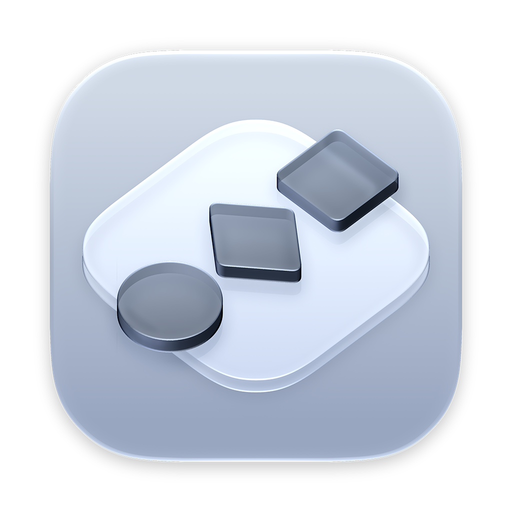

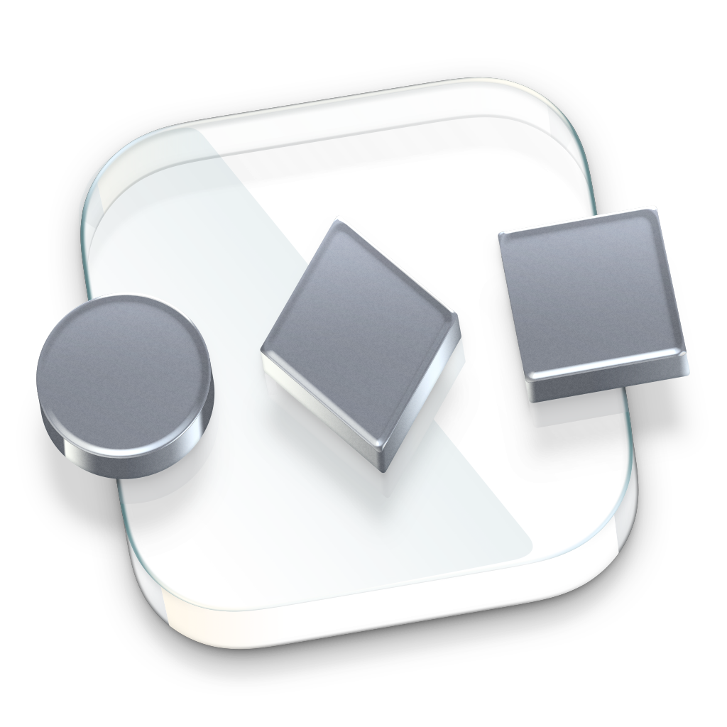
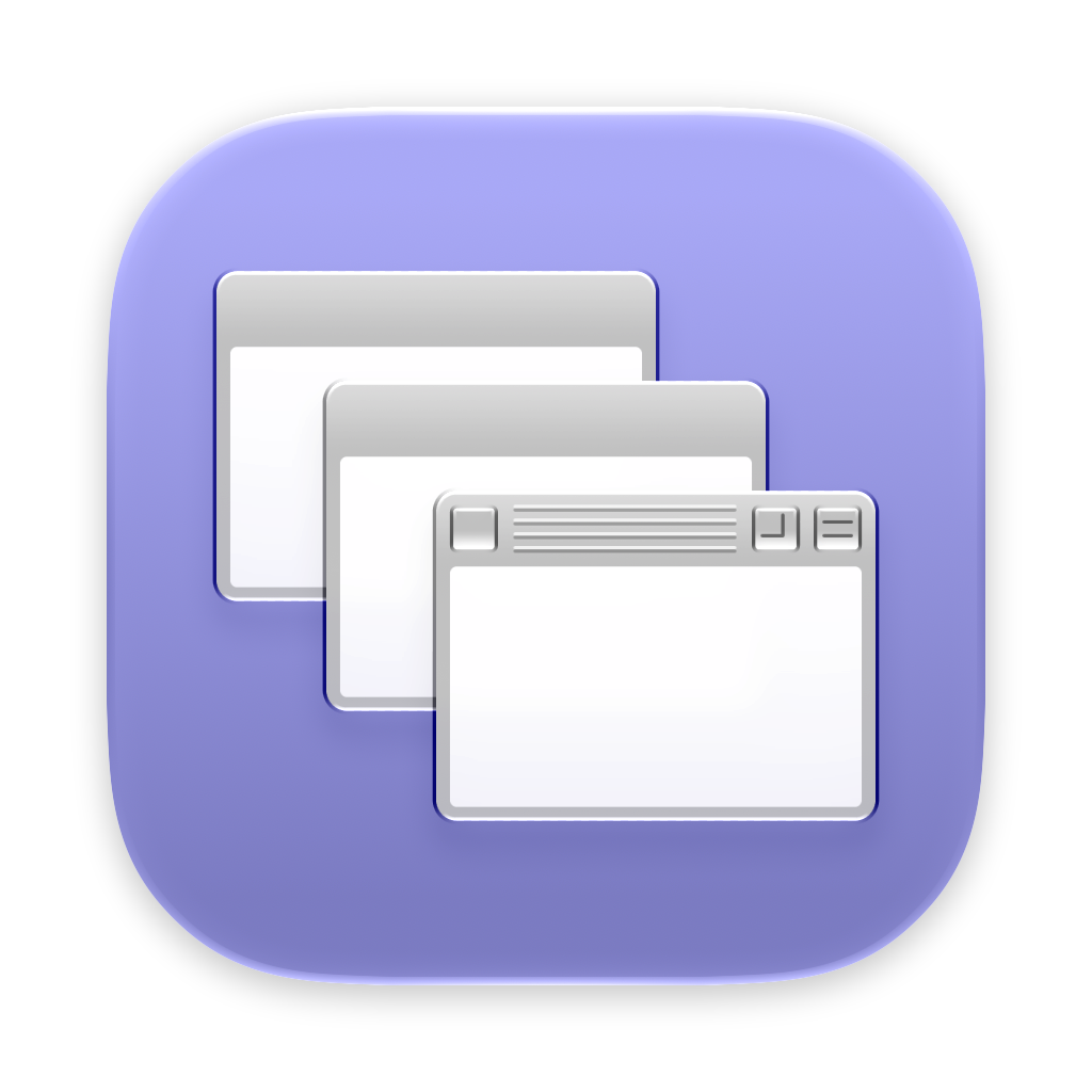
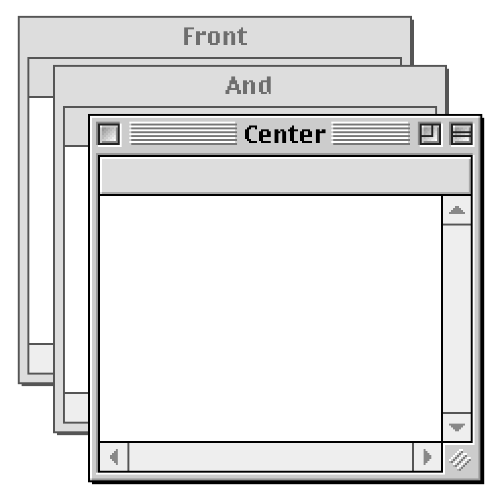
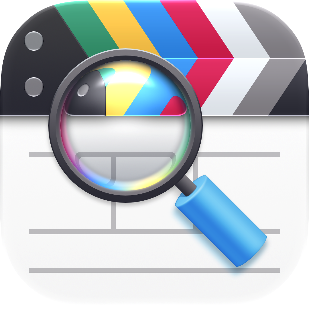
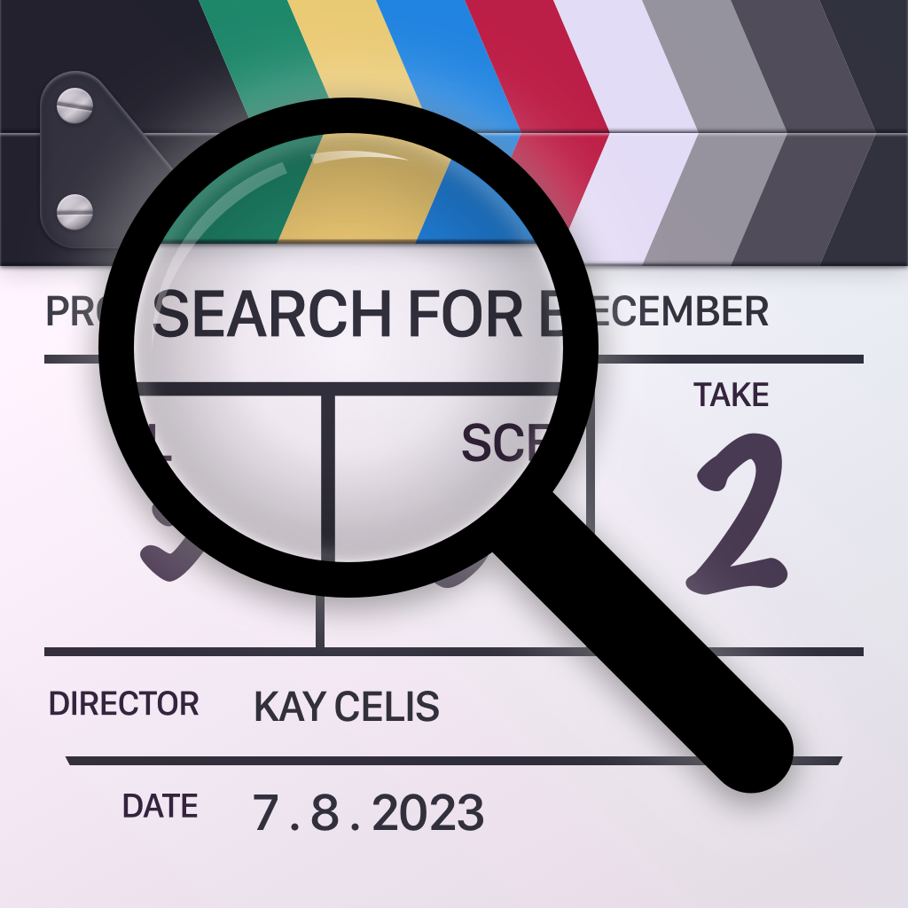
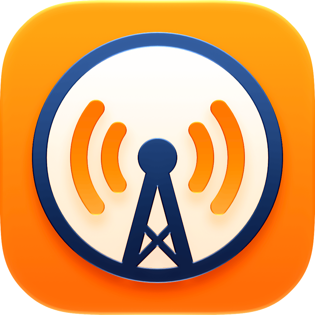
![Marco’s [REDACTED] Reminders App](https://cdn.atp.fm/images/20260702-reminder.png?v1)
Sponsored by:
Become a member for ATP Overtime, ad-free episodes, member specials, and our early-release, unedited “bootleg” feed!