Ask ChatGPT

 Design Matters with Debbie Millman
15 Dec 2025 · 47m
Written by AI. May contain mistakes.

Get the gist, explore an idea or ask about something said.
 Claude
On Design Matters with Debbie Millman, what are the key points of this episode?
Searching your listeningAutomatic transcript. May contain errors.
0:01So, you want to get into calligraphy, huh? I said, oh, yes, Professor Reynolds, I do. Who needs two typographers in the family, you know? Change this other thing, make this curve longer, make this curve sharper or whatever. It'll have some other effect.
0:17From the TED Audio Collective, this is Design Matters with Debbie Millman.
0:24On Design Matters, Debbie talks with some of the most creative people in the world about what they do, how they got to be who they are, and what they're thinking about and working on. On this episode, in celebration of the 20th anniversary of Design Matters, we'll hear from some of the typographers and lettering artists Debbie has interviewed over the years. It is perfectly legible. It never interferes with the reading. I wanted to create a new creature. I love just coming up with really stupid conceptual projects that I can never do for clients. There's not a day that goes by when you don't encounter a typeface of one sort or another.
1:03Most people don't think about it, but someone designed that typeface. In fact, there are designers at work on new typefaces all the time, and you're about to meet a few of them. You're also going to meet a few of the not-so-distant cousins of typeface designers, lettering artists who draw letters and text for their books or art or design work. Over the years, I've interviewed a number of typeface designers and lettering artists, and I'd like to play you some excerpts from some of those conversations. Canadian artist Marion Banshees is celebrated for her intricately patterned images and custom lettering.
1:46I spoke with her in 2010, shortly after the publication of her book, I Wonder. So each piece in the book, each essay in the book is very different. And you've said that some are tender and bare, while others lie in jeweled cases, and others still are tarted up like elaborate cakes. What made you decide to create each essay with a very different visual language? This was part of the point of the book, and it was one of the things that I wanted to achieve with the book was to make a point about graphics not being superfluous to text. I'm astonished, actually, by the number of people in the graphic industry, visual people who don't communicate visually.
2:34At the very best, usually what we get is we get pages and pages of text and illustrations to accompany that, which in the illustrations are in boxes with captions, and they're separated from the text. At the very worst, we get pages and pages of text and no imagery whatsoever, which just blows my mind when somebody's talking about something visual. But I wanted to really integrate the two so that when I'm speaking of something visual, I'm not just showing the visual, but I'm actually representing the entire piece in that visual sense. The best example probably in the book is the piece that was about signage from my hometown of Saskatoon.
3:21And that was, again, it was originally written for Speak Up, and it was originally written, you know, on the web, it was necessarily written as writing and then images. And when I brought it into the book, I wanted it to be so much more than that. I wanted the entire reading of the piece to be the experience of seeing all those signs all over Saskatoon. And so So the whole piece is fluorescent orange and yellow and black. I mean, it's really in your face. And then on top of that, I changed the writing. So instead of writing in an article style, I rewrote the entire piece in the language of signs.
4:07So I actually turned the essay into a series of graphic signs. So the whole thing is complete. Some of your essays are harder to read than others, and you clearly state that the typographic treatments will no doubt cause a certain amount of pain to some of your more rigorously trained colleagues in graphic design. However, you make no apologies for the typographic jungle you've painstakingly nurtured. And so two questions, Marion. Why no apologies and why a typographic jungle? I actually think that the book is, except for one section, the book is 100 % legible. It's meant for reading. I don't want people to get the impression that the book is typographically adventurous, because it's actually not.
5:00I'm a really, really conservative typesetter. That's what I bring from my book typesetting days is this conservatism in terms of text that's meant to be read. But my typographic choices, my combining of typefaces, my choice of typefaces is what would quite possibly cause pain to some of the purists in the type world. I think that probably the average person would think nothing of it, but type purists would probably throw their hands up in the air and say, my God, why did she use such and such a typeface for this and not that? So I don't apologize for it because it is perfectly legible. It never interferes with the reading.
5:48And yet, you know, it's got personality and I'm happy with that. I actually have to say, Marion, in the hundred plus broadcasts that I have done of Design Matters, I've never actually wanted so badly to be able to show something to my listeners as I do now. Well, that's a great thing. Because there is really no other way to be able to experience this book other than see it. There really are no words that could possibly describe the adventure that one takes when going through your book. And so this is a moment where I'm going to have to tell our listeners that in order to believe it, you're really going to have to see it.
6:34But I am going to take some umbrage to something that you just said, because there is actually one chapter, and I think you did mention this, so I will give you that. There is one chapter that I have spent quite a long time trying to get through, painstakingly trying to get through, and have been unsuccessful. And it's a chapter aptly called Secrets. And so I am now going to put the question to you in person. What is the secret story saying? Well, that would be a secret now, wouldn't it? Now you're being a minx. Well, I mean, you know, just in the way that I want people to experience the chapter on wonder in an environment of wonder and experience the chapter on the signage from Saskatoon in that signage.
7:26So, too, when I write about secrets, it is secretive. There are two parts to that chapter. One of them is essay-like. It's talking about secrets and ciphers and the messages that we're not supposed to read. What do you mean by messages we're not supposed to mean? Well, things like people's diaries and other people's letters and things that you're really not supposed to be digging into. And it's written in a type that I designed that is difficult. to read. You can read it. It's difficult. But once you get the hang of it, you can read it. The other part of that chapter is actual secret text in that I wrote it in a cipher, a kind of code.
8:09It's secret. It's a secret. There's a secret text in there. One of the most beautiful and wonderful and inspirational chapters in your book is the chapter where you reproduce many of the lists or the pages of lists from your mother's notebooks. They are magnificent. And I'd actually like to read something that you wrote about those lists from your book. This is from the chapter Memory 2. Food, friends, family, pets, directions, TV shows to watch, notes from the radio, problems with her car, book titles, appointments, meetings, bills to pay, oven times, questions, answers, the repetition of chores and people and food.
9:03We've a kind of fabric of life. Her life, my life, all our lives are somehow reflected in these pages. These are the things we do every day that make us both unique people we are and members of something bigger and more universal than our own tiny lives. It's remarkable, really remarkable. You pop up quite a lot in her lists. Ask Marion to remove the dead mouse. That was a particularly interesting one. And then things about the oven, phone Marion, make carrots, phone Jenny, phone Dennis. Tell me why you included these lists in your book. There is actually a lot of my mother in this entire book.
9:48The book is dedicated to my mom, who died in 2006. These lists were, they were kind of seemingly ordinary to-do lists that she kept for a good part of her life, and which I inherited when she died. They were a part of her life and as well as part of my memory of her. Because, you know, ever since I was a kid, I remember her having these notebooks. And the early ones have conversations back and forth between me and my mom and my brothers. What kind of conversations? You know, it was sort of what you did before you had cell phones. I mean, we would come and go from the house. There would be a message from my brother saying that he's off to his polyscience class.
10:34and a message from my other brother saying that he was out with Laurel or whoever. But in particular, there's also these very immediate messages. So my mom, for instance, would be talking on the phone, and I was a kid at the time. I was, you know, 10 or something, and I would be bugging her and trying to get her to answer some question or give me permission to do something, and I'd be writing her a message, and she would write me a message back, and I'd write her a message. Meanwhile, she was on the phone. And so she's, you know, talking to herself and she's talking to her pets. She's, you know, writing notes about the pets.
11:09I mean, and they're hilarious. I mean, it's incredible. These are to-do lists and they're funny. And there's just so much of her in there. And I just, I wanted to include this because they're handwritten and they're graphic. They're, you know, the perfect example of a graphic representation of a human being. And in a way, they're doing exactly what I'm trying to do in the book, which is represent language and thought in a graphic way. And she already did it. And so it just wraps up the book perfectly. Marion Banshees in 2010, talking about her book, I Wonder. Odette Ezer is a typographer and artist based in Tel Aviv.
11:56I spoke with him in 2013. In your book, The Typographer's Guide to the Galaxy, you ask some rhetorical questions. You put them out at the beginning of some of the chapters. And sometimes you answer them directly and sometimes you use different examples to articulate an answer, visual examples. And so I want to ask you some of these questions. I think they're really fascinating questions, whether they have to do with typography or not. My favorite question that you ask in the entire book is, how can I make type behave in a way that it speaks about time? And so I'm wondering if you could answer that question.
12:39Well, it would take me some time to answer this question. Of course it would. I think what is really important about this question is the question itself. I mean, we trained as graphic designers and typographers, we trained to ask, how does this type look? And I claim that what we really have to ask is how does this type behave? And this is a completely different question. When you ask it like that, you understand that you can activate type just like a person that sits in front of you. And I hope that by doing this, we can achieve a higher level of communication. I think that one of the most successful ways that you've done that is in your tortured letters experiment.
13:31Those that are listening that might not have seen them, first of all, I urge you to look, OdedEzzer.com, and you can see his tortured letters experimental typography. But I literally felt a visceral sense of fear, a little bit of disgust in seeing these sort of tortured pieces of typography, but not so much because they were just pieces of typography, but mostly because they were bandaged in a way that made it seem as if they were amputated in some way. there's this sense that something is fundamentally broken and that it has been tortured and not just hurt by accident. Right. How do you do something like that?
14:14How do you come up with this? Well, I didn't really think when I do these things. I mean, I just let myself play. So in this particular project, it was a really short, by the way, really short project. I mean, it took only one day and because it was a series of improvisations and I just had my photographer with me. He said, oh, don't move. Just leave it like that. I will shoot it and then you can continue. And that's how we worked. It was really a fluent process. And I try not to think too much. How old were you when you did the project, Odette? Well, it was a few years ago. All right. So late 30s, mid 30s.
15:00Okay, so as Paula Sher would say, it took you 38 years in one day, not just one day. Because it's everything that you brought to that day to create that experience. I agree. So a couple of other questions from the book. You ask the question, how do letters look when they are happy? How do they look when they are shy? How do letters look when they're shy? Well, again, I have to think about it. I mean, well, I assume that if 10 designers will ask this question, the same question, you will get 10 different answers. And that's how it should be. The importance is to ask this question rather than to answer.
15:43Of course, the answer will be very, very interesting. But I just wanted to explain my way of thinking about type. Sperm, DNA, and type. You ask a question in your book, or you actually state, I love to combine typography and other fields in order to find out what else can be done with letters. And so your sperm DNA and type, typospermae, is that correct? Typosperma. Typosperma. How did you actually construct the letters? Because they felt very three-dimensional. Right. Right. Well, it started with the two dimensional drawings. Yes. And the first few drawings were not very good because I felt like I'm forcing the letters on the sperm.
16:35And I didn't want that. I wanted to create a new creature. So then I slowly, slowly understood that if I don't use the whole letter parts, like I use only part of the letter and I use only part of the sperm. and together form new creature, then it looks convincing. And also I have this excuse that the sperms are not developed yet. So you can have half-ready letter sperm. So you have mutated letters and beings. One of your more recent projects is a piece that was inspired by Memory Palace, a popular graphic novel by Hari Kunzru. I read that you actually literally hungered for something different.
17:26You were hungering for something different. So you shot a video of yourself ravenously devouring bits of edible typography, spelling out key concepts in the novel. It's not entirely clear in the movie, in the video, that you've made these letter forms from seaweed. It actually looks like you're eating something that actually isn't really edible. I see this as conceptual as I see Sagmeister's Cranbrook poster, where he carves the information about his lecture into his body. And here you are engulfing, eating this information, and you eat it in a way wherein it's not entirely clear to the viewer if your mouth or tongue is bleeding while you're eating.
18:24And it feels as if this is your attempt, and in some ways as sagmeisters as well, to sort of become one with graphic design, that you are now the canvas in which the design is either happening or containing. Can you talk a little bit about what made you decide to eat the typography and what made it seem as if it might actually be painful? The idea behind those eight different videos that I created for the V &A exhibition was to try to find other ways of reading type and content. So one of the ways was eating the types. Imagine to yourself that you are introduced to typography, but you don't know what is it, actually.
19:22so if you are really a curious person you will try different things and one of the things that i thought i can try to read is by trying to taste it and to eat it and to try to to have it in my body and maybe in this way i can read the text of course you can't but it was a an honest attempt I dealt with other techniques of reading text, just like burning text, burning the actual letters, not the book, but the letters, tearing it apart, and other very naive attempts to understand what's going on there. It's one of your most powerful pieces. Thank you. Odette Ezer from 2013. Jessica Hisch is an author and a lettering artist.
20:20I've interviewed Jessica several times over the years, and I want to go back to the 2011 interview I did with her. At the time, Jessica was in her late 20s, and the internet was a whole other place. In addition to your extraordinary talent, one of the things that really put you on the map in the design community was a project that you started when you first went freelance, a project called Daily Drop Cap. So talk about what Daily Drop Cap is slash was. Well, when I left working for Louise, I knew that my schedule was going to be kind of all over the map and that I am not incredibly disciplined at, you know, showering before noon and stuff like that.
21:03So I wanted to, you know, do a project that kind of kept me on a schedule when my schedule was going from like very regimented to just all over the map. So I set up Daily Dropcap. I originally wanted to do an alphabet a week and realized really quickly that was far too ambitious. So I settled on a letter a day and it ended up being just kind of like the best thing I could have ever done for myself. Why? It just took off as a project. It inspired so many young designers would write me and tell me, oh, my God, your project made me want to do a daily project. And because I did this daily project, I started getting work.
21:37And a lot of people ended up kind of knowing who I was because of daily drop caps. So how did you get publicity for it initially? I mean, you put up one letter a day. After a couple of weeks, what do you have, 30 letters? So how did it catch on like that? How did it become this really cultural phenomena? I think a lot of people started paying attention once I got past the one or two month mark because they saw that I was being really regular about posting. And I think at the time there weren't a lot of, like, lettering websites like that. A website called Letter Cult existed, but a few friends of mine, friends of type, started up a site around the same time.
22:17And theirs is a very similar thing, except it's, you know, four people collaborating instead of just one. And I think that the biggest thing that kind of put it around was the Internet. And that's one of the reasons why I have just kind of a love-love relationship with the Internet. You know, Tina from Swissmas wrote about it, and that was a huge push. Jason Santamaria wrote about it, which, of course, I mean, that guy has more Twitter followers than, like, the president. Not really, but almost. Close enough. And so you then went from Daily Drop Cap, and I think you had 12 or 13 alphabets. 12 alphabets that I completed, and then there was a 13th guest alphabet.
22:54And then you've been doing regular internet projects ever since. So in addition to all of the freelance work that you do, designing stamps, designing book covers, etc., you also have a number of other sites that you've created. the Should I Work for Free site, which I want to talk about. Mom, this is how Twitter works.com. You also have your own blog where you have posts like the dark art of pricing and so forth. So you seem to have quite a following of people that are interested in your point of view, as well as your actual output of design work. Which has been really wonderful. I mean, the main reason why I've started all these projects is that a lot of the lettering work that I do isn't exactly the most intellectual work.
23:38I do a lot of work for advertising, which is really wonderful. But at the same time, like someone hires you and says, draw the word Christmas in ribbon. And that's kind of all that you do. It's not really a giant exercise in brainwaves. So I've used a lot of these side projects as a way to kind of exercise my other creative muscles and copywriting. I love copywriting and writing for things. And I love just coming up with like really stupid conceptual projects that I can never do for clients. All right. So let's talk about some of them because I think they're really intriguing. Let's talk about Steal My Idea.
24:09Let's talk about that. You have a bunch of ideas on this site. You have an idea that's called the Zipcar-like gym service. You have the Internet is now Diamonds. Oh, that was very topical. Forwarded emails from mom. So what about Steal My Idea? Let's talk about that one. Well, I always have these. The thing is, if anyone pays attention to the stuff that I do, I'm churning out side projects like crazy. I think I have like 11 of them at this point. And it's kind of like a little overwhelming to maintain all of them. But at the same time, I feel like I'm constantly I have this walk that I do every day from the Bedford Avenue stop to my studio in Greenpoint, which is about 25 minutes, 30 minutes.
24:49And I'm always coming up with like some random weird idea on that walk that I wish that I had time to do myself, but I don't. So instead, I tell the Internet, hey, do you feel like making a website called ifeelawful.com in which all that you do is scout out bodegas that deliver like Advil and Gatorade to hang hungover people, you know. And now what about your cake site? You got, did you get a lot? You had, you had, you posted a query about asking people to send you cake. That, it started out as a joke at the studio because when I was sharing a space with Tina from Swissmas and a bunch of other web designers down there, and Tina, of course, gets a ton of requests constantly for people to kind of pimp their stuff on her website.
25:33And people do that a little bit to me, but not quite that much. But they do it a lot with like, hey, will you send my portfolio to other art directors that are looking? And I decided to make a joke of it and say, you know, I won't judge you at all based on your work, but I will judge you based on your baking ability. So if you can send me a cake that's creative and good, I will do a massive write-up about how awesome you are at baking and how that probably translates into your design portfolio. So it's how many baked goods did you get? For a while. It was like once a week or something. So everybody at the studio was like, man, this is awesome.
26:10And then by like maybe the third or fourth week, they were like, all right, I think I'm about four pounds in. I think we should maybe quell this a little bit. Okay. Okay. Jessica Hish from 2011. I interviewed her again in 2020. so there's a whole lot of Jessica Hish you can listen to. Tobias Frere-Jones is a designer who has created some very popular typefaces including Gotham, Retina, and Interstate. I spoke with him in 2015. Over the seven years you worked at Font Bureau, you created a number of the typefaces that are their best known, among them Interstate and Pointer Old Style and Gothic. Let's talk about Interstate.
26:52The font was released in 1994, just two years after you arrived at Font Bureau. And from what I've read, Interstate was loosely based on the font family highway gothic used by the United States Federal Highway Administration for road signs. Is this true? Yeah. And so what inspired you to do that? I grew up in a number of different places in Brooklyn, but for a long time, I lived at the very top of Brooklyn Heights, just by the Brooklyn Bridge there, up the hill at the beginning of the Brooklyn Heights Promenade, looks out over the water, over to Manhattan. If you stand at the very northern end of the promenade and look down at the BQE that will appear below you for a moment, you'll see a highway sign right there for, I believe it's exit 28.
27:41It's this unusual circumstance where you get to see a highway sign at eye level and a pretty short range. So I spent a lot of time standing there at the railing looking at these letters, thinking that these shapes that are so distinctive and so recognizable don't exist outside of this one particular environment. And they work pretty well at this environment. They're durable and legible at high speeds. And those qualities ought to be useful for running text. So it was with this kind of premise that the strength of these forms can be sort of remapped to a new situation, that I had this idea that I would make a text face based on highway signs.
28:25And I just kind of liked the fact that it was from this completely sort of off the wall source. So with the help of my friend also from RISD, Scott Stoll, I tracked down the Federal Highway Administration's specification for what highway signs ought to look like and what the letters on highway signs ought to look like. It's a pretty bizarre looking spec. And how closely it's followed varies a lot from state to state, I found out later. But the idea behind interstate was basically to take these forms and try to keep their personality, what I came to think of as their clunk, and remove the parts that don't help, like the weight that clumps up in places and the widths that look kind of weird and the curves that break in weird places.
29:13Basically to make all of that look deliberate and balanced. That turned out to be a much more difficult job than I realized. How do you do something like that? How do you make something look deliberately balanced? A lot of trial and error and most of all observation. You have to then be able to trust your own observational abilities. Yeah. And that doesn't appear on day one. that comes through finding out what happens if you change the width of the lowercase n and the lowercase h and the u and the m of its relatives, and then seeing what kind of effect that has when you set a whole block of text in it and then trying something with the lowercase b, d, p, q, and g.
29:57That'll have some kind of effect. I came to notice really quickly that to be able to understand sort of the cause and effect, I would have to do one kind of change at a time and then see what that effect was and try to understand that if I do this, it will have this effect. If I change this other thing, make this curve longer, make this curve sharper or whatever, it'll have some other effect. It was really the first time that I took this very sort of foggy notion of a personality and tried to break that down into the parts that would project that. It's this kind of curve, this kind of intersection.
30:35Interstate has now been used all throughout culture, including the 2000 U.S. Census. You've called the font working class lettering. What do you mean by that? It called it working class or blue collar typography to acknowledge its source as being different than Bembo or Garamond or any of these other sort of fine printing typefaces, which are great. And they're beautiful and they're lovely and they're really important. But I think there's also a value in this other source that has a much different kind of attitude, but also comes from outside typography. Type design has a tendency to point back to itself.
31:22In what way? What do you mean? So much of type history was an incremental process from one designer slowly shifting a style from the designer that had come before, whether it was Fleischman and Caslon and Baskerville and the rest. That certainly changed after William Morris. So we don't think it's so unusual to find Futura and Garamond on the same page, even though those were designed hundreds of years apart. it. We couldn't really do that in fashion or in many other fields. You might be able to pull that off in architecture in some way, but... Maybe with some furniture, but it would have to be inventive.
32:05Yes, yes. But there's a kind of fluidity now to history that I'm pretty sure does not exist in most other fields. Tobias Frere Jones in 2015. Matthew Carter is one of the world's most celebrated typeface designers. His many typefaces include Georgia, Yale, and Roster. I spoke with him in 2018 in front of a live audience for the Type Directors Club in New York City. Can you explain to the audience what a smoke proof is and how you make one? Yes. This was one of the most fascinating things that I learned in doing my research. When you're cutting a punch, you obviously want to see what the letter looks like.
32:52The only way to do that is to hold it in the soot of a candle flame so you get a little deposit of black soot on the face of the punch and then dab it on a piece of coated paper normally to leave a little impression. So that is what you do. You look at it and you see the letter printed at actual size and so on. Inevitably, when you first look at it, it's wrong. so you worked on it more. It's very difficult to persuade students that, you know, whoever it was, I don't suppose it was me, but the first time somebody digitized two letters on a computer and sent them to a laser printer and they came out at real size in real time, was the first time in the history of type making that any type designer saw their work in that way.
33:44I mean, smoke proofs, you can imagine, it's immensely laborious. When I was at Minotype, if you wanted trial matrices cut, you had to wait because it interfered with production and so on. Same thing in the photocomposing days. I mean, the factory was very good to me, but there were often, you know, with matrices, it would be weeks of waiting with a trial font. It would probably be several days at least before you could see what you were doing. So smoke proofs were the sort of punch cutters' only way of getting some sort of idea of what this letter might look like before you struck the matrix. So you heated up the metal type.
34:30You then were able to get some soot to be able to then press it down on some sort of coated paper to see what it would look like. Yes. Wow. You don't believe me? No, I do. I do. I do. It's true. It's just hard to believe how far we've come. It is. It is. And also, I can't imagine that looking at the type that way would really be that accurate. It's accurate in this sense that the image you get is very precise, provided you do it right. But, of course, you get no clue about spacing, how the letters look together. You can, you know, we used to do this. We used to make smokeproofs. We would cut them up, tiny little pieces, and paste them up, you know, to make an alphabet or words.
35:19Unbelievably laborious. But still, it's not really a very satisfactory way of doing it. But it was the only way to do it in those days. What made you decide not to go to Oxford after you had planned to go? Well, I think it was just this year I'd spent and got interested in type. Although, as I say, the particular craft, I mean, it takes more than a year to become a punch cutter, but I had some sort of journeyman proficiency. You know, I could sort of, I kind of knew what to do. As I say, I couldn't make a living that way, but I had got interested in type. And I think that, you know, although my dad never pushed me to sort of follow in his footsteps, he said, you know, who needs two typographers in the family?
36:09You know, conversation at the dinner table would be much more interesting if you went and did something else. But then when I did say that I'd gotten very interested in this, he was very supportive in that sense. But I think it was a combination of my liking the experience that I'd had at Enske Days and not liking the prospect of learning Anglo-Saxon that decided that for me. You were really struggling initially to find work, to get a job.
36:45You were drawing alphabets for modernist designers and wanted to develop contemporary sans-serif type during a fairly conservative time in the country. And you started working with Alan Fletcher and Colin Forbes, two of the original partners at Pentagram. Talk about that experience. First of all, did you meet Alan through the boarding school experience? No, no, no. Here's what happened. I moved to London in 1958, I think it was. And in 1960, I had a great stroke of luck, which actually did sort of change my life. I was given a sum of money. I think it was£300. But£300 was a long way in 1960. And what I chose to do, to this day, I'm not exactly sure why, I chose to spend it on coming to New York.
37:37So I spent a few weeks in the spring of 1960 here. And I was gobsmacked. I mean, I went to Pushpin. I went to Schmeichel Geismar. I went to Liu Balin. They all handed me around, you know, and so on. And I saw graphic design that existed. I mean, I was amazed. But the thing that really turned me on the most was going to Morgenthaule Linotype. Mike Parker, who I already knew, had been working there about a year, I think an assistant to Jackson Burke, who was the director of typographic development at Morgenthaule. Morgenthaule, by the way, then was a sort of dark satanic bill down by the Navy Yard in Brooklyn between the Pratt campus and the Navy Yard.
38:24But I loved it. I really loved the factory. atmosphere and so on. And I kind of let it be known to Mike and Jackson that I loved to work there. There was no job for me at that point. And actually, in retrospect, that was a mercy because I don't think I had anything to offer at that point. But then in the intervening years, I did go there in 65. So in the intervening five years, when I got back to London, you know, sort of charged up with everything I'd seen here in the studios in New York, I didn't make, I can't remember exactly how it started, but the fact that Alan had been to Yale and worked in this country.
39:02I did do quite a lot of work for him and for Colin, for Bob Gill when Bob came over and joined an ad agency in London, for Derek Birdsell, David Collins. There were a handful, not a great many, but there were some very, very good graphic designers in London at that time who wanted to work in a sort of international modernist style. But the typesetting trade in Britain was incredibly conservative at that time. You know, Helvetica was released in Switzerland in 1957. In 1961, we could not get Helvetica set in London. Why not? No one had it. You know, they had the monotype faces. They had some Stevenson Blake grots and so on.
39:49Nobody imported Helvetica. You know, nowadays, if something introduces a new typeface in, I don't know, here in Berlin or in Tokyo, people are using it in seconds. You know, the fact that there should have been a four-year time lag between introducing a face like Helvetica and me. But in a way, I benefited from that because I got to draw a lot of lettering, sometimes whole alphabets, sometimes logos and so on, for those designers. And this was a really great training for me because they were very exacting and they made me get it right and get it on time and all that good stuff. So it was really a very fortunate thing I kind of fell into.
40:38Matthew Carter in 2018. Chris Holmes is a calligrapher and typeface designer. I spoke with her in front of a live audience at the Type Drives Culture Conference for the Type Directors Club in 2019. You've stated that calligraphy literally means beautiful writing, but to you it also means efficient writing. So can you talk a little bit about the distinction? Well, calligraphy really was originally not invented but developed for reproduction of books. because if you can't print books, you have to have some way to write them out to share the literature. So I think that these scripts evolved over time not to be fancy or eye-catching, but just to kind of get the job done.
41:27And what evolved were letter forms that are very efficient. Every major part of the letter is done with only a single stroke. So if you're doing hand lettering with a crow-quill pen or something, You do a whole bunch of little strokes to outline the letter. But with calligraphy, you just go whoop, whoop, and there's your letter. I learned this while researching you, and I am astounded at the difficulty of calligraphy, which looks so effortless and beautiful and is almost irreplicable. Like it's just not something you can do easily. It's something that requires so much more skill than meets the eye.
42:08Yeah, they say that it takes 10 years to make a good calligrapher. And when I heard that during my first year, I thought, oh, no, I'm never going to make it. But I did make it at just, you know, one step at a time. After you left Reed, I understand that you had a job at Hallmark Cards in Kansas City. How did you get that job and what did you do there? I was a lettering designer there, but I didn't last very long. Two months, right? Yeah, two months. I got the job because... Were you fired or did you quit? I was not fired. I quit. But Hallmark Cards was just interested in finding lettering designers, and they asked for portfolios.
42:48I sent my portfolio and they hired me. But when I got there, I just found that I really didn't like the work very much, the sort of saccharine messages that we were writing out. It's a wonderful place to work, and I learned a lot about hand lettering just in two months. But I just thought, you know, I really don't want to do this forever. So I left the job. Now, you had a major detour in your life at this point. You decide that you want to study dance. You want to become a professional dancer. No, that wasn't at this point in my life. The reason I decided to study dance was way back at Reed. I used to hang around the Reed Calligraphy Studio because Lloyd Reynolds hung around there too.
43:30And you could go in and watch him just practicing with his big coit pen and the letters just kind of flowing out of his hand like water. I loved to watch him. And one day he kind of put his pen down and he growled at me, So, you want to get into calligraphy, huh? I said, Oh, yes, Professor Reynolds, I do. He said, If you want to be a good calligrapher, get into modern dance. That's where you really learn how to, you know, move that pen across the paper. So I ran right out and signed up for a modern dance class. And again, I had the luck of finding a fantastic teacher. Judith Massey taught there at Reed.
44:07And she was so inspirational that I thought I wanted to be a professional dancer. And so you went to New York. Now, I believe it was it was it after Hallmark? Yeah, no, it was after Hallmark. Hightail it to New York. Yes. And you decide. So at that point, you studied with Martha Graham. At the Martha Graham School. At the school. And you studied at the Alwyn Nicolai School? Yeah, that's correct. And so what made you decide not to be a professional dancer? Well, I wasn't good enough. It's that simple. I went there and I took classes and I went to auditions. But just technically, I was never going to be a top modern dancer.
44:45But while I was in New York, I took a class at SVA. Yes, you did. From Ed Ben Gatt. Yes, you did. I interviewed him last year. Quite a feisty interview we had. Yeah. And he taught hand lettering. And that was really another in a string of great teachers. That was another teacher. And he took me from being a calligrapher to being a lettering designer. And he was incredible. His finish work was just so perfect. And at that time, the way you did finish work in lettering was with black ink in a crow quill pen. and then you corrected your mistakes with white placa. And it was so agonizing. I was never very good at that, but he was great at it.
45:29So I took his class and I thought, okay, I'm failing as a modern dancer, but I'll bet I could succeed as a lettering designer. That was Chris Holmes in 2019. You can hear the full interviews and hundreds of other interviews with some of the world's most creative people on our website, designmattersmedia.com, or wherever you get your podcasts. We'll be back next week with another special episode called from the many years I've been recording Design Matters. Yes, this is the 20th year we've been podcasting Design Matters, and I'd like to thank you for listening. And remember, we can talk about making a difference, we can make a difference, or we can do both.
46:11I'm Debbie Millman, and I look forward to talking with you again soon. Design Matters is produced by the TED Audio Collective by Curtis Fox Productions. The interviews are usually recorded at the Masters in Branding Program at the School of Visual Arts in New York City, the first and longest-running branding program in the world. The Editor-in-Chief of Design Matters Media is Emily Weiland.
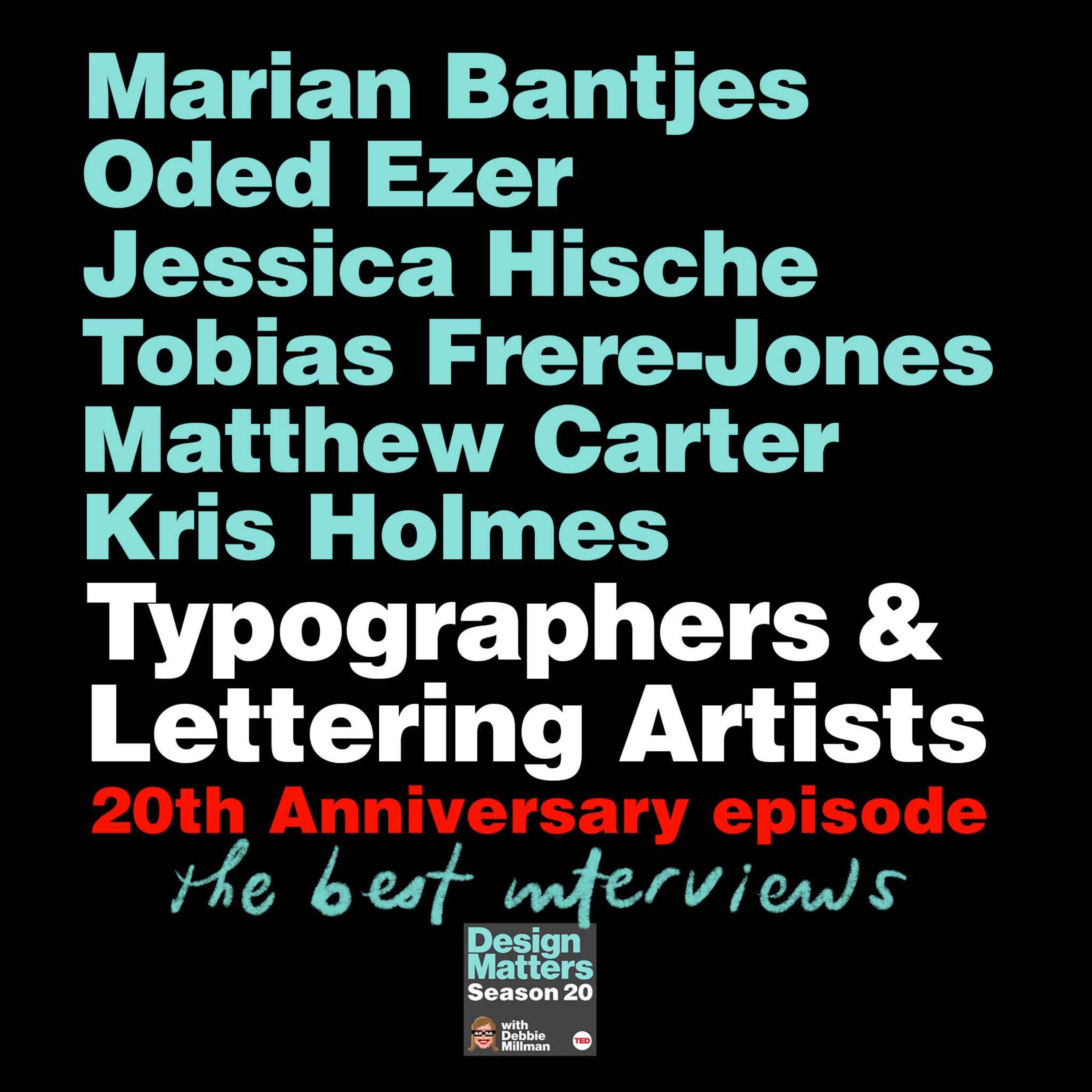
In celebration of the 20th anniversary of Design Matters, Debbie Millman shares excerpts from interviews with typographers and lettering artists Marian Bantjes, Oded Ezer, Jessica Hische, Tobias Frere-Jones, Matthew Carter, and Kris Holmes, reflecting on legibility and expression, how letters behave, the discipline of refinement, and how type has evolved from hand-crafted processes to the digital tools we use today.
Hosted on Acast. See acast.com/privacy for more information.