 Ask ChatGPT


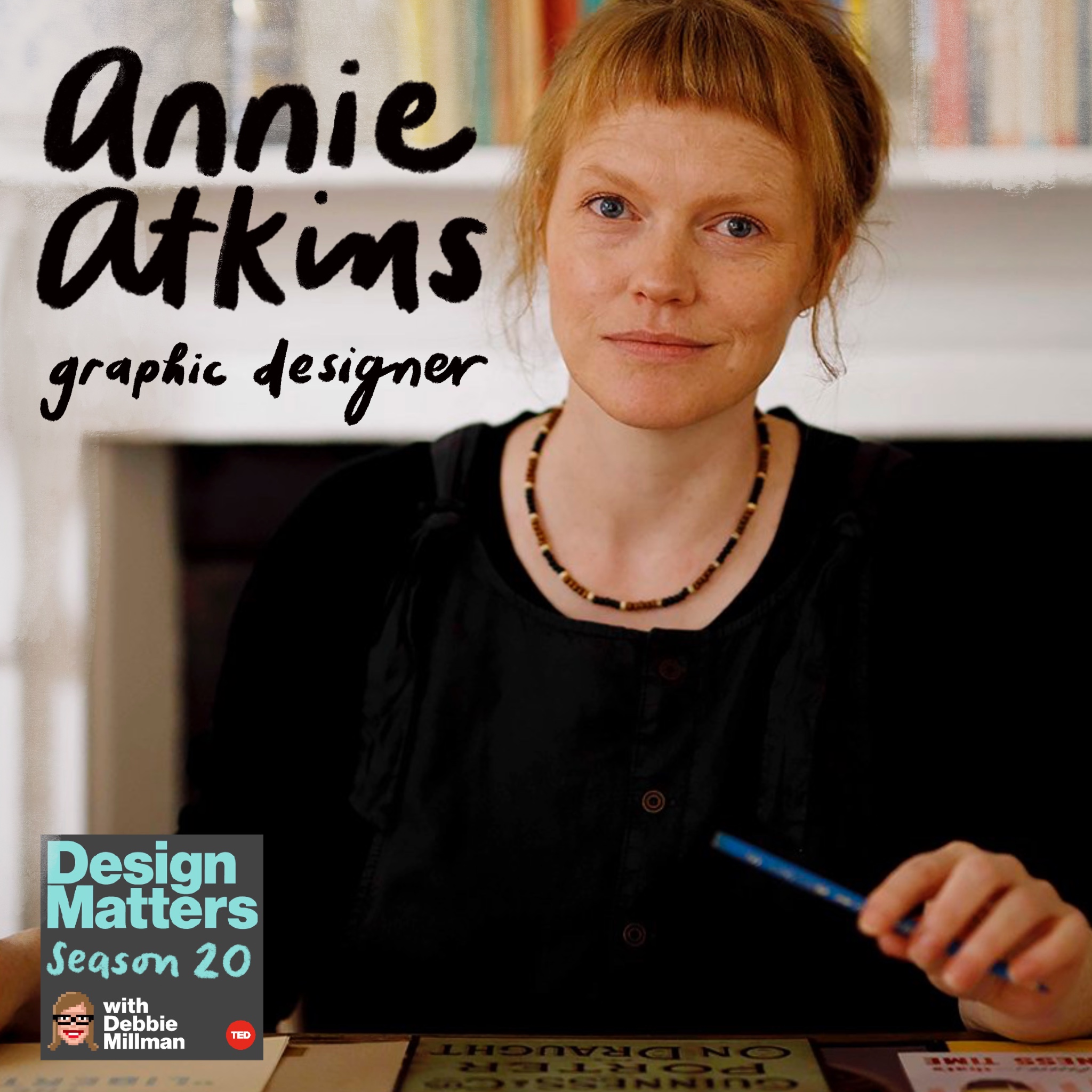
In this episode of Design Matters, host Debbie Millman talks with graphic designer Annie Atkins, who specializes in creating graphic props and typography for motion pictures. Atkins discusses her career, notably her work on films such as The Grand Budapest Hotel and The French Dispatch, and her recent book, Letters from the North Pole.
Written by AI. May contain mistakes.
Get the gist, explore an idea or ask about something said.
 Claude
On Design Matters with Debbie Millman, what are the key points of this episode?
Searching your listeningAutomatic transcript. May contain errors.
0:00What happened was, people started selling bootleg versions of it, like their own knockoffs. but of course at that point they didn't know about the spelling mistake
0:13from the ted audio collective this is design matters with debbie millman for 19 years debbie millman has been talking with designers and other creative people about what they do how they get to be who they are and what they're thinking about and working on on this episode amy atkins talks about working as a graphic designer on wes anderson films and about that coveted cake box. The real boxes, they've all got the spelling mistake on them. So if you see that for sale on eBay, then you should buy that one. We generally don't think about graphic design when we think about film and television. Yes, there are the opening credits, which are often elaborately designed and produced.
0:58I'm talking here about the variety of things we see in scenes, the props, especially in historical dramas. Need an American passport, say, from 1949 for your movie? Need a pastry box with some lovely period branding on it? Need a telegram saying the Titanic is on the way? What you need is graphic designer Annie Atkins. You can see her work in movies like Grand Budapest Hotel and the French Dispatch, where the props and sets are so central to the story, they practically steal the show. Annie Atkins joins me today to talk about her career in film and television and about her brand new book, Letters from the North Pole.
1:45If anyone can make a letter from Santa Claus look and feel like the real thing, it is most definitely Annie Atkins. Annie, welcome to Design Matters. Hi, Debbie. Thank you so much. Annie, you have a warning on your website that I'd like to ask you about. You declare never, ever use glue on a cutting mat. And I'm wondering what inspired that declaration. Yeah, that's one piece of advice I like to give to young graphic designers who are starting out in film. You know, when I started in film, I had been a graphic designer for years, but in an ad agency back around the millennium when we did everything digitally.
2:30And working in film, I was suddenly having to use glue, like for the first time, honestly, since I was a kid, probably. And, you know, use cutting knives and, you know, making things with my hand and various other materials and tools. So I made a lot of mistakes when I first started, and one was always getting glue on the cutting mat and sticking all my work to it. Well, you were born and raised in a little village in a remote part of Snowdonia in North Wales named Dalwathelen, population 300. and I understand the nearest cinema was 25 miles away and your exposure to movies came through your neighbor's VCR.
3:15What kinds of films were you watching as you grew up? Yeah, we never went to the cinema really. It was just too far away. You had to go all the way to the coast. But my next door neighbors were one of the first people I knew in the village to get a VCR. And we used to rent movies from the local shop. But of course, in a village of 300 people, it was a very small shop. So quite limited what we were watching. But my neighbours also taped things off the TV. And really, I suppose we grew up watching Spielberg. Spielberg movies, movies he wrote and directed and produced, but also all the movies that he inspired as well, because he was such a pioneer of, I suppose, family filmmaking.
4:03Movies that the whole family would sit down to watch together, things that adults got and children understood, real kind of action adventure films. Well, we'll talk about your relationship with Steven Spielberg shortly. Both of your parents worked in creative fields. Your mother was an artist. Your dad was a graphic designer. And I got really excited when I saw that your dad was a graphic designer at the legendary record company Hypnosis, which designed some of the most recognizable album covers of the 1970s. Do you know which record covers he worked on? Yeah, I was very excited by that when I was a kid because I loved Pink Floyd.
4:45Yes. Did he work on that album? So he worked on a few different Pink Floyd albums, I think. I can't remember which ones exactly. I think Wish You Were Here. I'm not sure though. But then he was actually on the cover of a Wishbone Ash album because he was, I think he was the assistant on the shoot and he had to get dressed up in the costume. So that was very exciting to me as well when I was a kid. Oh, that was exciting to me now. Your mother was an artist and a wildlife illustrator. And I read that she drew every single day and that one of your favorite illustrations of hers is of you asleep in the hospital with this caption, Annie, one day old, in pencil underneath it.
5:32So one of the first things your mother did after having a baby was to draw a picture. I found that really quite compelling. Yeah, she drew a lot. She drew all the time. So she would have taken all her pencils and sketchbooks into the hospital with her when she was having me. While she was in labor. Yeah. Yeah. I don't know about that. I don't know about that. But my dad, because he was a photographer, he took pictures of my mum giving birth to me as well. So that's quite nice too. but yeah my mum was an artist but you know one thing that I always forget to mention really is when you know when I was a little kid my mum was actually for her work for her paid work she was actually a cleaner she was the cleaning lady at the local education centre and she had this lovely story that somebody wanted to give a going away present to somebody as a Van Gogh painting a print of a Van Gogh painting and they couldn't get it on time and my mum who was always drawing said oh, don't worry about that.
6:37I'll paint it. I'll paint fake. And she painted this fake sunflowers by Van Gogh. And it looked so realistic that she started doing this on the side as a side hustle. And she would paint these fake impressionist paintings and sell them to people who would decorate their houses with them. And the local newspaper used to do these pieces on her all the time, calling her this master forger, you know. So I have some of those news clippings now. And now I realize, oh, okay, that's where I got this whole forgery thing from, you know, because my mum always said, the best way to be an artist is to copy.
7:11Like you have to go out there and start imitating other artists and start imitating the world around you. And that's how you learn to draw. And that's how you learn to create art. Well, I love the fact on your first book, you have the drawing of fake love letters, forged telegrams and prison escape maps as the cover of a matchbook case. So yeah, she's embedded in your work. Is she the first person who taught you how to draw? Probably. She must have been. Although I have to say straight away, I don't really consider myself someone who can draw. I'm really not an illustrator. I think if you want to be an illustrator, you have to be able to draw people.
7:54And I definitely can't draw people. You know, I would really consider myself a graphic designer and a writer. And I do some illustration, but it's very, very naive illustration. You know, it's really the basic stuff. If I need proper illustration, I always hire a real illustrator. Your parents also ran a design business, a graphic design business together in rural North Wales, creating artwork for the heritage sector. It included creating information boards at scenic points and design maps and nature trails for the National Trust. And is it true that you still have a sketchbook from when you were five years old that has your name on the front with the title graphic designer?
8:39Yeah. Did you make that or did your parents make it for you? I think my dad made that for me at work. So he was a graphic designer and then eventually my mum quit her cleaning job and he quit his graphic design job and they set up a business together. Now, because both of your parents were artists, you've said that there seemed no question that you would also take that path. Did you ever have thoughts about a different kind of career as you were growing up? Not really, no. I really wanted to be a graphic designer like my dad. That's really what I wanted to do. I pictured myself as a grown-up, you know, in this swanky office sitting at a drawing board.
9:15That's what I thought being a graphic designer was. And of course, that's what it is. Aside from your Annie Atkins graphic designer sketchbook, what other kinds of things were you making as a young person? Oh, we did lots of crafty stuff, you know. Like my mum, also another side project of hers was that she taught art in the local primary school. So she was always doing projects with me like making paper mache, making puppets. We did a lot of puppetry, really just like making anything, anything where you could just get a bit messy. And of course, now that I'm a parent, I realize my mum was just trying to keep me busy.
9:54You know, you just got to give kids so much to do, you know, just give them as many materials as you can and let them make stuff. You studied visual information design at Ravensburn University. I believe that was in London. Is that correct? Yes. And at that point, you anticipated you would work at an advertising agency after you graduated, which you ended up doing. You said you didn't think there was any other option. Why is that? But so I suppose, I mean, advertising in London was booming at the time. And that's where all the jobs were. I had just never considered anything else. You know, we were all being given internships in ad agencies in London.
10:35And I just didn't really consider anything else, to be honest. And then I got a job in an ad agency in Reykjavik in Iceland. I mean, of course, there's tons of other graphic design jobs. it just hadn't occurred to me to do anything else. What made you decide to go to Iceland? You worked at McCann Ericsson. Was that something, did you go there to work for McCann Ericsson or did you go there because you really wanted to go to Iceland? No, I went off on my adventures. So after I graduated, my dad had lived in Iceland briefly when he was young. He worked in a dark room there, I think, just for a summer.
11:12And so he had always talked to us about Iceland when we were kids growing up, saying what a wonderful place it was. It was a strange and wonderful place. So I was really interested in going there. So I went off on my adventures, took my backpack, took my portfolio with me. And when I arrived, I started going around the agencies until I found a job. What kinds of clients did you have and what kind of work were you doing back then? So I started off as a junior designer. So the ad agency was very swanky. I got my wish. I just remember there was a pool table, there were leather couches, everything in the agency was like red and black, which I thought was extremely cool.
11:54Everybody had asymmetrical haircuts. Yeah, it was really... Did you end up getting one? I got an asymmetrical haircut. Yes, I did. It was a really exciting time. And the clients were big car companies, Mitsubishi, Iceland telecom, internet providers. It was very, like, Iceland was very kind of high tech at the time. It still is, like, I think it always has been, to be honest. And I was making brochures and magazine adverts. I don't think I was making them particularly well. I read that you said that you, while you initially loved it, you realized that you weren't very good at advertising. No. Why not?
12:38Really? No, I wasn't good at advertising design. I wasn't good at corporate design, commercial design. It was corporate design, but it was also corporate design in a Scandinavian aesthetic. Okay. So it was all very fresh and crisp and clear and digital, like perfect kerning, beautiful white space, muted color palettes. And I really struggled with it, you know, coming from a much more tactile background, messy background, I suppose, for want of a better word. I suppose eventually I did learn how to imitate it, but I never really felt that it was my thing. I definitely didn't excel at it. And it was kind of disappointing because I'd spent my whole life wanting to be a designer, right?
13:21So it was disheartening. At the time, I was also writing because I was writing a blog. Yeah, blogs were kind of big back in 2006. And I remember going to talk to my boss at the agency, the creative director. And I said to him, you know, I just think maybe I'm not doing really well with design here. Maybe I should be doing something else. And he said, well, actually, I've been reading your blog. And I think maybe you should do something else. Maybe you should go and do something with a bit more emotion in it, which was really amazing to hear because that's not what I had been thinking really, you know.
13:57But I think it was true that I needed to do something with a bit more emotion. And my idea was that I would go to film school where I would learn how to be a screenwriter or a director or something like that, you know. So I left Reykjavik and I came to Dublin and I went to study film production here. And you got a master's degree in film production. Is that not right? Yes. So it was a very broad degree film production. It's a little bit of everything we did, screenwriting, directing, producing, editing, even a bit of acting, you know, set design, all kinds of things. And of course, what happened in that year that I spent at film school was that I realised I did love design.
14:42Of course, it was design I loved all along. It's just that now I had this world of design for film opened up to me. In one of your classes, the production designer Tom Conroy came in to teach. He was designing at the time the Showtime series, The Tutors, which was in its second season. and you were able to show him your portfolio. And he suggested that when you finished your courses, you could come in for a job interview. What kind of work was he seeing in your portfolio that excited him so much for him to invite you in to potentially get a job? Well, my course leader, Leon, said to me, listen, we've got Tom Conroy coming in.
15:25He's the production designer of big TV show at the time. You really need to get your portfolio under his nose because he knew that I had been a graphic designer in my past life. So I did, I showed it to him. But actually, I think what caught Tom's attention was at the time we were designing a set for a college project and I was sticking up lettering on a detective's door. You know, detective's doors, glass doors have their name, you know, in gold spoil. Yeah, and that window pane, right? Yeah, yeah, yeah, yeah. And I was sticking that up very confidently. And I think Tom liked that. He was like, oh, you look like you're good with your hands, you know.
16:04And that's the kind of thing we're looking for in film. So yeah, he invited me to come in for an interview. I thought I was interviewing for an assistant job in the art department, but he said, look, we're actually looking for a graphic designer. And you ended up with a full-time graphic designer position on the show. yeah on a show set in the 15th century I couldn't believe it I didn't I didn't I didn't even understand why they would need a graphic designer on a show like that I read that you said you couldn't understand why this show would need a graphic designer on a show that was set in the 16th century royal court which was a period before graphic designers existed and I kind of loved that what did you end up discovering like how did you it seems like you were really thrown into the deep Ben, you were a full-time designer, graphic designer on a show, never having worked in television before and really only beginning your career as a graphic designer in film and television.
17:00It was so scary. I'm just so thrown in at the deep end. You know, I really, I was so clueless about the workload. I did have a little bit of training. So the departing graphic designer to spend a week with me. Oh, a whole week. Yeah, a whole week. And she explained everything to me in that week. And it was so overwhelming. Like I couldn't believe the amount of work that had to be done. And not just the work that we had to create, like the Royal Scrolls and the stained glass and the wallpaper patterns and the calligraphy, you know, whatever else there was to make in Tudor times, but also the management of it all, you know, ordering all the right paper, keeping an eye on the schedule, making sure you had everything ready for the shoot, understanding that the shoot doesn't work in story order.
17:47So, you know, you have to think a little bit differently time-wise. Yeah, it was completely overwhelming. And when I teach my students now, I always say to them, part of what we're going to do here is make sure that you don't feel as overwhelmed when you start your first job as I was when I started mine. I read that you taught Jonathan Rees Myers how to use a quill on that television show? How did you learn to use one? And what was it like teaching him? I don't think I taught Jonathan Rizmeyers, actually. I think that's Chinese Whispers, because I started the Tudors on the third season. So Jonathan Rizmeyers would have already known how to use a quill at that point.
18:29But I did teach Henry Cavill how to use a quill. who was playing... Even better. Yeah, even better. He's one of the most handsome men on the planet. He is one of the most handsome men on the planet. And also, you know, because it was my first job in film, I was really not used to being around actors at all. I was so nervous around them. I still am, to be honest. I think actors have a very strange energy, don't they? They're so personable constantly, you know? So I always feel a bit awkward around them. I'm much better at my desk with my head down, scribbling away than I am chatting with famous people.
19:10But yes, I had to teach Henry Cavill how to use a quill. And at that point, I didn't even know how to use a quill myself, to be honest. So we just kind of figured it out together. But I think the main thing was that whenever I teach an actor how to use an old dipping pen, I find that they always try to do it very quickly because they see signing an official document as something that's to be done with great flair. I signed this document for the king. But actually, calligraphy is a very slow process and you have to dip the nib in the ink very, very slowly and it's quite repetitive and laborious.
19:43So you have to try and get them to slow down a little bit. They usually end up asking for a hand double. One of the things I learned in your first book was that finding the right calligrapher for historical drama is actually really tricky because they have to not only be fluent in the various letter forms of the period, but their hands also need to be the right gender, age, and skin tone to stand in for the cast members as hand doubles. I had no idea. I am going to be looking at all period movies in a completely different way, looking to see if I can spot the difference in a person's hands. Yeah, you know the shot where it's like a real close-up on the ink.
20:29The Dickensian character is beginning to write their important letter, and then you cut to a wide and it's the actor in their costume, you know, but the hand is usually the hand of a calligrapher. You've said that teaching somebody or engaging someone to do calligraphy, an actor to do calligraphy, is often more difficult than their sex scenes. I think it's easier for an actor to do their own sex scenes or like stunts than it is to do their own calligraphy. Calligraphy is tricky. It's really difficult. When did you realize that this type of work you were creating was actually your calling? Oh, I think for the first few years, I probably felt like I was winging it.
21:16you know. And then somewhere along the line, I must have got the hang of it. Because I did a few different period shows here in Dublin. We do a lot of historical drama here. And I think I just, you know, everything is just practice, right? You can't get good at anything unless you practice. You have to practice it every day. And the good thing about film is you create so many pieces every day that if you do three or four movies or shows, you will be good at it. So I think by the time I was working on a TV show. It was a TV show about the Titanic, about the building of the Titanic. And it wasn't a great show, actually.
21:51I don't think it did very well. But the things we were making for it were wonderful because it was the first show I'd ever worked on that was set in a period after the invention of the printing press. So, you know, I had gone from making scrolls and stamped potato printed materials and fabrics and things to suddenly now making letterpress imitation pamphlets and newspapers. I hadn't done a newspaper before then. Cigarette packaging, all these kind of printed items. And I found that really thrilling. And I think I was getting the hang of it by then. Since then, you've worked on the television shows including Camelot, Penny Dreadful, which was created by Oscar-winning director Sam Mendez and James Bond writer John Logan.
22:38One of your biggest and most lauded projects has been working with Wes Anderson, particularly on the Oscar-winning film The Grand Budapest Hotel in 2014. How did you first meet Wes Anderson and what was the experience of interviewing for that job like? It was actually the Titanic TV show that I had just wrapped. After that, I began to feel like I wanted to do something because I did a lot of historical drama and I began to feel like I wanted to do something a little bit more imaginative, maybe a bit more creative. So I got in touch with the animation studio Laika in Portland, Oregon, because I had heard a rumour that they were about to start a movie that was set in the 1800s.
23:24And I thought to myself, oh, that would be interesting, you know, to kind of blend historical design with animation, which is very much, you You know, children's animation is very much a heightened, more imaginative design. So I reached out to them. I sent them my portfolio. And the answer came back from the art director saying, oh, you know, thank you. Thank you for sending us this work. You know, if you're ever on the West Coast, you could call into us and we could have a look at your portfolio. And I thought, the West Coast. I'm never on the West Coast. I live on the East Coast of Ireland. You know, I'm not going to be on the West Coast ever.
24:03But I did have a friend of a friend who lived in San Francisco. So I called her up and I went to stay with her. And then I called Laika again and I said, okay, I'm on the West Coast. And they said, okay, well, you better come in and show us your portfolio then. And that was a rigorous interview process. Now, I had three interviews for that job, which seemed a lot to me at the time. I remember one of their questions was, you've done a lot of historical design and we can see that you're good at research and imitating realistic documents from the past. But how do you think you could apply that to a more heightened imaginative design, the kind of things that we're doing here in Leica?
24:45and I remember just trying to think off the top of my head and I said yes I said I do have that but if you look at my personal work you'll see that it's much more flamboyant it has much more flair and color and I think what I can do for you is marry those two things together and they said okay good answer you're hired. Wow did you have to show them that personal portfolio or did they just take your word for it? Yeah I showed them yeah so what I had been doing in my spare time was just making my own artwork, like fake movie posters, theater posters, just anything where I could be a little bit more imaginative.
25:21And so working for Laika, how did that lead to working with Wes Anderson? Sorry, yes, that was the connection. So the head art director at Laika was Nelson Lowry, and he had designed Fantastic Mr. Fox for Wes a couple of years previously. So when Wes was coming to Europe to do Gran Budapest Hotel, he was looking for a European graphic designer and he asked Nelson at Leica, do you know any European graphic designers? And he said, well, yes, I know. I know someone in Ireland. So then one day I was just sitting in my studio here in Dublin and I got a text message from Nelson and all it said was something wicked your way comes.
26:01And I thought, that's strange. What does this mean? And then an hour later, the phone rang and it was a New York number, which was exciting in itself because nobody from New York had ever called me before. It was Wes's producer. And she said, you know, we're coming to Europe, we're making a film that's set between the wars. And we're wondering, do you have any examples of early 1900s graphic design in your portfolio? Because I'd done the Titanic TV show, and then I'd also done an animated movie, The Box Trolls with Laika, I was able to show them tons of work from that period, from the late 1800s, early 1900s, which was both historically correct in places and then imaginative in other places.
26:47And I think that's how I got the job. I want to talk to you about some of the things that you made for Grand Budapest Hotel. But I also want to talk a little bit about the way in which you work before we get to those kinds of specific, very specific details. In addition to working with Wes Anderson, and you've worked with him now on a number of films, you've also worked with Steven Spielberg on several films, Todd Haynes. Do different directors have different approaches to how design is deployed in their movies? Yeah, I think so, definitely. I mean, Wes Anderson is very hands-on. I've done three Wes Anderson movies.
27:30So I did Grand Budapest Hotel, French Dispatch, and Isle of Dogs, which was animated. You know, I think Wes is very different to any other director I've worked for because he's so hands-on. Like, you know, it's really his art. And he's involved with every little detail and every process. And I'm not just talking about fun stuff like design, you know, but I'm also talking about, I've seen him help stagehands carry sandbags across the set, you know, he's just right there with everybody. So he's a really amazing director to work with in that regard. Whereas Spielberg, I don't think I ever really talked to Spielberg directly on either of the two movies that I did for him, except when it was like really specific direction about like a newspaper headline that was going to be shown really in close-up.
28:20Whereas on a Wes Anderson movie, I would like get 30 emails a day or something, maybe even more than that. Now, what is your official title when you're working in movies or television? Graphic designer. You're a graphic designer for what is considered props. Is that correct? Well, really the graphic designer works for a few different departments. So if it's something that the actors have to handle, then it's a prop. If it's something that's built into the set, like an actual piece of construction design, like say a big billboard or a stained glass, piece of stained glass or something like that, then it would be for the art departments and the construction crew.
29:06And then if it's a piece of dressing, like patterns for curtains, then you would be working for the set deck department. And then sometimes you might even do something with the costume department. Like if you have a movie that has a lot of uniforms in it, like a police presence, then you'll be making badges and things for the uniforms. And then sometimes we also work with other departments as well, but rarely, I can't think of one off the top of my head. So there's so much range in what you do. Yeah. So, I mean, I use the term props because people understand what a prop is, but actually it's more than that.
29:43So it's really anything that has lettering or an illustration or some sort of pattern. So that would include telegrams, packaging, maps, love letters, books, poems, food packaging, labels, passports, shopping bags, police reports, wills, menus, fake CIA identification cards, It's anything with paper with letters on it. Yeah, maybe even a birthday cake if it had to have a name on it. It sounds like the dreamiest job in all of graphic design, frankly. Yeah, it does sound good. It does sound good. And all those things you listed there are really fun, interesting things. And a lot of what we do for film is really fun.
30:28Now, I learned from, again, from your book, that one of the best ways to explain what is going on in a movie is with a newspaper headline. Why is that? Yeah, I think directors really use newspaper headlines as narrative storytelling devices, you know, because you want to establish what's going on in the world when the story begins, you know. So are you going to shoot a million dollar war scene or are you going to like show somebody eating their breakfast, reading a newspaper that says, you know, there's a war on? Yes, we use newspaper headlines a lot. It's not always historically accurate, you know, British broadsheets didn't even have headlines on the front pages.
31:09Did they have ads on the front? Yeah, small ads. I think pre-World War I, they didn't have headlines on the front pages at all. But it doesn't really matter. We need to use a little bit of artistic license. I always think as long as you know your onions as a graphic designer, then you can present that information to the director or the production designer or whoever it is you're working for and say, this is what newspapers actually looked like in 1917. Or we can just put a headline on because you're telling a story. And nine times out of 10, the director's going to say, we're telling a story here.
31:40And that's totally fine. How do you get started working on a television show or a film? How much research do you do before you actually make anything? I would generally start researching straight away, as soon as I get the job. And then we usually get a few weeks prep. And prep is the weeks before the camera starts rolling. And in that time, I'll start researching the period, start collecting my reference material and do things like get my paper order in, do my script breakdown, really familiarise myself with the script and all the different locations and sets. And then start making the big things or the things that look like they're going to be shot on first.
32:20And then as soon as the camera starts rolling, you're basically just playing catch up all the way through until the direct calls wrap. Do you do most of your work on set or do you do most of your work remotely? So film graphic designers usually work in the art department office, which is usually in a studio next to the set. But these days I work completely remotely. A few years ago, I made the decision to go remote and to just have my own studio here in Dublin. It wasn't great at first because this was back before the pandemic. I think people in film at that point really preferred to have you within yelling distance, to be honest.
32:59But then the pandemic happened and, of course, everybody went remote. So it was more acceptable then. As graphic designers in film, you've detailed how you have two main priorities when starting to design any proper set piece. The first is to set the period and the second is to set the location so that when the audience starts watching a movie, they instantly know where the story is being told and when it's taking place. What are some techniques you use in doing that, in establishing those two directives? everybody who's working in film is doing the same thing. Like people are doing it with costume, people are doing it with location work and we're doing it in the art department as well.
33:45And I think the beauty of film design is you can be really obvious about things, you know, like if you need to show that we're in New York, you show everybody on the train reading the New York Times or, you know, whatever it is. I think also different places have quite distinct looks in their graphic design. You know, like London has a very distinctive look. You know, we really associate London with black and red and that lovely deep blue colour. So yeah, you can go super obvious with this and really let people know where they are. You've said that part of what you're designing for the cast and the directors is helping them create a fully realised world for them to walk into in the morning and help them stay in character and help them understand the period more and help them understand the way things worked in a specific time or a specific place.
34:41Do you have some favorite experiences doing that that stand out to you? Yeah, I think we have to remember that like most of what we make in the art department, especially small little detail things like graphic design, most of that is never seen by the movie camera or the audience. This stuff all blends into the background. So I do feel like sometimes what we're doing is designing for the cast and for the director so that when they arrive on set in the morning and they walk into this beautiful set that the art department and the set department have spent a lot of time and money on creating and they look at these tiny little details that the graphics department have dressed in, then it's really going to help transport them to another time or place.
35:27You know, I like to think that these little details can help nudge actors a little bit further into character. I mean, the truth is actors can probably act in front of a green screen. But, you know, we're world building and it's our job to make a world for them that they walk into and they pick these little things up and they go, oh, wow, now I am in 19th century East End London or wherever it is. Well, even though people aren't necessarily registering it as the first thing they see, even if it's in their peripheral vision on a screen, it's helping to establish a mood and a feeling and sort of an understanding of the world that's being created in a really, really powerful way.
36:14And especially with your work, which really elevates that experience, I think, to a much sort of more meaningful degree. Well, you can be very detailed with graphic design, and you can also write, because nearly all the graphics that we make, paper graphics to dress a set, need to have content in them, you know, they need to have written content. And that doesn't come from the script. Sometimes it does, if it's a hero prop, if it's something really important to the story, but all the other little love letters and telegrams and bits and pieces that we have to dress an office scene with has to have content on it.
36:50So if you can keep writing in the atmosphere of the scene, you know, whatever drama is unfolding in that scene, then you can really help start creating an atmosphere that's going to be believed by the cast. One thing that I had absolutely no idea about that I love knowing is that you will sometimes or often use crew names for things like gravestones and newspaper bylines. Can you talk a little bit more about that? Yeah, we do use crew names. So we wouldn't use crew names on a Wes Anderson job. Like a Wes Anderson job would always have a specific list of names that he has probably written himself, honestly.
37:28But on TV shows that I've worked on, yeah, we would just go to the crew list and use crew names to pepper around all the bits and pieces that need names and addresses on. And it goes through legal clearance. but often you know crew names don't really work for a period piece like for a period piece you want the names to sound period as well so I think a good way to do it is to go to a census that was taken at the time and use names from that list but then they all have to be cross-checked by legal to make sure that you know no nobody's being implicated in some kind of crime you know like someone the character in your movie who owns the gun shop there isn't a real person who owns a gun shop with the same name, for example.
38:09Let's talk about the making of the beautiful and now coveted Mendel's box in Grand Budapest Hotel. How did you go about making that? And did you have any sense at all that it was going to become such a viral piece of graphic design in a movie? No, I had no idea. When you're working on a film, you really have no idea what it's going to be like? Because you're concentrating on these teeny tiny little details and there's a director and a production designer thinking about the bigger picture. So Noah had no idea that the Mendelssohn's box was going to become this kind of almost iconic piece of design that illustrated the movie.
38:53I know you've talked about it before and I hate to be redundant, but it's such a juicy story. And I just want to make sure my listeners hear it from you. Talk about the spelling of the word patisserie. Yeah, no, it's fine. It's fine. I love this story too. Like, it's totally fine. I knew that the Mendelssocks was going to feature heavily in the film because in the script, it popped up again and again and again. And it was Wes who chose that lovely pink colour and the lovely blue of the ribbon. I think in an early iteration, the Mendelssocks was green, which I can't imagine now. In fact, I think a lot of the early work that we did for Granby Depesito Hotel, there was a lot of mint green.
39:34I remember Adam, the production designer coming in one day and saying, okay, we're changing the colour palette for the hotel. It's going to be pink, it's going to be red, it's going to be purple, it's going to be gold. And I remember thinking, hmm, is that going to work? You know, little did I know. This is why I'm a graphic designer and not a production designer. Yeah, so I was working away, concentrating on the little details. But of course, the lettering for the Mendels box was done by hand. So the actual word Mendels was drawn by our illustrator, Jan Jericho. And then I drew all the little texts in all the other areas.
40:11And because it was drawn by hand, there was no spell check. And I put two T's in the word patisserie. And it went to print. We screen printed those boxes. I think we made 300 boxes and nobody noticed until about halfway through the shoot. And I think it was actually Wes himself who noticed because there's one, there's one shot in that movie where it's real close up. It's like a zoom into the box. And you know, with a zoom shot, there's nothing worse than a zoom shot on a spelling mistake. So we had to, uh, we had to remake the box for all the scenes that we had left with it in. And then anything we'd already shot had to be fixed in post, which is pretty laborious, really.
40:55So I was quite embarrassed, actually, at the time. But, you know, Wes Anderson Cruz, a very nice cruise, they were all right about it. Thank goodness. But then after the movie was released, and, you know, the medals box became this kind of icon for the movie, what happened was, people started selling bootleg versions of it, like their own knockoffs. But of course, at that point, they didn't know about the spelling mistake. So they were making boxes that had the right spelling on them. And I said, you know, the real boxes from the movie, all the 300, wherever in the world they went, they've all got the spelling mistake on them.
41:33So if you see that for sale on eBay, then you should buy that one. Well, there are YouTube tutorial videos to show people how to make, quote unquote, quote, a functionally accurate Mendel's box. And there are a whole slew of people selling, admittedly, replicas on Etsy and merch from the movie on Redbubble. I can't think of any other movie that has that type of rabid following for accurate material from a movie. I think it's incredible. It's truly incredible. It is incredible. And it was such a, I mean, it was such an amazing experience to work on a film like that because it's just the way Wes created those scenes and those designs, you know, he really made a character out of the graphic design.
42:25So how lucky was I to work on such a beloved movie that had such a spotlight shone on the graphics? You know, it really, it's a film I hold very close to my heart. Was there ever any conversation about keeping the two T's in as sort of a moment of charm? Because, I mean, the movies are quirky. Why wouldn't it have an intentional misguiling? No, I don't think Wes Anderson would let an accidental mistake into one of his movies. It would have to have been deliberate from the get-go, I think. Now, you mentioned people potentially having an original box from the movie. Your first book, Fake Love Letters, Forged Telegrams, Prison Escapes, Designing Graphic Props for Filmmaking, that book came out in 2020.
43:21and it was a bit of a combination monograph and tutorial, but it featured a lot of material from your movies. Are those all part of a personal collection? How do you manage to keep all of this material? Well, you're supposed to keep one of everything you make back because we don't just make one of any prop, even if there's only one needed for the scene, we have to make what we call repeats, which are identical copies, so that if something gets destroyed on set, they can quickly replace it with a new prop. And things get destroyed quite easily, actually, because the lights on the set are very hot.
44:02Actor's hands are very sweaty. So if you have like a delicate love letter, it's not going to last the day. The standby props team are going to want to keep swapping it out. So I always make extra pieces and then I always keep one back in the studio so that if we do have to create it again in a hurry at some point, I have it in front of me so I know exactly what it looks like. So yeah, I did have one of each piece that I made. Annie, let's talk about your brand new book, Letters from the North Pole. What made you decide to create this book and why a children's book? Well, I love children's books.
44:40I read so many children's books. I have two small children of my own. And we read sometimes upwards of a dozen books a day. I've never been very good at playing with toys. I'm a mum who likes to either read to the kids or get on with some jobs. So when they need my attention, we sit down together and cuddle up and read books. So I absolutely love children's books and especially children's books that rhyme. It's like catnip to me somehow. I just love reading rhyming verse. So when I was approached by the publisher Magic Cat, they had had an idea about a book of letters between kids and Santa Claus with the idea that I would maybe make the letters for them.
45:26Because the book has letters that you can actually pull out and read, you know, as if they've really come from Santa Claus. So I was immediately on board. I really wanted to do this project and I wanted to write it and I wanted to direct the book myself as well. Yeah, and I was really, really excited about it. And now it's going to be released next week. Yes, it's a beautiful, beautiful book. It is very unusual. The book has envelopes in it, full size, the same size as the pages that open up and include a letter that is actually from Santa and also cards that are almost sort of evidence pages.
46:08They describe a toy or a idea that kids that are writing to Santa have that they want Santa to make. And so there's a treehouse and water slide invented by Otto, age six. There's a remote-controlled parrot invented by Maggie, who's also six. There's shoes on springs, which I do think might be my favorite, which is an invention by Bon Bon, who's aged four. And then there's several others, and there are cards, there are letters, there are pages, there are envelopes. Each piece of ephemera is its own little piece of art. So I want to talk to you about these various elements. So you wrote the book, you wrote all the poems, you wrote all of the letters.
47:05Yeah, it's about children wishing for toys for Christmas and they have these ideas for inventions and they write to Santa and they're hoping that Santa is going to put these toys into production in his workshop in time for Christmas. And Santa writes back to the kids. And in the envelope from the North Pole that he sends, there's also a kind of blueprint of the child's invention. That's what I meant by the cards. Yeah, it's a blueprint. Sorry about that word wrong. No, that's okay. So it's almost like he's had a technical drawing created by an industrious elf in his workshop. And he's saying, yep, you know, we're going to try and get this made for you.
47:46And then also the children are asking questions about Santa's existence. You know, they're saying, how do you get around the world in one night? And Santa is, he's not giving away too much information. You know, he's kind of deftly batting these questions away so that we can retain a bit of an air of mystery about Santa Claus. Because, you know, even though I really wanted to write a book about Santa Claus, one of the things I love most about him is that we know very little about him, actually. And that's the magic, isn't it? It's the not knowing. It's waking up in the morning and seeing the presents and the mince pie and the carrot for the reindeer have gone.
48:25And we know he's been here, but we don't really know an awful lot more than that. The letters from Santa are classic Annie Atkins. There are stamps, there are signatures, there's terms and telegram information. There is a note that says, please note that no guarantees can be made as to last minute requests during the busy season. there's so much charm there's so much wit one question why did you put the name Santa Claus in quotes on the stationery yeah that's a nice little detail I think it's because back in the day a trademark name or a company name would often have quotes around it you know to show that it was a name.
49:21And I thought that was a nice little touch because it's almost alluding to, you know, who is this Santa Claus? You know, does Santa Claus really exist? I mean, obviously, of course, Santa Claus exists. And the book is very, very clear that he exists. But I thought it was a nice little detail. And I love that you give Santa, the workshop a title, Woodworker and toy maker. Santa Claus is a woodworker and a toy maker. Annie, I didn't ask you this in advance. I don't know if you have any of the letters at hand. I was wondering if you might read one to us. Oh, I will. Yeah, I do have one somewhere.
50:02Let me have a look. I also love that they're all dated different days. Yeah. So many wonderful details. That was a continuity issue. The children had to be writing to him in December and they had to get their reply from him in time. So yeah, the dates felt important to me to get right. So this is a letter from Santa to Hannah. And Hannah has had an idea for a kids detective set with a disguise in it and various other detective tools so that kids can start their own detectives business. Dear Hannah, you question how, in just one night, I go the whole world wide. But winter nights are long and dark.
50:46Time is on my side. My deer are brisk, my sleigh is quick, and I've had lots of practice. Racing night time as the world is turning on its axis. I was glad to get your letter. A toy detective set. I've put it on my list of things I hadn't thought of yet. But you'll never ever see me as I tiptoe through your home. Down the chimney, stockings full, then whoosh, away I flow. And then it's signed, S. Claus. I thought it was important that Santa Claus had boundaries, you know, like all these kids are wondering if they're actually going to meet him. And his answer is always a very firm no. And that's in each letter.
51:28I was very, very surprised to see that in each letter, he makes it very clear that he is not going to be seen. Yes. So each big envelope has a folded letter. They have the blueprints for each of the inventions. Talk about some of the other ancillary things, the postage stamps, for example, on the envelopes. How much of those did you make? Yeah. So one of the other kind of problems I felt I had to figure out when I started writing the book was retaining Santa's air of mystery. If we were going to make a book all about Santa Claus, did I really want to show Santa Claus? I wanted to show him somewhere, but I didn't want to show him everywhere.
52:17and then I thought maybe it would be a nice idea if the only place we ever really see Santa is on the postage stamps that are stuck on the letters that come from the North Pole. Because that's also a very Christmassy thing, isn't it? Something we're quite familiar with. We see Santa on postage stamps. So I thought that might make sense. And our illustrator, Fia Tobing, who did all the lovely illustrations of the children and Santa in the book, she drew those stamps really beautifully and then there's other stamps on the envelopes as well it's supposed to look like it's come from halfway around the world you know it's got north pole franking mailed through the arctic express airmail stamps registered letter stamps if undelivered please return sender stamps you know it should feel like it's an important letter that's come through the letterbox for the kids and i love the way each of the letters are addressed to maggie over the bridge, second house on the left, the Cotswolds, England.
53:14Yeah, it feels like that's an address that only Santa would really be able to use in any kind of useful way. I think my favorite thing about the book is that the letters are all from Santa, but the inventions are approved by Mrs. Claus, not Santa. Yeah. Talk about that decision. I'm so glad you noticed that. It's just such a small detail. But it was important to me that Mrs. Claus was also a character in the book, even though we also don't really see her either. But yes, everything has to be approved by her. It really gets her seal of approval at the end of the day. Yes, she's the boss lady. Yeah.
54:02Now, this book feels like it really needs a sequel to use film language, and it really needs to be a letter set that children can make with stamps and signs and all kinds of things that they can sort of co-create with you. Do you have that in mind for the next potential place that this book can grow? Well, we're going to do some children's events in the run-up to Christmas in bookshops so kids can come in and write their own letters to Santa. And I'm going to bring all my stamping gear with me, rubber stamps and ink pads, and we'll do some fancy lettering and, you know, decorative things. And I'll bring my vintage post box as well so we can post them too.
54:47But I love the idea of actually making a craft set for kids. stamp set. I mean, the stamps are so incredible. Every envelope has a completely different collection of stamps on them. It would be so wonderful. Kids love to be able to cut things out and stick things on things. And it just, like, so do adults, frankly. Yeah. I'm thinking about it more for me than anyone else, but in any case. Yeah, like a little stationary craft set. That's a lovely idea. I love it. Annie, I have one last question for you. I read that one of the best tips you ever received regarding the kit you use on set came from the supervising art director on Vikings from Carmel Nugent.
55:30And I'm wondering if you can share that with us, because I think it's sort of a fun little tip for those of us that particularly like measuring tapes. That's right. I remember Carmel, the art director, saying to me, get your measuring tape and paint it with pink nail polish, and that way nobody in construction and we'll walk off with it by mistake. I love that. Annie Atkins, thank you so much for making so much work that matters and brings so much joy to people. And thank you for joining me today on Design Matters. Thank you, Debbie. It's so lovely to talk to you. Thank you. Annie Atkins' latest book is titled Letters from the North Pole.
56:08You can see lots more about her at AnnieAtkins.com. This is the 19th year we've been podcasting Design Matters and I'd like to thank you for listening. And remember, we can talk about making a difference, we can make a difference, or we can do both. I'm Debbie Millman, and I look forward to talking with you again soon. Design Matters is produced for the TED Audio Collective by Curtis Fox Productions. The interviews are usually recorded at the Masters in Branding Program at the School of Visual Arts in New York City, the first and longest-running branding program in the world. The Editor-in-Chief of Design Matters Media is Emily Weiland.
56:46I feel you
Building worlds in motion pictures through graphic props and typography—Annie Atkins joins to discuss her career designing set pieces for films such as The Grand Budapest Hotel and her new book, “Letters from the North Pole.”
Hosted on Acast. See acast.com/privacy for more information.