In short
```markdown
Lenny's Podcast
Product | Growth | Career
Episode Title
How to See Like a Designer: The Hidden Power of Typography and Logos | Jessica Hische (Lettering Artist, Author)
Overview
In this episode, Lenny Rachitsky interviews Jessica Hische, a renowned lettering artist and New York Times bestselling author, about the intricacies of typography and logo design. They discuss Jessica's process in redesigning Lenny's podcast logo, the psychology behind typography, balancing creativity with business needs, and the influence of AI on design. Jessica also shares insights from her diverse creative pursuits including children's books and running an art store.
Key Topics
- Jessica's Background:
- Custom typography and bespoke lettering for various applications.
- Worked with high-profile clients like Wes Anderson, USPS, Apple, Nike, and more.
- Notable accolades include Print Magazine’s New Visual Artist and Forbes 30 under 30 in Art and Design.
- Logo and Brand Refresh:
- Jessica's approach to refreshing Lenny’s logo and brand.
- Discussion on when a startup should consider refreshing their logo.
- Importance of cohesive brand elements and the psychology of typography.
- Typography and Logo Design Insights:
- Exploring the emotional impact of different typography choices.
- How to develop an eye for design by observing fonts and their emotional triggers.
- Recognizing patterns in typography and logo design that influence perception.
- Approach to Pricing and Working with Clients:
- Unique pricing strategy that keeps creative exploration flexible and cost-effective.
- Collaborative process that respects the client’s existing design team.
- Impact of AI on Design:
- AI as a tool in the iterative process, generating styles and aiding creativity.
- Concerns and optimism about AI’s role in illustration and design work.
- Other Creative Ventures:
- Children's books like "My First Book of Fancy Letters."
- Running a physical art supply store, "Jessica Hische & Friends," in Oakland.
Insightful Discussions
- Seeing Like a Designer:
- An exercise to connect feelings with typography and logo elements.
- Understanding design elements like spacing, letter width, and weight.
- Empowering Non-Designers:
- Encouragement for non-designers to trust their instincts about design.
- How to cultivate a designer’s perspective and utilize it in product management.
Notable Quotes
- "Most people are better at understanding the feelings and sensations that typography and logos give us than they give themselves credit for."
- "Hope is a discipline." - Reflecting on the choice to create positivity.
Resources and References
- Books Mentioned:
- "The Creative Act: A Way of Being" by Rick Rubin.
- "Inside Paragraphs: Typographic Fundamentals" by Cyrus Highsmith.
- "Just Kids" by Patti Smith.
- "The Emperor of All Maladies" by Siddhartha Mukherjee.
- Tools and Products:
- Penco brown bag stand.
- MyFonts and Geometric sans serif fonts.
- Podcasts and Conferences:
- Enterprise Ready Conference.
Connect with Jessica Hische
- [Website](https://jessicahische.is)
- [Instagram](https://www.instagram.com/jessicahische/)
- [Threads](https://www.threads.net/@jessicahische)
Connect with Lenny Rachitsky
- [Newsletter](https://www.lennysnewsletter.com)
- [LinkedIn](https://www.linkedin.com/in/lennyrachitsky/)
- [Twitter](https://twitter.com/lennysan)
Closing Thoughts
Jessica emphasizes the importance of storytelling in design, which can create lasting value and emotional connections with brand elements. This episode serves as a comprehensive guide for anyone interested in understanding the deeper aspects of typography and branding, whether for personal growth or professional application.
---
For full access to Lenny's insights and more episodes, visit [Lenny's Newsletter](https://www.lennysnewsletter.com/subscribe). ```
Written by AI. May contain mistakes. Listen to the episode to check what was said.
Transcript
Automatic transcript. May contain errors.0:00Most people are better at understanding the feelings and sensations that typography and logos give us than they give themselves credit for. Because what we are as people are endless absorbers of patterns and information and all this kind of stuff as we move throughout the world. We don't take time to sit and digest it, but it's still coming in and getting logged. And so even as like a non -designer, I think you can look at examples of logos where something's not quite right and be like something's not right here, I just don't know how to name it. But I think a good exercise is just sort of like looking at fonts that are available in the world and asking yourself what feeling does this give me.
0:46Today my guest is Jessica Hish. Jessica is a design legend and it was such an honor to both have her on this podcast and also to work with her on a refresh of my newsletter and podcast logo and brand which is launching around the same time as this episode comes out. Jessica is a lettering artist specializing in typographical work for logos, film, books and other commercial applications. Her clients include Wes Anderson, the United States Postal Service, Apple, Nike, Tiffany and company, the Gap and Penguin Books. And her work has been featured in design and illustration annals both in the US and internationally.
1:21She's helped create logos for Phil's coffee, event bright and mail chimp is a best selling children's book author. And if you live around the Bay Area, you've seen her work all over the city without knowing it. In her conversation Jessica shares the process that she went through to update my logo and brand for my newsletter and podcast, what specific elements of a logo and brand impact, how you feel about that brand, why a good enough logo is just fine for a long time for most startups. And when it makes sense to refresh your look, also some really clever productivity tips, design advice and a bunch of really fun stories.
1:55Jessica is a master of what she does and I am excited to spread the Jessica Hish Gospel. If you enjoy this podcast, don't forget to subscribe and follow it in your favorite podcasting app or YouTube. It's the best way to avoid missing feature episodes and it helps the podcast tremendously. With that, I bring you Jessica Hish.
2:16Jessica, thank you so much for being here. Welcome to the podcast. Happy to be here. I thought it'd be good to start with asking you just to describe what it is you do because you're very atypical of the kinds of guests I have in this podcast and you also have a very unique skill set. Yes, well, I will describe what I am most prominently known for because I'm a person who just does a lot of things. But the thing that I do the most professionally is custom typography, like bespoke lettering pieces. And so that translates to working for all kinds of things. Sometimes it's for film and television.
2:53I've done it. I've done like movie titles and things like that and television credits and stuff. Sometimes it's book covers, actually a lot of times it's book covers. And then a big part of my business is doing logos and logo refreshes and things like that. So basically being like the person who knows all the things so you don't have to have that person on staff when it comes to typography. This episode is brought to you by the Enterprise Ready Conference, a one day event in San Francisco bringing together product and engineering leaders shaping the future of enterprise sass. The event features a curated list of speakers with direct experience building for the enterprise including leaders from OpenAI, Vanta, Checker, Dropbox and Canva.
3:37Topics included Vance Identity Management, Compliance, Encryption and Logging, essentially a complex features that most enterprise customers require. If you're a founder, exec, product manager or engineer tasked with the Enterprise Roadmap, this conference is for you. You'll get detailed insights from industry leaders that have years of experience navigating the same challenges that you face today. And best of all, it's completely free since it's hosted by WorkOS. Spots are filling up quickly. Make sure to request an invite at EnterpriseReady .com. That's EnterpriseReady .com. I'm excited to chat with Christina Gilbert, the founder of one schema whenever a long time podcast sponsors.
4:20Hi, Christina. Yes, thank you for having me on, Lenny. What is the latest with one schema? I know you now work with some of my favorite companies like Ram, Vanta, Scale and Watershed. I heard that you just launched a new product to help product teams import CSVs from especially tricky systems like ERPs. Yes, so we just launched one schema file feeds, which allows you to build an integration with any system in 15 minutes as long as you can export a CSV to an SFTP folder. We see our customers all the time getting stuck with hacks and workarounds and the product teams that we work with don't have to turn down prospects because their systems are too hard to integrate with.
4:56We allow our customers to offer thousands of integrations without involving their engineering team at all. I can tell you that if my team had to build integrations like this, how nice would it be to be able to take the software roadmap and instead use something like one schema and not just to build it but also to maintain it forever? Absolutely, Lenny. We've heard so many four stories of multi -day outages from even just a handful of bad records. We have laser -focused on integration reliability to help teams end all of those distractions that come up with integrations. We have a built -in validation layer that stops any bad data from entering your system and once schema will notify your team immediately of any data that looks incorrect.
5:32I know that importing incorrect data can cause all kinds of pain for your customers and quickly lose their trust. Christina, thank you for joining us and if you want to learn more, head on over to oneschema .co. That's oneschema .co. Part of the reason I was excited to have you on this podcast is that I was lucky enough to get to work with you on a refresh of my logo and brand for my newsletter and my podcast, which I'm very, very excited about. It's actually going to be launching right around the time of this episode going live. This is in part a celebration of the new look and logo and brand.
6:05I thought it would be an awesome excuse to bring you on the podcast and kind of giving inside glimps into the process of updating a logo and a brand. Partly because I think it will just be people that are like, what the hell? How do this change? Where do this come from? Why is this versus that? Also just for people that are thinking about this for their own product or business to understand the process and understand when it might be right for them, when it might be not right for them. So broadly, how does that sound? Sure, yeah, of course. So one of the, like everybody that starts a company knows that they need a logo, right, that that is like a big thing.
6:39Some people start a company and think the logo is going to drive the culture of the company, which I don't think that that is true. I think that, you know, like the product itself and the team you build and the people you put together are the thing that should be driving things forward. But I do think the logo and the brand assets can generate a lot of both like internal and external excitement and just kind of like tell people what to expect from the thing that they're about to engage with. You know, in that way, like when I, you know, some people say like don't judge a book by its cover, I'm like the opposite where any book should like the cover of the book should be giving you incredible insight into what is on the interior of the book and setting the tone and setting the vibe so that when you open the book and read the book, you understand like you, it's a symbiotic thing where you're like, oh, I understand what I was getting into.
7:29This got me excited about starting it and whatever it kind of like keeps that ball rolling, but with the refresh work that I do. A lot of people start companies and they have a certain amount of money. If they're bootstrapping it, they have less if they get venture money, they have a little bit more, but what they don't want to do is spend venture money on like a massive brand exploration when you're still in the hiring process, you're still trying to get early stage engineers and all that kind of stuff. And so I am sort of like a weird contrarian in this way in the brand world where brand people are like brand is everything and you need to like take a significant investment in brand because that guides the vision of the product or like whatever.
8:13But I think being a bit more of an insider within the sort of tech world, I understand that sometimes people start companies and have an intention to do something. And while they're doing that, they're building the team, they're doing cool stuff, but then the company has to pivot for one reason or another whether like a competitor immediately comes out with a thing that you're doing or the technology that you're doing gets postponed like whatever's going to feed into it. And so if you invest super heavily on like the whole brand vision from the jump, sometimes it's like throwing away money if you have to pivot.
8:47And so what I love about the work that I do is that I understand that a lot of people have to like just have something to put on decks, you know, and have something to put on a holding page or whatever. And internal teams are totally capable of doing that early work. But then if it does become successful, you don't want to get locked into whatever it is that you had to throw together like before an investor meeting or something. And so I come in then to take existing, be existing vibe and smooth it out, address any of the concerns that came up. A lot of times it's really utilitarian stuff like this doesn't scale well or this thing falls apart, I went in this context or we never had a good avatar version of it or whatever.
9:33And so sometimes it's really specific utilitarian fixes and sometimes it's just about sort of growing it up and sophisticated it without losing like what was there in the first place that people got excited about. To give people maybe a couple more tactical piece of advice here. What's a sign that it's maybe time to do something with your logo and brand from like you took a first pass. It's good enough you're, you know, your wife made one, your husband made your logo. It's like, oh, it's great. Let's just go with this. What's like a sign that maybe it's time to okay, we should actually at least up level this not necessarily hire studio, but take something to make it better.
10:10Well, one of the things is if suddenly you're starting to deal with the greater rollout of the look and feel of the brand. So like if you at first just basically had like a really beta website and like small version of the app you're about to do a new one that kind of updates and expands it. That could be a really good time to roll it out. So one of the things that a lot of people do when they're starting a company is that they'll make a logo with a font that is really popular or widely available or free. And if you are about to let's say like print a bunch of swag for new hires or you're hosting a conference or you know whatever is that event where suddenly you're going to physically invest money in making stuff with your brand on it.
11:01That might be a good time to do it. One of the reasons why I like tell people why having custom a custom logo or custom typography can really matter is that if you're using something that's available to everyone, the chances of someone else coming in and copying you are very easy and high. Like you might be one of these lucky companies that just out the gate is like outrageously successful, but with success comes people climbing up behind you trying to copy your success. And if that success is very easily copyable like and people will try to like sort of trick your customers into coming their way by repeating the things that you're doing, including the branding.
11:40One way to avoid that is by doing something that's more customized when it comes to the logo and brand. So let's actually talk about the work that you put into updating my logo and brand and from that we can spin off into lessons in insights the have along these lines. Overall just high level what's the process you go through to go through a low -gray fresh sure of course so super high level it's figuring out what the goals are. Some people have a goal where they want their customers to not notice it at all. You know like they're like, oh everybody loves this, but I the person with a design I can see all the problems with it.
12:18And I need to roll something out that fixes the problems that I see but that no one else really notices. So if that's like one one approach to it right which is like a very close in refresh where we're just like trying out little things to make it feel custom or fixing things that have come up with the same. So when when stress tested like whether it looks crazy when you scale it and looks like horsey and and sort of heavy handed when you scale it too big or when you scale it too small you lose a lot of legibility and stuff like that. So that's what would be like a really close in exploration.
12:51And then for other people they might have bigger goals where they're about to pivot the company to like try to attract a different audience or things like that. So they might have they might have this really cool and successful like group of people that are like they're super users but they're trying to expand it. So then it's about like what can we do to like shift the vibe to make it include these new people without excluding our core folks. And so my first round is sort of figuring out what that scope is like how how experimental how broad are we going to go for that first round because then everything else cascades from there.
13:32So if we go really broad for the first round then we're in this process of narrowing down the scope as we go down. Whereas if we go really close in for the first round we're already just talking about really a technical stuff. And then this is another thing that is a little bit unique to me that not everybody else does but I will like hand off files to clients to try in situ like really early on if what we're trying to do is solve utilitarian issues. And most other people are like no you don't get the files until we do the final because I don't want you to like run away with this or whatever. So there has to be some trust with it.
14:08So yeah figure out what we're trying to accomplish and always keep those goals in mind and then scope out the process based on what those goals are. And so for each round we're addressing different things like first round might be about like just capturing the overall look and trying things as broad as we can. And then the next round is okay well now we have like generally a look that we want but is it the right weight is it the right you know letter height do we have enough details that kind of thing. And then we kind of get narrower and nerder as we go along in the process. Awesome and then in the experience of my podcast logo we I was an ass and at the end of it I'm like no this isn't right because we narrowed narrowed and then I was like no this isn't not feeling it and then we unnarrowed it and went back.
15:01That is not an uncommon experience though this is one you know like there's a few things that I'm not opposed to that I know people that are very opposed to I'm not opposed to Frankensteining options together. To me it's like I'm giving you a menu of all the things that we can do and if you're and but I'm like a chef that puts a menu together where you can kind of combine different appetizers and different mains and they all still make sense. Some people will give you a menu and if you try to do that it's insane and it tastes terrible right but for me like everything that we're doing I feel like mixes and matches fairly well and I will let you know if it doesn't.
15:37And then it's not unreasonable for clients to go down one path and then use that as validation or confirmation that something that we did much earlier was actually the right way and in that way like you know if a client ever asks me to do something they're like let's see it in purple or whatever. Like there's designers that will really fight you to the nail because they're like that is wrong that is wrong but I know that some people just have to see it before they can let it go you know like sometimes you have to walk down a path before you're able to understand what the right thing to do was all along you know.
16:10That's exactly I felt for me going back to the goals the different goals people have when they're exploring this you mentioned there's like there's just like little problems with the logo doesn't scale doesn't print well that kind of thing. Another goal is people are pivoting and they want to change the vibe and and the feel of the brand what are their goals might appear that you've come across of like why people want to do this. Well sometimes there's like a legibility issue that is like really glaring once you see it and then people are like too close in to notice it so this is why it's like you have to show it to a lot of people that aren't familiar with like looking at those letter forms and stuff.
16:44The one that came to mind immediately when you asked was when I did a refresh for Jenny's ice cream which is a really like amazing ice cream brand based out of Columbus Ohio and they had a few utilitarian things in mind like they had this long J that created this pocket of white space underneath it that made it really hard to design with. But then the biggest glaring one was that they decided to make the apostrophe of the Jenny's over the eye as like a cool thing and it made the word look like it said penis because of the way that J was drawn like it had a little loop at the top of the J and so that was like the most specific fix that I'm going to do is like make the logo not say penis anymore.
17:26But yeah I feel like a lot of it is like misreads you know when you think about logos and things like that you want it to be something that at a super fast glance people can read it right away. You know that doesn't mean that everything has to be simple but it just means that everything has to be incredibly legible especially when you're starting a new company or you have a less recognizable brand because eventually you become a household name and then people can look at just the color and recognize that it's you or like whatever. But it takes a long time building equity before you get that and until that it's really important that the legibility is just super tight.
18:04Let's talk about the actually thinking through my new logo and brand can you just talk about what you had in mind as you started to explore directions and we started narrowing what was kind of like the mindset and approach in the vibe. I think with the Lenny's brand you are what I would call a person that has a beloved fan base that we don't want to exclude or offend by shifting gears super crazily. And so when I was looking at redoing your brand it was about like what's here that we can look at that we should keep or at least explore keeping in order to make sure that it still feels the same on the other side.
18:46And you know like we didn't want to do anything super drastic so some of the things to think about in that way are you have this sort of like handwritten approach to a lot of the parts of your brand and I was like how do we do something that feels handwritten that feels like it could jive with the handwriting scripts and stuff that you were using but might feel like a little bit more refined moving forward and in a way that could blend with illustration so that the illustration and the letter forms all feel like they were created in the same by the same hand. You know like a lot of times for me when it comes to doing an exploration like that it's about like how do we make sure everything feels like it was created at the same time and not that we just tacked on new things and figuring out how to blend everything together is important.
19:32Color was also a big one I feel like people's color stories are something that like is an immediate like read where if you blur your eyes and look at a brand you can tell you can recognize it by its color. And so I think keeping your color similar was a big one too but then I really wanted to try different approaches with the typography you know doing stuff that was a little bit more clean doing stuff that still had a bit of like a funky edge to it because your original Lenny's podcast type had this sort of like cut papery. You know a little bit off kilter vibe to it and so trying to capture that but with new cleaner typography and that was really fun so we had like I was using a type face regular as part of it which has like a nice kind of wonkiness to it it was drawn by a friend of mine James Edmondson who I love all of his stuff.
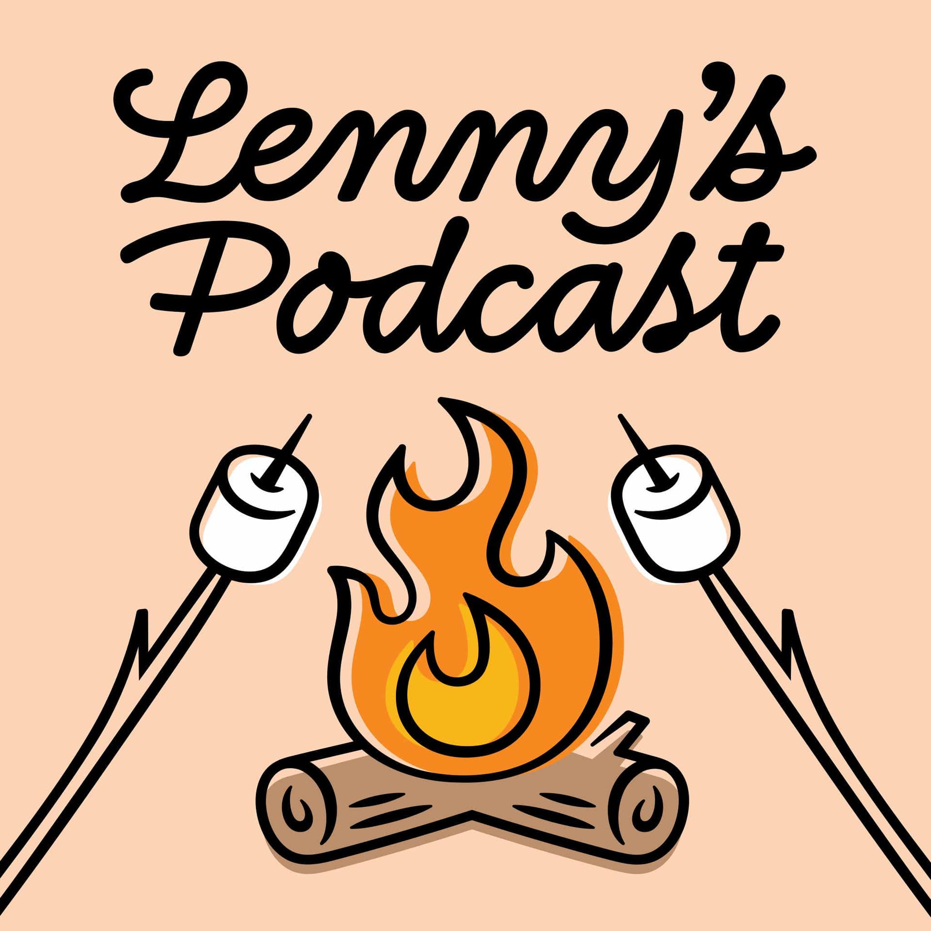
20:23So that was one of the things that we approach because I felt like it could kind of capture the look of the original cut paper -esque type but yeah it was really fun to try a lot of different things and work within the iconography that you had used on a few stuff with the microphones and also marshmallows and campfires and all kinds of things and just trying to make like a more unified system. Other things that didn't work as you tried to explore this process that you recall that might be worth sharing of just like oh that was a cool concept but didn't quite work the way you thought. With working on this refresh like so much of it was thinking about what are the immediate uses of the logo and so like your logo you have these very specific uses that you need it for like the avatar for the podcast being like a top one.
21:14You know like some people they'll design a logo and then have these sort of like illustrative versions of the logo that get rolled out for other things but I feel like those layouts were actually kind of more important than even just having like a basic letterhead -esque logo and that's an interesting way to approach it because usually it's like let's start simple and expand and make it crazier and I felt like we had to always keep those things in play. You know so it was like designing brand assets while also designing the logo and I feel like it's usually like sometimes you'll see examples of that in early explorations just because like it makes it feel real to the client that's why it like there's always like the tote bag like you got to put the logo on the tote bag and then it feels real or whatever.
21:58But in our case we had really specific uses that needed to get explored very early on and that made it you know a slightly different process for me. In terms of things that didn't work though I think you know just trying to work on the level of detail within the illustration and type so that it could shrink down because we knew like one of the primo examples of the logo being used was on that podcast avatar and some of the versions felt like a little bit too detailed to shrink down that much. And trying to kind of get the balance of that having the illustrations feel illustrative and whole but not when they scaled up to feel like too simple like a you know like we just pulled it from a icon library like I think that was like an interesting challenge.
22:45Yeah one of the impetus is for changing my logo for motivating me is my wife's a designer as you know and she's got strong opinions about my logo and she always was making fun of my logo saying it was a look like a clip art fireplace that anyone just could just plug and play. And she was like I was so bad you got to change it so that was one of the motivators I think I might share that when we start working together. Yeah and also too I think that really talks to what I was saying earlier about getting making sure that everything feels like it was created together rather than it feeling like these disparate elements because I think you can have an icon or logo that is quite simple as long as the rest of the brand matches that simplicity.
23:26So I think for you like the biggest thing was making the illustration and the typography just feel like it came from the same universe instead of feeling like these separate elements when I first moved to San Francisco I moved to San Francisco from New York and as a New Yorker I had an apartment with a full kitchen that never got used I just like eight restaurants and did take out like for the seven years or whatever that I lived in New York and learning the cook at first when you learn how to cook. It's like you're making a pot full of ingredients and none of the ingredients are actually working together but then the more you do it and the more you understand how these things are meant to blend and cook at different temperatures at different times you start having this cohesive dish rather than like hot ham water you know what I mean.
24:14And so I feel like a lot of clients come to me and they have hot ham water when it comes to their brand and it's just about turning that into a soup like that something that feels real. I want to take a quick tangent. So most people listening to this podcast are not designers their product managers founders engineers and folks building product and I think there's always this like I've always wanted to see the world through the eyes of a designer because there's so much I don't see and there's so much that affects. How I think about something that I don't understand when I look at a logo and so I thought it might be helpful just to spend a little time helping people see like a designer a little bit so let me just ask you this question when people look at a logo or brand what are what are just elements that make it what it is that make you feel the thing you want to feel that we may not recognize.
25:06I think most people are better at understanding the feelings and sensations that typography and logos give us then they give themselves credit for right because what we are as people are endless absorbers of patterns and information and all this kind of stuff as we move throughout the world. We don't take time to sit and digest it but it's still coming in and getting logged right that's why like if you see something funky in the world you know like that's weird I don't like that I don't know why I don't like it but I know I don't like it you know and I think like even as a non designer you can see that in typography you know because we like the whole being able to recognize patterns thing I talked about this a bit at config it's like it's a safety thing you know like I'm not going to say that.
25:58But looking into the world your eyes can spot that thing that's a little bit off and that thing that's off feels not safe to you because and that it's like thinking about when we look at a meal and the there's a thing on the plate that looks like it's moldy or something like that you you understand like that doesn't look right to me this doesn't smell right to me and your body knows it before your brain knows it. And so even as like a non designer I think you can look at examples of logos where something's not quite right and be like something's not right here I just don't know how to name it.
26:32But I think a good exercise is just sort of like looking at fonts that are available in the world and asking yourself what feeling does this give me you know and just write them down you know you just don't and it doesn't matter just give yourself permission to say whatever is happening in your mind like the first thing it doesn't like don't overanalyze it just look at it. And be like that feels calm to me that feels exciting to me that feels whatever to me and then the more you do that you the more you can start seeing similarities in the ones that feel exciting in the ones that feel calm in the ones that feel whatever and then get into analyze mode of like oh these 10 things that I said feel calm are a lighter weight have more generous spacing have rounded edges have you know like have rounder bowls to the letter forms you know you just start seeing commonalities between the things.
Read the full transcript
27:29And it's just about sort of like seeing them all together to understand like why what those similarities are so I think anybody can do that I mean you're not going to have the language of like the leg of the are and the title of the I like it would have don't worry about that like you know like typography language to like think about it. But if anybody's capable of doing that and it can be really fun to sort of just like stop and ask yourself and notice you know. This is great I want to go actually a little deeper so so what I'm hearing is look at something tap into the feeling you feel when you look at it like actually pay attention to it because there's there's wisdom in that.
28:09And then the specific things that you pointed out that impact that feeling are you mentioned spacing between the letters the edges I imagine there's just a color of it what are there a kind of specific elements impact the way someone feels when they look at a logo. There's the width of the letter so if it's like really narrow versus really wide you know so I always think about the width the weight so spacing sort of detailed treatment of things whether things are very like hard and jagged or soft. And how soft it is like sometimes we just add a tiny bit of softness so that it just feels like printed so you can take like a typeface like Helvetica right like just the one everybody knows right.
28:55But if you take Helvetica and just ever so slightly round the edges just a little bit all of a sudden you have this typeface that feels more vintage or softer or whatever because we're perceiving it like we would perceive it if it were printed on paper verse perceiving it as this like hard geometric piece of technology that we're viewing you know what I mean. And I know that it's because when you look at stuff printed on a page it bleeds into the paper a little bit which means that that softness reminds us in our bodies of a thing that we've seen that was printed you know and so it's cool to sort of walk back your feelings also so you'll look at something and go that feels like this and then ask yourself why does it feel like that and it might be because you saw it on like a flyer for a band when you were 22 and it brought out that feeling in you of what it's like.
29:50It felt like to be 22 at that thing and that's a very specific feeling to you but it can inform your decisions about design because you can be like oh I'm not that much of a special snowflake other people might have that same reaction but have different experiences that are adjacent to that reaction you know it's so it's it's cool because you are sort of reverse justifying decisions and I think that's like a really fun exercise to do is like to sort of song explode or your intuition. You know so you make a decision intuitively or or look at something and like into it what you feel from it and then really try to dive in why do I feel that way what could this have reminded me of that made me feel that way and you have to be just so forgiving and loose with yourself as you do it because then you'll get into like some really weird stuff and it's real and that's like really great inspiration juice for like picking other things you know.
30:50I love the exercise that you gave so so the one you gave earlier is look at a bunch of fonts like look at your font folders that like a place to go just like open up your phone folder or go to my fonts or like a place where there's like a ton of fonts and like just search for something like search for San Serif or whatever like search for a really basic category of fonts. Serif, San Serif script like whatever like the top level edge of stuff and then just page through page through page through screenshot stuff that you like and make a folder full of screenshots and then you can kind of take those screenshots and start categorizing them.
31:28This one feels feminine this one feels masculine this one feels aggressive this one feels whatever and just kind of take some notes on it and then then you ask yourself like well why did I feel that way and you're like oh well this feels feminine because it reminds me of wedding invitations and wedding invitations feel inherently bridey versus groomie you know like and then all of a sudden you're like okay well now I know that if I'm going to do use a script for something this zone of script feels very wedding so maybe I avoid that for this brand that's actually like a cutting edge food packaging company or whatever you know because it feels to aligned with that industry.
32:08And those things happen like stereotypes are real and trends are real and what can sometimes happen is like some industry kind of usurps an entire style for a period of time. So then if you use anything within that style it's like you're aligning yourself to that industry and so that's why it's sort of important to sort I mean everybody that does branding one of the things that they do is they analyze the competitors of the company right and so you just like look at a landscape of like what are all the competitors doing. What is their visual vibe and do I lean into that or do I avoid that like if I lean into it then I'm immediately getting this like everyone that looks at it understands I'm a fintech company because I look like a fintech company if my whole thing is I'm trying to be divergent from that I'm trying to show how different I am from the status quo then you use it as like a reactionary thing of I want to do nothing like that and do something really different so people understand that I'm trying to do something different.
33:06This isn't just another fintech company. Yeah, I'm thinking green the color green has to be a part of the logo if you want to be a fintech company. Yeah, exactly and if you're trying to be weird then you're like teal you know. On this topic of seeing like a designer is there any is there any other tip just before we move on to a different topic of just like how someone could learn to see like a designer a little bit more. Yeah, another thing to notice because I'm assuming you're like a product people I feel like a lot of product people end up having some engineering background whether or not they're engineers themselves right they have to interface with the engineers and they build stuff and so they come at it from like a data standpoint.
33:47And so I can always tell when there's an engineer that has suddenly got taken an interest in type design and it's now a type designer because everything is very very regular right so every like you can draw a grid on top of everything and the lines all line up perfectly you can and you see lots of reverse justification of that like when people are making logos and they have like sort of a more engineering background. The thing to notice that is interesting within type is that yes you're absolutely following rules but you're breaking those rules quite often to correct for optical tricks and so if you look at a geometric sand serif for instance that's like a category of sand serifs and they're meant to have a lot of really strong geometry be very regular you know like most of the sand serifs that you think of that you're like I'm in love with this of the last 10 years like geometric sands is.
34:39But when you really start to examine them you notice that there's all these little things that people are doing to make them look perfectly geometric even though they are not mathematically perfectly geometric so that's another thing that you can do whether you're doing in Figma or doing it somewhere else is just like type out a couple of lowercase letters lowercase specifically are really good for analyzing this because there's more because they're smaller than the uppercase letters you usually have to accommodate.
35:17So I'm going to get a little thinner as I come into that or if I have say I have a two story a so two story is like the one that's like this and then a bowl right you might notice that the this vertical of the A there the bowl actually eats into that stroke a little bit to a rate of the A base a little bit of that added weight that would have been perceived optically you know had you like had you kept everything perfectly regular and so it's weird because you end up like creating something that's perfect and then have to make it not perfect in order to make it be perceived as perfect. So that's like another just like fun thing to start noticing and you notice it a lot more on typefaces and typography that is heavier in weight because when things are heavier weight you're constantly managing these like really in key moments where things join together and you have to subtract a bunch of weight from that so that it doesn't get perceived as this dark mark where the letter is happening.
36:21So I think about like lowercase ours and lowercase ends so the where the shoulder of the N or the R comes out sometimes like the top of the R is actually narrower at the top than it is on the bottom and that's to try to subtract some of that weight in there where that join happens. So anyway that's just like a fun thing to notice that you have to do that and then once you start seeing it you start seeing where it happens more often and and the answer of like why it happens is because you're like correcting for this optical weight issue and then you're like oh man now I have X revision I can see all these weird things I've never seen before it's very fun but anyway a lot of people when they first start out doing typography whether you're an engineer or whether you're a designer they don't account for it.
37:10So I can always just look at something and see whether someone is truly an expert at typography or whether this is like a fun hobby for them and they're pretty fresh at it. And so the exercise here is like open up a figma start typing and make it really big so you can basically see the font really like a single letter like make a single letter like the whole page and then just draw some vertical lines or do the thing where you draw like a little circle or whatever and see if that circle is the same size at the point where two strokes joined together or the point where this stroke is just vertical and on its own and you'll notice that there's differences even in typography that's meant to look extremely rigid and geometric.
37:53I want to come back to my logo and just a closed loop there talk about just like the final result that we landed on and why you think that was the final answer and kind of the way people what you think people might get from it whatever comes to mind. Yeah totally I think like the final answer or the final logo we took it down a lot of different paths trying to see where it was going to land but ultimately ended up keeping it like pretty close to home and really focusing on that asset of the fire you know like we tried so many different versions of like it's microphones with the fire and it's it's you know marshmallows with the fire etc and it was just about like you know sometimes the simplest solution is the correct solution and I don't know I just feel like in terms of what we were doing for blowing it out and making it really cohesive.
38:43We went a lot of directions where there might have been like multiple versions of the logo depending on the scale and ultimately ended up in a place where it's like much more you know in line and consistent across the bar. Yeah maybe what I'll do is we'll share I don't know if you're comfortable with that we could just share all the iterations somewhere that we do. Oh yeah I love sharing iterations. Okay cool. Yeah sweet like the biggest issue we had with the podcast logo specifically is originally I was thinking the mic made sense to differentiate it from the newsletter and then at the end of it is just like what's why do I have this friggin mic in there and just feels strange so that's where we kind of revisited the whole idea and kill the mic and went back to a different version of the of the fireplace with marshmallows.
39:24Yeah I love the marshmallows so awesome I love it that was my wife's my wife loves the marshmallows also and it's a versatile we can use it in so many different ways. And then I guess maybe one last thread there is we explored handwritten kind of typography that you created yours from scratch and then there's like the block letters maybe just thoughts on those two options and benefits and why go one direction versus another. The handwritten one I really liked because I felt like we could bring the line quality of the illustration into the handwriting but then the only problem with the handwriting is that if you want to blow that out if you want to include other handwriting throughout the rest of the brand.
40:04Finding something that matches that perfectly without creating a custom typeface is a whole thing and so I really like being able to kind of combine the two where we have this like broader visual vocabulary that we can pull from because you're going to have headlines you're going to have sub heads. You're going to have all these other uses for typography moving forward and if you just have one thing to pull from. It's a lot harder to work with you know it's just nicer when you have like a few elements to play with it's like having a wardrobe right like if you have only one pair one shirt and one pair of pants like there's only so many things that you can do but if you have all these things that kind of work together and can recombine then you can blow out a brand system like much more easily.
40:44Yeah that's one of my favorite things about working with you is you create all these different variations of ways to use it and doesn't always have to be the hand written one it could be the block you outlay anyone and it's it's not like this is it don't change anything about this is the only way to use it. Well part of that is because like some some brands like if you have a massive company like you know hundreds of employees generating hundreds of things sometimes having too many assets can be can over complicate stuff because unless you have a really really well written brand book outlining how to do everything that people are adhering to very closely you can get like the assets kind of running rampant throughout all of the stuff and being used incorrectly but because.
41:26You're not a massive company and you have creative control over the things that are happening and can help direct that we can be much more playful with the assets and give you the ability to sort of use things in different ways so it kind of depends on how much you trust all the people that are handling your assets if you need like I am of the mind that you shouldn't need like a 500 page brand book in order to direct the the how the brand is used moving forward and that if you do the brand move forward and that if you do the brand move forward and that you can do that. So you might be quite complicated you know or there might be even just parts of the logo that make it difficult to work with like my goal always when designing a logo is to design a logo that's so easy to use that you don't have to be an extremely skilled designer to design well with it like that's my number one goal because I know not everybody is going to be at a stage where they have like a brand an internal brand team or like a designer that's like a rock star designer that can work with really complicated.
42:26Assets and make them look good so I just want the assets to sort of teach you themselves by just how they exist how to use it you know like you as a person that has any taste whatsoever and hopefully people that you're hiring. For any job at your company have some degree of taste you know if you hire an engineer they have to have taste about how that happens if you hire a marketing person they have to have taste about how that happens. They should be able to look at that and into it most of the way that you should be able to use it without being explicitly told do not do this. This episode is brought to you by Merge product leaders yes like you cringe when they hear the word integration they're not fun for you to scope build launch or maintain an integrations probably aren't what led you to product work in the first place.
43:16Lucky for you the folks at Merge are obsessed with integrations their single API help SaaS companies launch over 200 product integrations in weeks not quarters think of Merge like plaid but for everything B2B SaaS organizations like ramp, draughta and electric use Merge to access their customers accounting data to reconcile bill payments file storage data to create searchable databases and their product or HRIS data to auto provision and deeper vision access for the customers employees. And yes if you need a I ready data for your SaaS product then Merge is the fastest way to get it so want to solve your organization's integration dilemma once and for all book and attend a meeting at merge .dev slash Lenny and receive a $50 Amazon gift card that's merge dot dv slash Lenny.
44:07This a good circle back to something you touched on earlier that I wanted to come back to which is a lot of companies in your opinion put too much weight on the power of brand and rebranding and how much a brand can fix their problems can just again share your perspective on just how this might be an issue for people where they almost over emphasize the power of brand. Yeah I think well there's different companies right there's companies where brand is literally everything where they're doing something that's not crazy innovative in the first place and the brand is the thing that is the whole company and that's fine that's a completely valid way to do stuff it's sort of like people that can take in information and re communicate it in a way to another audience or whatever that they hit that audience in a way that the.
45:00The original information couldn't do think about all of the people who write books on psychology and medicine and all kinds of stuff that write it for a broader popular audience they're the ones reading the medical papers they're the ones digesting all of this like really huge complicated data and turning it into something that normal people can read right and I think that there are companies that are doing that they're taking a thing that is not innovative or isn't like they're not the only ones doing it but they're repackaging it in a way that's not going to be a big deal. So that's a way that takes that and makes it so accessible to so many people in that case brand can matter immensely right where the brand really is the thing that shows people that the thing that you're doing has value but for a lot of people the brand should be somewhat invisible so that the thing itself becomes the star you know like if we think about the experiences that we have using products right sometimes there's products where there's a time.
46:00So it's kind of like fun and delight built into how you use it and that can happen through brand through like you know design choices and things like that and sometimes the delight is the fact that nothing is getting in your way as you're using that product and so you just kind of figure out what is your like what's your ethos of your company is your is the whole thing about like doing a thing well doing it simply and making sure that everything gets out of the way of that experience or is it like we're trying to generate this delightful thing or we're trying to open it up to a new audience or whatever and depending on whatever that goal is brand can have a different place in that in that equation.
46:42I think some of this unique perspective on the power of brand and the need for it in tech companies comes from you're not like a tech person and you work with tech people you work with tech companies. Do you feel like that has an impact on the way you think in the value that you bring to companies to give them this kind of very outside perspective. I mean most of the folks that I know that work in brand or you know kind of traditional graphic design print design they don't necessarily have a lot of insight into how building companies works. You know like they're not friends with a ton of startup founders and things like that and I've just had been in this like very fun position being like everyone's token creative person in the bay for a while and this has been for a long time right so I I remember speaking at like a Silicon Valley event that was like women in Silicon Valley in like 2009 or 2010 something like that and it's interesting to be a person that has never actually themselves worked at a tech company but felt so involved and understanding about how all of that works.
47:51You know my partner the reason why we're in the Bay is because he got hired by Facebook back in 2011 and we were kind of like old at the time and take that with a grain of salt don't judge me because we were like 28 29 like coming over to work at Facebook and everybody there was like 23 24 and so all the people that we ended up meeting in the Bay were more people are age that were like moving on to start companies and things like that and so we got just got to see that perspective so clearly of like what it is to branch out on your own to fundraise to do all this stuff to pivot to do little experimental apps and see where that goes to get acquired as a team versus getting acquired as a you know technology or whatever and I've been able to see that in a way that I feel like a lot of people that do my job don't get to see and that makes me very sympathetic and towards what it is to want to build a brand as a founder you know like I understand that you have limited resources and those resources aren't necessarily going to get devoted to doing a 200 thousand dollar brand exploration because when you have you know 500 thousand dollars like of money at all to like for a year to like try to get things going you certainly should not spend half of that money on branding and that's and that's not going to be a lot of money.
49:12I think that's my opinion but that's not to say that brand can't be important and can't come in at some level or can't be thought of as a partnership between you and someone else where you know there's this whole idea of like fractional leadership now which I feel like hasn't really infiltrated my world as much but I don't know why it hasn't because most people don't have internal comps teams internal brand teams until the company is very mature and the idea that I think that I think that's going to be a lot of money. So I think that you could bring someone in who is a real expert in whatever it is they do just as you need them you know and they just get kind of like consultant equity kind of thing like that that should be more present because people don't necessarily need to have internal brand teams for like the first six months to a year of when they're doing stuff unless they grow really significantly.
50:05So along these lines you have a pretty unique way of pricing your work so for people that may want to explore this with you share whatever you can about just how you think about pricing and ideally even like an order of magnitude of pricing so they're like oh okay we should actually do this. So again like and to go back to the process how it's always about like figuring out what people are trying to accomplish so a lot of my process scales depending on how broad of an exploration that we're doing so the way that I treat it as I treat my branding work not just similarly to how I'm doing it. So I treat commercial lettering which is a typical you know like brand people what they typically do is because the client has to own the assets outright at the end no matter what what they tend to do is bill everything that the client owns everything as you are moving along so it's all sort of like work for higher but the idea being that it's a buy out of everything that is being made.
50:58And so what that means is that when a branding agency is pricing stuff for you they're taking the buy out rights and baking it into every round of work so that every round gets more expensive because you are owning all of the work right. And so what I do is I treat it much more like a commercial lettering project where I say you have to own the rights to this eventually but hey let's break that out and let's keep the creative process lighter and less expensive so then we have more room to explore. So then if some stakeholder comes in last minute is like blows everything else up and we need to start over you haven't already paid to own everything that we've created you just pay to own the thing that we create in the end that gets chosen.
51:42And so I really like the idea of keeping the creation process more flexible and to try to scale to what people need versus having a really rigid way of approaching everything. And so sometimes people will bring me on really early in the process where if they have an internal team or if they're working with an external agency or something they want me there from the get out. And then some people are like we have no money and we are going to try to do this as much as we can inside of our business but then can we hire you at the end to like make it look good. You know if we can get everybody bought in and get it like 80 % of the way there.
52:16So depending on what people's budgets are I kind of have different ways of working or just depending what their needs are because my whole thing too is I don't want to step on anybody's toes because sometimes companies have these really amazing designers that are working in house. And it sucks as a designer who started a company and thinks that you might be able to get a chance to like work on what is considered the most important asset in terms of the brand. And they just form it out to someone else instead of letting you touch it. So to me like that's a recipe for anything that I create to be immediately killed because someone inside is going to be like it's time to shine and then they're just going to kill all my work.
52:56So I'm always like how do we collaborate? How do I make it so that I'm an asset to you not that I'm trying to step on your toes not that I'm trying to like take over what's the cool juicy work from the people who inside that are really excited to do it. So I just want them to feel as bought in as I can be. But yeah, it becomes interesting. So it means that like sometimes and I feel like I get told by branding people that I'm like too inexpensive because they're like, oh for what you do it should be like 60 or $70 ,000 at a minimum to do all this kind of stuff. And I'm like, I feel like the majority of the projects that I do end up being between like 25 and 35.
53:31But you know, depending on how you bring me in it can be less if it's just kind of like as a consultant. And so it's not like out of the realm of possibilities to hire like a proper crazy expert at stuff. You know, it's not like you're thinking about sinking half a million dollars into the brand, you know, that's a very different experience. Awesome. Thank you for sharing that. Before we get into other stuff that you do because like you said at the top, there are many other things you do outside of this specific time to work. Is there anything else you think might be helpful or important for people to know about working with you on a logo refresh or just thinking about logos and this whole space we talked about.
54:11The best thing is just sort of like seeing what's there and really being able to like understand what's not working about it and what your goals are. And so like I said with that sort of like reverse justification of, you know, intuition, I think if you know that the logo is not quite where you want it to be, just spend a couple days like asking yourself why. Like what is the thing about this that bothers me and don't don't get specific. Don't be like the way the R is or whatever. Like maybe that's the thing that we talk about down the line. But always think big picture before you think minutia because sometimes people think that like they'll throw a bunch of minutia stuff at me.
54:52But it's because they haven't really stopped to think about what is the overall thing that's bothering them. And you just never get there if you're always trying to address detail before you address the big picture stuff. So you have to just like always start super top level and really ask yourself like very broad questions about why you think it's not working. And then kind of go tighter and tighter and tighter and be like it really could be like this C has always bothered me. You know, like and then you're then you go that we can get real specific about that when I'm doing the refresh. But I think I also need to understand like sort of the overall reason why we're doing this.
55:29Not just the like little bug a boo that bothers you specifically but might not bother anybody else. Yeah, when I was thinking about this, I was like it feels like my whole feeling was this could be better. That's kind of all it was for me initially is just like I feel like it could be a lot better. I imagine that's enough for some people just like I think this could be better. And then like that's definitely enough for some people because I think like sometimes like I think you specifically had a very clear vibe going on with all of your brand stuff. You know, like some people it's totally like a mishmash grab bag of random trends and there's no real voice that's coming through.
56:09But I feel like you've been doing this for a while and like when you see everything together, there's definitely like a very clear sort of vision and vibe that you get from everything. Like I always tell people that like having terrible vision can be like your best asset when it comes to like logo and brand because it allows you just like take your glasses off if you have terrible vision and look at it and get the feeling when you can't see the detail. You have to be looking at it with blurred eyes like what is the what is the overall look of this thing and just trying to get as broad and nudily as you can with it instead of it being about those really specific one by one stuff.
56:53You know, and I think like when you blur your eyes on your brand, there was a really clear cohesiveness to it already and it was just about massaging it into a more consistent professional looking place. Well, I can't look at the old logo anymore now that I've gotten this thing coming together. So I'm really excited for this to come out. Just a couple of closing questions. One is you have a lot of other stuff going on that is not just typography and logo refreshes. You have children's books, you do lettering for classics, you have a store in Oakland, talk about all these other things you got going on in case might interest people.
57:32Sure, yeah, of course. So I'm based here in the bay as we've talked about and I have a studio in downtown Oakland and my studio is kind of like Barbie's creative dream house where the top floor is my office. That's where I am right now. And then the bottom floor on one side is a workshop. So I do a lot of printmaking. I've just always what I went to college at a school that was very focused on like interdisciplinary work. And I feel like I bring a lot of like manual and a lot of processes into my work a lot. And I find it really important to like make physical things as a part of my creative process.
58:04So I do a lot of printmaking. And then on the other side downstairs is a brick and mortar store. And so I've always wanted to have a brick and mortar store because as an artist, I think having people have a physical connection to your work can be really important. I think one of the reasons why a lot like people hire me to do things for them is because one of the gifts of working with someone that is like a real nerd professional about whatever it is that they do is that they bring you along the journey and give you the language to talk about the thing through their eyes and through their experience.
58:41And so like to me like my the funnest thing for me is actually telling clients and teaching them about all the things that we are doing along the way so then they go out into the world as like a newly minted type nerd and can communicate all of these things to other people. And that connection is just really important. The connection to the work, the story behind it, I feel like that's what that's one of the ways that we create lasting work is understanding that the work exists because there's a story behind it. And things if they're just created because of like the aesthetics or they're just created, you know, quickly or whatever, it's really easy to discard them because there's not a story behind it.
59:22But if you think about all the objects in your life that have followed you throughout your life, right, like what's the thing that you've had since you were in fifth grade or whatever that is still magically in your possession in your house. You have that because the story of that thing is so important to you. And I think that the work that we create the design that we create can have that it can be like imbued with so much story and meaning that when we think about moving on from it, we're like, oh, but this. And I think that's one of the ways to build a lasting brand is to just make sure that the story of creating it feels so real and visceral and important.
1:00:00And so the store is like a way for people to have a physical connection to other work that I create, like the prints and things like that. And then with the kids, the kids book stuff that's also sort of about creating like lasting stuff like I like creating physical things in the world. I like repackaging like things that I've learned in therapy in a way that kids will appreciate and enjoy, you know, like I'm just always thinking about like what's the way that I can say a thing that has been said before but hasn't been said in this way. And if I can turn that into a physical object that people can have and appreciate like all the better, but yeah, I don't know.
1:00:35I just feel like I can't. While professionally what I do is considered very niche, I feel like all the things that I do are quite diverse. Because they tickle different parts of my brain, you know, and I have to use my hands in different ways and my mind in different ways. And it's how I've been able to not to generally avoid feeling burnt out as a creative is just being able to move on between different kinds of work and just feel excited about different things at different times. For folks that want to maybe check out the store, how do they find it? It's called Jessica and friends. Yes, it's called Jessica Hishin friends.
1:01:12You can just Google J H and F. Yeah. So I put J H and F on as a part of the Google Maps name so I don't just spell my name to strangers because I have like a weird German spelling last name. And I also have a second store called Drawling, which is like drawing with an L throne in there. And that one is like an all ages arts apply store. That's sort of a kids arts apply store. So that one is kind of grew out of J H and F as well. So those two stores exist. And then with my books, if you just look up my last name on any of your favorite booksellers, you'll find me. Last question. I'm just going to throw this out there in case something interesting comes up with a segment on this podcast called AI corner where I like to see how people have found ways to use AI in their work and their life to be more productive, do cool things.
1:02:02Is there some way that you've found a way to use AI in the work that you do that makes you do more interesting stuff? A little bit. I am sort of in this really interesting position in terms of AI where my partner works at meta on Gen AI stuff. So he's like a director on the Gen AI team at meta and is very bought into AI as a whole thing. And I am a little like about its impact on a lot of the things that we do. I think overall it will become a tool and be very useful, especially in a lot of different fields. But I think this sort of timeframe in which it's more novelty is going to have kind of a not the best impact on things like illustration.
1:02:45But eventually we'll all come out of it and it will be fine in terms of how I've been able to integrate it into my process. I did some work for Salesforce last year where the theme for Dreamforce was going to be very AI driven. And I felt like I needed to explore AI as a part of the generative process for creating that art. So I did have fun creating custom lettering and then trying to run it through stable diffusion to get stable diffusion to generate instances of my lettering in different styles. We were making these like clouds. We ultimately didn't end up using it. But it was still really neat to see and I could see the validity of that in the creative iterative process.
1:03:29I think the biggest thing for me is that I find that the sort of sloggy slow drags of work is very fulfilling to me that like a lot of the evangelists of AI are like, oh, imagine if you could spend all of your time high level thinking and coming up with the concepts and guiding the vision and whatever. And then just get AI to do everything else that you don't care about. And for me, that just sounds like not the most holistic approach to how I work. Like because I can't the reason why I do all the things that I do and why my process is the way that it is is because while I love thinking and I love coming up with conceptual stuff, I find it to be very like cerebraly taxing.
1:04:17And then I need to break from that by doing the more like low key production end of stuff. And that's kind of my favorite part of the process is like we know what we're doing. And now it's just about like going in and like you know when it comes to judging logos, for instance, like the days that I spend knowing exactly what I'm going to do. And all it is is me just moving little busy a hand around and getting it feeling right and whatever. Those are like pure therapeutic zen for me. And so I think like I will always have that as a part of my work. And it will probably not have AI be outputting that part.
1:04:59But I have been able to have it be helpful in the iterative process a little bit, both through generating sketches with that project. And then also through like a lot of stuff with you know, writing with my kids books and things like that is like coming up with lists of words and concepts that are adjacent to each other or whatever. And I have found that sort of like Claude and and chat Gbt are very good for things like that. Like I'm working on another kids book now. And I'm trying to think of the directions that it can take. And one of them is sort of like illustrating different feelings and things like that.
1:05:31And like I could sit there and like brainstorm what are the different emotions or whatever or I can just ask Claude like list 50 emotions. And then I can cherry pick the ones that come up that feel right. You know, so I do find it's really good for that early brainstorming stuff. And that's been that's been really nice. Is there anything else that you want to share or leave listeners with before we get to our very exciting lightning round? Yes, well, I do have a new kids book coming out in October. And so aside from all the logo stuff like please do check out my kids books. It's called my first book of fancy letters.
1:06:09And it is like a new spin on an alphabet book. But instead of it being like an alphabet book for brand new babies, which you could totally buy it for brand new babies because it is very simple and fun. And they'll like the bright pictures. It's kind of for the age where kids can recognize letters but can't necessarily read and write yet because they get so into seeing letters drawn in these different styles and like imagining what other letters could be drawn in. So each of the letters is is drawn to represent the word that it sounds like so letters can be athletic bubbly or creepy. And then it's like well, what does a creepy see look like.
1:06:48And then when kids are starting to understand letter sounds and recognizing letters, they can start thinking about like what other words start with that letter sound. And then they start listing stuff out and become immediate like over the shoulder art directors. And so it's been really fun like showing it to other preschoolers and like TK and kindergarten kids because they're a media like well R should be river. It should be a river. And I'm like, well, how do you draw a river. And then so it becomes this fun imagination exercise to so definitely check that out. It's up for pre order now and comes out October 22nd.
1:07:21That is so delightful. I know you have multiple kids. Do you start to see the idea with one age of kid and then by the time the next kid reaches that age, it's like ready and published. Is that was that worth it? Yeah, the only thing is both of my old well my oldest child is a real super reader. She's always like a head of the game. So the second that she could read, she was like, Oh, picture books are for babies. And so now she's reading like she goes into Pegasus books and it's just like, where are your books for teenagers and they're like, you're not your nine. We're not going to show you that, but here are the middle grade books or whatever.
1:07:55And so there is a little bit of that. There's also I mean, you are a parent, but you are a parent of a very young person. They kids don't want to buy anything you're selling as a parent. So there's a little bit of that where I feel like I get so many wonderful letters from other families about how it's like their favorite book and they read it every night. It's so important. And then my kids are like, yeah, yeah, it's just mom's book, whatever, you know, like so. Yeah, that's bittersweet. Well, with that Jessica, we've reached our very exciting lightning round. Are you ready? I'm ready. Speaking of books, first question, what are two or three books that you've recommended most to other people?
1:08:36Rick Rubin's creativity book is so good. Definitely recommend that. I feel like it was a real. I haven't listened to it on audiobook. I read the physical book, but I also heard the audiobook is very zen. And I feel like it's just a very good palette cleanser in terms of being an artist and creating because it feels both high level, but also very actionable. So I really recommend that in terms of learning about and understanding typography. There's this book called Inside Paragraphs by Cyrus Heismith. It's very small and very digestible. You can like read it in one bathroom visit. You know, and so and it's illustrated really well.
1:09:16It has cool illustrations. So if you want to learn about some basics of type and typography, it's a really great book and incredibly accessible and not like reading, like bring her or something like that. So big ups to that book. And then, oh, what's another book? I don't know. I feel like I'm just going to end up recommending all the books that I'm currently reading. This month, I read both Patty Smith's Just Kids, which I loved also and was also I feel like I'm reading a lot of books about sort of being an artist more so than being a designer. And that book I found really interesting, just sort of like hearing her story of moving to New York and having nothing and just sort of like trying to trying to be an artist and make art and having that be the thing that drove everything that she and Robert Maplethorpe did.
1:10:05And I don't know. I just feel like I'm looking for ways to kind of get out of my very business driven sensibilities around art making and get into a space that's more loose and free and driven by passions and feelings more so than necessarily like career based milestones and things like that. And then this is a wild card one, too. I just finished the Emperor of all maladies and I'm just like a big fan of reading things about you and biology and things like that and found it totally fascinating. So do read that one too. I can't help but ask how do you have time to read, raise children work on so many projects, have a run a store.
1:10:47What is your secret? Well, you get pretty ruthless about your schedule when you're a parent where like when you're at the office like you are just heads in like working. And so I think like just trying to stay as focused as possible in that way I do this thing where I bounce back and forth between projects a lot as I'm losing steam. And so having multiple things to work on actually keeps me motivated to keep working. I think it's kind of an ADHD thing where I will start my day one way and then as soon as I start losing steam I switch to a different thing loose steam switch to a different thing loose steam switch to different thing.
1:11:26So rather than taking like breaks I just take a break by working on something that feels fresh that can be super helpful. Yeah, I mean it's like it's incredible. I also would tell people when I had first started out I had a full time job and then was doing freelance in the evenings and people were like how do you not get burnt out whatever and it's because my day job was so different from my night job that it felt like I was doing two separate eight hour shifts instead of one continual 16 hour shift. And so I think that's something to sort of think about is that there's always going to be things that need to get done as a part of your work or things that you're interested in and passionate about and just having enough diversity and what that means is going to allow you to like maintain enthusiasm for doing all those different things for much longer and actually like the more homogenous your life and career and job is the faster you're going to burn out.
1:12:23So just making sure that you have enough variety and all the things that you do as an awesome tip I'm glad I went there okay back on track to our lightning round is there a recent favorite movie or TV show you really enjoyed. Severance was like my favorite TV show I think I've ever watched. There's a second season's coming out. I know that that's that came to mind because I need a second season was coming out so I'm just like really excited about it. But yeah, I think that's that was probably tops for me. Is there a favorite product you've recently discovered that you really love. Oh yeah, well there's a few thing.
1:12:52Well, there was one that's just like a super random one that was just pure delight. So there's a Japanese brand penco and they make a lot of wonderful stuff I carry a lot of their stuff in my store. And one of the things I bought recently from them is this. Like a pen a pen cup like a pencil cup and it's ceramic, but it looks like a paper bag like kind of a lightly crumpled paper bag and then it just has like printed on it like penco whatever. And I just really like it when objects like when you take an existing object and give it a new form. And I find that to be like very delightful. And so that was I think one of the things that I really love to recently that I bought for the store.
1:13:28Awesome pick two more questions. Do you a favorite life motto that you often think about come back to share with folks by useful and worker in life. You know, it's funny being a lettering artist because I'm not much of a quote scale like all things considered consider it. I should be because I could like make a million dollars by just making live left love pillows or whatever. But I'm not like usually continually collecting quotes, but I was just at a conference up in port like called XOXO and one of the presenters showed a quote on the screen that resonated with me like more than most things that I've seen in recent memory.
1:14:05And I feel like this is my new I it was one of those quotes that like I was like maybe I should get a tattoo of that. You know like when it gets to that level where you're like considering a tattoo you're like, OK, that's official. And it was that it was hope is a discipline. And I just really loved that and it's by Mary on May, Caba or Mary on Caba. The idea that we have to choose to create positivity that it's like a choice and that like in order to dream of these things like you can actually create structure and discipline around it. And that it's not just something that is just inherent and comes like you have to actually have like a practice around being hopeful and positive.
1:14:48Like I just really liked that as a concept because I kind of feel that I feel that way just about like navigating through life that you know everything that we do is a choice and that we can choose to frame things one way or frame things another way. And like understanding that you have power in that. I think is really important. And so I just like really loved that like hope is a discipline. I really love that I love any quote that inspires you to not feel like a victim and gives you agency and reminds you the agency ever. Exactly. And that's I think was the biggest thing for me is just because I feel like I feel very well resourced and being able to deal with hardship because I'm always able to sort of like re contextualize and reframe.
1:15:37And I think part of that is doing so much like intuition justification, which is what we talked about is like sort of walking through things mean like why is this why does that happen. And so when something bad happens, it's like understanding why it happened and then understanding the paths that it can take forward and the different attitudes that you can bring to it that can help you come out of it. It's beautiful. Okay, final question. I know that you recently remodeled your home. It's quite stunning. You share photos of it online. You work with this amazing architect to help make it as amazing as it is as a designer.
1:16:14Here's the question. How do you find the balance between trusting someone that is, you know, their own perspective and design approach versus pushing into a direction you think that it should go. How do you find the balance as a designer? Well, I actually feel like it's quite easy for me to trust people to do their own thing because as long as I go to them as being like I appreciate you and your vision and that's why I'm paying you. Then the last thing that I want to do is micromanage them because the reason why I'm paying them is because I don't have the bandwidth to do that myself because honestly I'm one of those people that if I had nothing going on like if like my job totally blew up or whatever, I would probably be one of those people that just specialized in a different thing like every six months and would be like I'm going to build a house now from the ground up.
1:17:04I'm going to do this from now, whenever and I just feel very capable of doing anything that I want to do because I understand that I can like find the resources for it. So when I hire people to help me do a thing, it's because there is this implicit trust in what they do and that that's why I want to work with them. So with the house, like I definitely had opinions about stuff but in general I'm just like hey this is your thing, you're the expert, like what do you think? Like let me give you the parameters and the things that we have to think about and then because you know more about wood resources and you know more about like the cabinet spacing and like whatever you tell me what you think is going to work best based on all these things that I like laid out for you.
1:17:52So I found it to be quite easy. I only got really like wigged out about very like a couple of different fine tunis. I imagine architects and designers are like oh no it's going to be a designer I'm working with. They're going to have a lot of opinions. I feel like my strength with the work that I do in general is just being incredibly decisive and understanding that there's 10 good answers to every one question. You know like some people are real maximalists about decision making and need to look at like every gray sofa that exists before they can choose the one gray sofa. Whereas I feel like I can look at 10 gray sofas and go it feels like there's two or three categories of sofa here and then within those categories there's a couple of good options.
1:18:37Here's a brand that I recognize is known for being of high quality that one's good enough and I can get to it really quickly and I feel like not everybody can do that. And I think that that permeates through like everything that I do in my life. It definitely is a huge part of the logo work because you really can do anything when it comes to typography. Like it can go in 50 million directions and it's just about having someone tell you like yes we could take this anywhere but these are the valid paths. If we go down this path this is the most intuitive and most correct way to do it. That is closest and most accessible to us and we can noodle on it until kingdom come but do we have to like you know like this is good.
1:19:20So I don't know I feel like it's like understanding I feel like there's some weird knowledge around understanding that nothing is ever 100 % perfect and the most you can expire and like you know get to is like you know what I'm saying. 99 .8 or whatever and that last like 0 .2 % you could spend your whole life trying to do that or you could move on and do other things and understand that it's like nearly perfect. That is really good advice and freeing piece of advice. Jessica it's been an honor to work with you on the slow go I am really excited for people to see it for it to be the new look of everything I'm doing.
1:20:00Two final questions working folks find you online if they want to learn more and potentially work with you and how can listeners be useful to you. Oh yeah of course so you can I have a website that I occasionally update it is Jessica Hish dot is slash awesome. I have a you'll notice I have a bunch of weird you are also my website so so that's a place to find me otherwise I am on Instagram and threads a lot. And so I was formerly a very active Twitter person and now I'm not really there so much and I kind of pop around with the other the Twitter clones but I'm on threads quite a bit. So Instagram and threads are good for social and then email I'm easy hello at Jessica Hish dot com and then what your readers could do for me I think it's you know the the work that I do in terms of the logo refresh stuff.
1:20:49I feel like this audience is just totally my perfect audience for it because you guys are all a bunch of smart awesome founders that want beautiful logos but understand that like sometimes you just got to get that first you know viable option out the door and then once you're ready you come to me and I help you and it's great. I'm actually not having Jessica thank you so much for being here. Happy to be here great convo so good. Bye everyone. Thank you so much for listening if you found this valuable you can subscribe to the show on Apple podcasts Spotify or your favorite podcast app. Also please consider giving us a rating or leaving a review as that really helps other listeners find the podcast.
1:21:36You can find all past episodes or learn more about the show at Lenny's podcast dot com. See you in the next episode. Bye bye.
From the publisher
Jessica Hische is a lettering artist and New York Times bestselling author based in Oakland, California. She specializes in typographical work for logos, film, books, and other commercial applications. Her clients include Wes Anderson, The United States Postal Service, Target, Hallmark, and Penguin Books, and her work has been featured in design and illustration annuals both in the U.S. and internationally. She’s been named a Print Magazine New Visual Artist (20 under 30), one of Forbes 30 under 30 in Art and Design, an ADC Young Gun, a “Person to Watch” by GD USA, and an Adweek “Creative 100.” In our conversation, we discuss:
• My new logo and brand!
• Jessica’s process for refreshing my logo/brand
• Why most startups shouldn’t worry about their logo/brand
• The psychology behind different typography choices
• Balancing creativity with business needs in logo design
• Jessica’s unique approach to pricing logo work
• How AI is (and isn’t) impacting the design world
• Jessica’s other creative pursuits, including children’s books and art supply stores
—
Brought to you by:
• The Enterprise Ready Conference — For B2B leaders building enterprise SaaS
• OneSchema — Import CSV data 10x faster
• Merge — A single API to add hundreds of integrations into your app
—
Find the transcript at: https://www.lennysnewsletter.com/p/seeing-like-a-designer-jessica-hische
—
Where to find Jessica Hische:
• Threads: https://www.threads.net/@jessicahische
• Instagram: https://www.instagram.com/jessicahische
• Website: https://jessicahische.is
—
Where to find Lenny:
• Newsletter: https://www.lennysnewsletter.com
• X: https://twitter.com/lennysan
• LinkedIn: https://www.linkedin.com/in/lennyrachitsky/
—
In this episode, we cover:
(00:00) Jessica’s background
(01:32) The logo refresh process
(09:45) When to refresh your logo
(11:45) High-level overview
(18:04) Approaching Lenny’s brand refresh
(24:25) How to see like a designer
(37:53) Lenny’s new logo: where we landed
(44:07) Brand’s role in company success
(50:04) Jessica’s flexible pricing strategies and collaborative design process
(57:14) Balancing multiple creative projects
(01:01:48) Using AI in creative work
(01:05:50) Upcoming projects and final thoughts
(01:08:24) Lightning round
—
Referenced:
• Jeni’s: https://jenis.com
• James Edmondson on LinkedIn: https://www.linkedin.com/in/jamestedmondson/
• Figma Config: https://config.figma.com/
• Helvetica: https://en.wikipedia.org/wiki/Helvetica
• MyFonts: https://www.myfonts.com/
• Geometric sans serif fonts: https://www.myfonts.com/pages/tags/geometric%20sans%20serif-fonts
• The Rise of Fractional Executives: https://www.reforge.com/blog/leveraging-fractional-executives
• JH&F: https://jessicahische.shop/pages/my-oakland-store
• Drawling: https://drawling.shop/
• Jessica Hische’s books on Amazon: https://www.amazon.com/stores/Jessica-Hische/author/B082XDN54V
• Dreamforce: https://www.salesforce.com/dreamforce
• Bezier handles: https://www.tella.tv/definition/bezier-handles
• My First Book of Fancy Letters: https://www.amazon.com/My-First-Book-Fancy-Letters/dp/0593385012/r
• The Creative Act: A Way of Being: https://www.amazon.com/Creative-Act-Way-Being/dp/0593652886/
• Inside Paragraphs: Typographic Fundamentals: https://www.amazon.com/Inside-Paragraphs-Fundamentals-Cyrus-Highsmith/dp/1616899417
• Just Kids: https://www.amazon.com/Just-Kids-Patti-Smith/dp/0060936223
• Robert Mapplethorpe: https://en.wikipedia.org/wiki/Robert_Mapplethorpe
• The Emperor of All Maladies: A Biography of Cancer: https://www.amazon.com/Emperor-All-Maladies-Biography-Cancer/dp/1439170916/r
• Severance on Prime Video: https://www.amazon.com/Severance-Toby-Stephens/dp/B001ARYGCU
• Penco brown bag stand: https://penco.jp/en/products/db079/
• XOXO: https://xoxofest.com/
• Mariame Kaba quotes: https://www.goodreads.com/author/quotes/8156101.Mariame_Kaba
—
Production and marketing by https://penname.co/. For inquiries about sponsoring the podcast, email podcast@lennyrachitsky.com.
—
Lenny may be an investor in the companies discussed.
Get full access to Lenny's Newsletter at www.lennysnewsletter.com/subscribe