
 Ask ChatGPT


- Podcasts
- Creator Science with Jay Clouse
- #282: David Altizer — How to Make Great Thumbnails (For Non-Designers) [Greatest Hits]
Creator Science with Jay Clouse29 Sep 2026 · 51m · 18 chapters
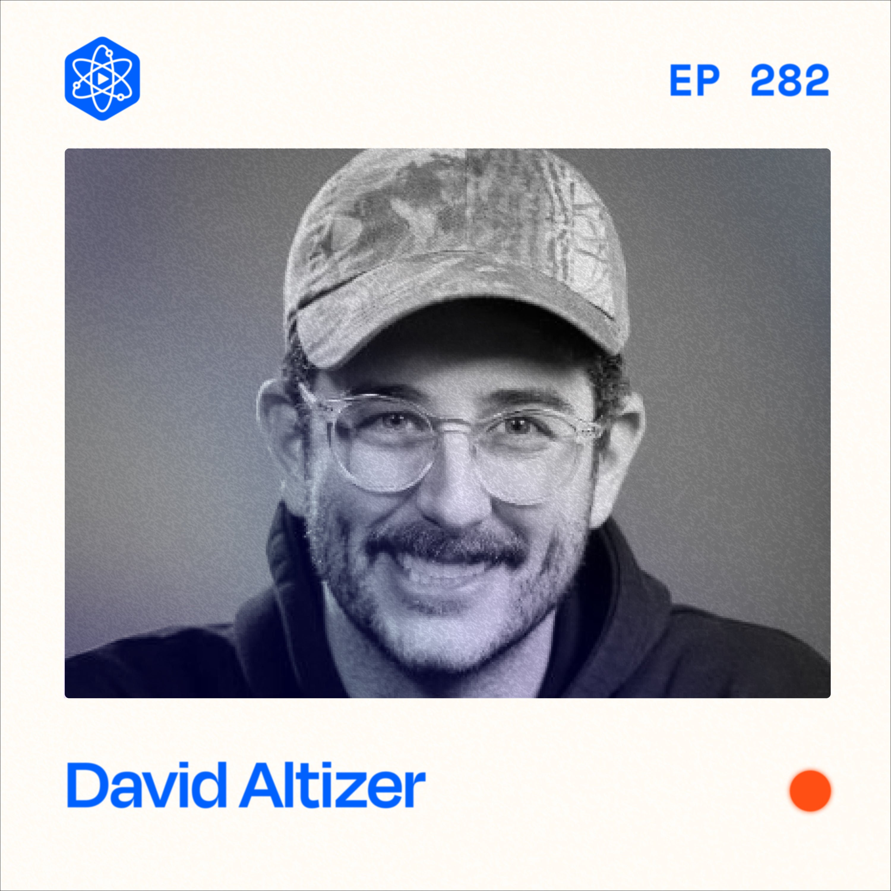
#282: David Altizer — How to Make Great Thumbnails (For Non-Designers) [Greatest Hits]
In short
David Altizer (thumbnail designer) explains how to create high-click YouTube thumbnails without being a designer, focusing on AI-era “AI visibility” and practical design fundamentals: rule of thirds composition, flat/clear lighting, minimal text, low cognitive load, and psychology-driven “contrasting ideas” that create curiosity without misleading.
Guest backgrounds
David Altizer is a professional thumbnail designer who has taken YouTube by storm over ~3 years. His clients include Curtis Conner, Jolly, Max Fosh, Hayden Hillier-Smith, and others; his thumbnails have earned nearly 350 million views. He also references Ryan Trahan as a top example of clean, intentional realism.
Key claims
Check whether you’re “cited” by LLMs using Ahrefs BrandRadar (tracks mentions across ChatGPT, Perplexity, Gemini, Google AI Overviews, Copilot). For thumbnails: use rule-of-thirds balance, flat lighting for easier shadow control, keep text to a third-grade reading level, and reduce elements to lower cognitive load. Clickbait is acceptable if it doesn’t mislead.
Notable examples
Wes Anderson’s centered framing; Ryan Trahan’s rule-of-thirds thumbnails; MrBeast’s “train into a pit” outlier approach; Curtis Conner’s “vintage tech” thumbnail with a “coming up” teaser; “Is it green or yellow?” word/color confusion; Far Side and Mark Rober-style “mid-action” thumbnail moments.
Written by AI. May contain mistakes.
Chapters
0:00
Understanding AI Visibility in Your Niche
Learn how to measure your visibility against competitors using AI tools.
“When somebody asks ChatGPT who are the best creators in your niche, does it say your name or does it mention your competitors instead?”
2:10
Thumbnail Composition Basics
Learn about the rule of thirds and its application in thumbnail design.
“The rule of thirds is one of the most popular ways to judge good composition for filmmaking.”
2:58
Lighting Techniques for Thumbnails
Understand lighting setups and their effects on thumbnail quality.
“This is only going to get better and better as time goes on, but you still need to be able to push and pull those levers to understand what gets the click, the psychology behind these contrasting ideas.”
6:46
Exploring Composition in Thumbnails
Delve into the importance of composition and balance in thumbnails.
“The rule of thirds is one of the most popular ways to judge good composition for filmmaking.”
10:29
The Click-Through Effect of Composition
Discuss how composition influences viewer engagement with thumbnails.
“Or are they ignoring thumbnails because they are not following those rules?”
14:00
Best Practices for Thumbnail Design
Learn effective strategies for creating eye-catching thumbnails that attract views.
“about best practices for easy thumbnail design.”
15:38
The Importance of Thumbnail Composition
Understand how thumbnail composition influences viewer engagement and click-through rates.
“I think my assumption is, and I'm curious if this is just like something you agree with or not, Because YouTube is just getting more competitive all the time.”
21:54
Psychology and Thumbnail Design
Explore the psychological aspects that impact viewer perception and engagement with thumbnails.
“The algorithm does serve them stuff on the homepage.”
28:00
The Power of Simple Thumbnails
Learn how effective thumbnails utilize simplicity and directness.
“Your videos are boring, you know, bad, good, great, awesome.”
29:00
Understanding Thumbnail Psychology
Explore how psychology influences thumbnail design and viewer engagement.
“So I think it's important for you to really understand what makes you click.”
Show all 18 chapters
30:39
Creating Compelling Questions
Discover how asking the right questions enhances thumbnails and viewer curiosity.
“And then the teacher would ask you, what color did you see?”
33:28
Learning from Video Performance
Understand how analyzing video outliers can inspire successful designs.
“And if I were to boil that down, it sounds like you're saying you want the person to feel uncomfortable, not having full information.”
35:44
Starting with the Idea
Learn the importance of developing a strong concept before creating thumbnails.
“And you'll see, again, patterns within that.”
38:00
Gathering Assets for Thumbnails
Find out how to collect the right assets for impactful thumbnail creation.
“What are the first questions you ask them?”
41:19
Lighting and Presentation for Thumbnails
Learn how to use lighting and presentation for effective thumbnail images.
“I couldn't pull from the video because it wasn't sharp enough.”
42:00
Creating Thumbnails: The Process
Learn about the process of creating effective thumbnails for videos.
“It removes that sharpening and the noise reduction that happens on the phones.”
43:56
Lighting Techniques for Thumbnails
Discover how lighting affects the quality and consistency of thumbnails.
“I think that one's got, you know, seven or eight million views.”
46:04
The Evolution of Thumbnail Styles
Explore the changing trends in thumbnail styles and the influence of AI.
“So I think that fad, if you will, is kind of over, but what has happened, what is instead of that plasticky, over softened, over processed earlier, like Matthew Beam and Mr.”
Ask about this episode
Get the gist, explore an idea or ask about something said.
 Claude
On Creator Science with Jay Clouse, what are the key points of this episode?
Searching your listeningTranscript
Automatic transcript. May contain errors.
0:00When somebody asks ChatGPT who are the best creators in your niche, does it say your name or does it mention your competitors instead? Because a response will only share a few names. And with LLMs, if you're not sighted, you might as well be invisible. And that's at the exact moment when someone is deciding who to follow or what to buy. The first step is finding out just how visible or invisible you are to LLMs like ChatGPT. And Ahrefs built a new tool called BrandRadar to show you where you actually stand. It tracks your mentions across ChatGPT, Perplexity, Gemini, Google's AI overviews, and Copilot, and gives you an AI share of voice against your competitors.
0:39That means how often you get named when your topic comes up, and whether you're being mentioned or actually cited as a source. It's built on 481 million real prompts, making it the largest AI visibility database out there. This isn't about gaming AI, it's about finding out whether the work you're already doing, the content, the authority, and the backlinks are translating into AI visibility. Try a free preview of Ahrefs brand Radar at creatorscience.co slash radar. That's creatorscience.co slash radar.
1:26How is this possible? Am I losing my mind? Don't miss the two-episode premiere of Marvel Television's Vision Quest. Nothing bonds a family together quite like Mortal Jeopardy. Now streaming on Disney+. This episode is brought to you by Palmolive. Family time isn't just the big moments. It's weeknight dinners. Sitting around the table, everyone talking all at once. So when the plates are empty and the sink is full, use Palmolive Ultra. Palmolive's most powerful formula removes up to 99.9 % of grease, leaving your dishes sparkling clean. And the new convenient pump makes cleaning even easier, so you can spend less time tackling dishes and more time together.
2:07Shop now at palmolive.com. The rule of thirds is one of the most popular ways to judge good composition for filmmaking. Once you learn this rule, you'll see it all the time. It's a mystery that nobody knew they needed to know. That's the best formula for a click. What if mini forks were made of salt? It worked because it's asking a question that nobody thought about before. That's David Altizer, a thumbnail designer who over the last three years has taken YouTube by storm. David's clients include Curtis Conner, Jolly, Max Fosh, Hayden Hillier-Smith, and now me. David's thumbnails have earned nearly 350 million views.
2:47and in this video, he'll show you why creating thumbnails is actually easier than you think. The reality is, I think in the next five years, maybe even less, a lot of this work can be done with AI. This is only going to get better and better as time goes on, but you still need to be able to push and pull those levers to understand what gets the click, the psychology behind these contrasting ideas. Those are the elements that make it human. Thank you to 1of10 for sponsoring this video. One of the most important things with good thumbnail design is understanding the balance of the image and the composition of the image.
3:22Those are great places to start is to like look at some of the most popular and iconic movie posters. I think movie posters would be like an adjacent kind of category to thumbnail art is looking at great movie poster design and study that look at great cinematography and composition within cinematography because for cinema every frame is framed in a widescreen format you know it's either a super wide 2-3-5 kind of anamorphic shot or it is a 16 by 9 and so that's a great place to study because often for photography they're framing for a vertical shot like a portrait shot but as a thumbnail artist all of our thumbnails are obviously 16 by 9 so looking at some of the most iconic you know frames from movies is great i think wes anderson does a really great job of making essentially thumbnail thumbnail frames in his videos or his in the video i say video something so youtuber in his videos in his movies and then understand the lighting if you're the creator yourself uh you've got a great set right there jay i'm looking at it you've got a nice key light you've got a fill light but I can or maybe you don't have a fill, but I do.
4:33Okay, great. But I can see there's a bit of shadow on your left on your left. Because your key light is probably, you know, the majority of the light and then you got a little fill on the other side. Well, for thumbnails, you actually want a pretty flat lighting setup because you can add shadow and post production really, really easily. But it's super hard to kind of fix really harsh shadows or dark areas. Lighting wise, like I see a lot of creators just maybe take a picture on their phone, probably while the video is being uploaded onto YouTube. They just switch over to selfie mode. They take a picture wherever they're seated, which is probably at their desk.
5:12And it's like really dark. And then they just like throw it in there and boost the exposure and call it a day. Or they just pull a screenshot from the video that is, again, just not lit well. You want clarity and simplicity. And so taking intentional thumbnail photos for your video is crucial, in my opinion. And that's one of the first things that I tell the creators I work with who we start working together. I'm like, hey, I noticed there's a lot of shadow. There's a lot of darkness in your face. Let's start boosting your face, kind of have a flat lighting. So essentially the light directly above the camera, maybe two other lights on the sides or sit next to a window.
5:51So you just want to have clarity on the face because obviously humans react to humans and you just want to be able to see everything there. And it's a lot easier to fix, like add shadows than to take it away. Yeah, we opened up a lot of paths there and we'll go down them sort of one at a time. But I want to go back all the way to composition because I think this word and this idea is second nature to you. And now I'm familiar with it, but even this term is probably new to a lot of folks. So talk to me about composition and what that means to you and how somebody who is playing around in Photoshop or Canva, how they should be thinking about composition.
6:33Composition is basically the overall kind of balance of the image. And there's many different types of compositions that are kind of iconic for filmmaking in particular. The rule of thirds is one of the most popular ways to judge good composition for filmmaking. You'll actually, once you learn this rule, you'll see it all the time in films. Basically, it's a tic-tac-toe grid that's applied onto the image. And the points of interest, the most important points of the video or the movie, motion picture, are lined up with where each crossing point happens on the tic-tac-toe grid. You don't want to just put everything in the dead center of the frame, though that can be a style in of itself and requires a different type of composition.
7:24Again, going back to Wes Anderson, he's a famous filmmaker that has a lot of centered framing compositions. And it's because he'll have his subject dead center, but then other elements in the background that balance it out. And that's really the crucial point is when you have something in the center and say somebody's looking off camera, it feels off balance when that person is looking off camera and you've got all this negative space over here. The eyes are going off to the left of the frame. And then on the right-hand side of the frame, there's just all this empty weight. So by simply scooting the person over to that crossing point on that tic-tac-toe grid, essentially putting them off angle, off, you know, kind of off center, it adds this balance to the image that I don't even know, like, the science behind it, but it just feels right.
8:16And that applies, that same rule totally applies to YouTube thumbnails. And you see it all the time. In fact, I'd say Ryan Trahan is like, his compositions are great. He tends to line his thumbnails up pretty much dead on with a rule of thirds rule. You can see that with a lot of the thumbnails that I do as well. In fact, I actually use a rule of thirds tic-tac-toe grid as an overlay when I'm editing my thumbnails. It's that important. and it's because it just feels more balanced when you're looking at a rule of thirds balanced image now the weight of certain objects in the frame need to essentially be balanced just like if you had um have you ever seen like those old-fashioned scales oh yeah you know so so you have a scale my hands are the scale and i've got you know a heavy object on one side well the weight of that object, if I don't have anything on the other side is going to pull down like so.
9:15So I need to balance it out with something else. So I've got my coffee cup here and my remote here, the coffee cup is actually a little bit bigger. But now when I if I'm talking about just composition, now when I have the remote standing upright, the weight of this now sort of balances the weight of the coffee cup. It's about the same size, except it's skinnier. This is a little fatter. So those two objects, if you're watching the video, balance each other out really well. And so the same is true with thumbnails. If you have a face off, off angle, like, again, if you're watching the video, I've just scooted myself to this side.
9:51Although when I'm looking at my my own frame, I've got this plant behind me. That's actually some weight that is making this even look wrong. So I would even go maybe here. Or I see this in like, interview thumbnails all the time you have, Yes. You have just one face. It's off to the side. I mean, we do it in our thumbnail. Sometimes if you have the guest and the interviewer, you have this opposed view that you were describing. Yes. Basically, the balance of it all has a lot to do with like the video just or the thumbnail just feeling right. And you see it with the best YouTubers out there. And it's the same rule that's been around for a very long time in photography and filmmaking.
10:28And it totally applies here with thumbnails. So when somebody is making a thumbnail, and they're not thinking about the rule of thirds, and they put that up, and it's on the YouTube home screen in the recommended areas, are people clicking on thumbnails because people are following rule of thirds composition? Or are they ignoring thumbnails because they are not following those rules? Oh my goodness. That is a fun question because I think there's always outliers within that. There's probably a few thumbnails that you could send to me that are like, well, this doesn't follow the rule of thirds. And that certainly is possible, especially if it's something that is a real viral moment, like an athlete moment or, you know, a news story or something.
11:19but yeah I don't I don't know if people click on the thumbnail because the composition it's hard for somebody who doesn't know these rules uh who doesn't understand graphic design they're not going to be able to point to why something feels right but it's just about the I don't know maybe just the human nature of it is like you know if it looks off it feels a little amateur and it feels um it just feel it doesn't feel intentional it feels very thrown together and will convey maybe a sense of unprofessionalism does it matter like youtube is not a professional place necessarily in fact a lot of the best creators out there are almost intentionally making their stuff look uh handheld and shot on phones and feel more amateur but even within that Again, Ryan Trahan is a great example.
12:13His stuff, I think, is shot on iPhones and it's kind of shot to look very raw, but his thumbnails have like perfect composition. So, you know, and I think Casey Neistat, too, you and I are the same age. So we remember when Casey blew up in 2016, right? Like the thing that I recognized with him was he had this illusion of these vlogs that he was doing every day being thrown together. But you can with the right, you know, with the cinema eye and understanding filmmaking composition, you could see almost every shot was so perfectly balanced compositionally because it was second nature to him. and I've noticed too, like, just because I've been a filmmaker for so long and my brain is just so compositionally wired, when somebody hands me their phone to take a picture, I just can't help it, but I'll just kind of start like looking for that rule of thirds and I just kind of frame the picture like that.
13:10And then you hand it to somebody that just normally just holds the camera and just takes a picture and they're like, wow, why does this look so good? I'm like, composition. If you're like me and thumbnail design and composition is still kind of scary, that's another reason to check out our sponsor, One of Ten. Let me show you why. So when I land on the homepage, the first thing I see is a bunch of outlier video thumbnails. And I can look at these for inspiration and start to understand composition. You can see the rule of thirds in play here and here, the center alignment here and here. You start to get a sense for, okay, why do these thumbnails work?
13:42But you don't even have to do all of that work. One thing I like to do is generate title and thumbnail ideas directly inside of one of 10. Let me show you how. If I go up here to the title generator, I can tell it a little bit about the video I'm making right now. Interviewing a thumbnail designer about best practices for easy thumbnail design. It will automatically give me titles inspired by my channel as well as top outlier channels. And so I like to go to this right-hand column because this usually gets me out of my own head and tells me how I can be thinking bigger. I asked a viral thumbnail designer to fix mine.
14:19How to design thumbnails that get clicks from an expert. He designs viral thumbnails for a living. Here's what he told me. This thumbnail trick 10x'd my views. These are all really good. So let me take one that's less than 50 characters. I like how to design thumbnails that get clicks from an expert. So I'm going to copy this to my clipboard, put it into my planning document, or straight from here, I can go to generate thumbnails. So here you can see four thumbnail concepts and all of these have good composition. You can see this one has me as the host, obviously. This pulled in an image of a past guest, has the podcast microphone in front.
14:58Both of these have the bookcase background from our channel and the color. But what's really cool is you can go into each one of these and edit with AI. I can say, point to the YouTube homepage. Now you have me in front of the YouTube homepage pointing out some of these thumbnail ideas. Every week I spend 10, 15, 20 minutes perusing outliers, trying to get new ideas for titles and thumbnails, and one of 10 makes that very, very easy. One of 10 is offering a special deal to viewers of this channel, 20 % off their pro plans. Just use promo code J20 at checkout. That's promo code J20 at checkout, and the link is in the description.
15:39I think my assumption is, and I'm curious if this is just like something you agree with or not, Because YouTube is just getting more competitive all the time. I feel like the need to understand these things gets more and more important Because you're competing against people who do and so my thought is people who understand composition They are just naturally going to have more attractive clickable thumbnails than you if you don't and so it's it's kind of like Do you want to compete with an arm behind your back or not? Yeah, I think you nailed it, but it's in terms of the why is it like that? I think just we are as humans, we're wired to appreciate art and we understand beauty.
16:21Like it's an inherent thing that we just kind of see and understand as humans. And I think this falls into that category. When composition is good, it conveys intentionality, it conveys, you know, professionalism, and it helps with the art of what you're doing. do thumbnails need to be art and are they art? I don't know. I think it's more of a marketing thing, but it can certainly lean into art for sure. And having good composition is really crucial, I think. So that's a great place to start. And it's an easy thing to look up and to learn about because it's been talked about for hundreds of years in many other categories.
17:01And it continues to be so even with this new generation of thumbnail designers who are essentially kind of the next level of graphic designers in the world. So I've heard you refer to the style of thumbnails you do as realism, or like one of the more frequent styles of thumbnails you as realism. And you've also talked about Curtis Conner's style that you call like a scrapbook style. Yeah. And so I'm curious to hear along those lines, what other buckets of composition styles come to mind for you? You've got the versus, you know, the one side here with another side here. So A versus B, that's a really good format.
17:44I love the center framing format that I've done a couple with frame Voyager. My favorite one is the one with Killian Murphy. That one was a ton of fun to make. But having just a center frame of a subject that just looks really cinematic focuses the eye on the center you could have maybe two people two other people behind that you see channels like patrick cc or moon or do a lot of those types of things where you have the center focus on the subject uh dodford also kind of has has pioneered that center person frame uh version you've got the podcast format you know you want somebody who's like mid-sentence looking like they're saying something really important with a quote next to them that's compelling or and that is a ton of fun to play with because there's very little you can do with that but you can get specific with certain colors and fonts and little effects to make it stand out and look unique and I think Jay you've done a really good job of that with your bookcase background format that you were using and so you're able to have a podcast format that's repeatable and it's easily recognizable from a branding perspective.
18:57You've got the Mr. Beast format, of course, the kind of like just extreme and just the clean focus. I think even their style has evolved over the last couple of years. And in particular this year, they've really leaned more into realism, but also still keeping that very clean, very focused design. Let's see what else. There's like the screenshot format, I think is still... Last year it was big and we saw a big shift from the highly edited to like the not no almost no editing style Screenshot of like the video itself. Just like a still from the video Yeah, I think for certain niches that works really well I think honestly a niche like a finance niche or like Alex Ramosi comes to mind like that type of Style where the the content really is all that people are there for they may even not even watch the video they kind of listen to it like a podcast.
19:53So letting it be pretty raw, especially if the video itself is pretty raw, makes it stand out amongst all the highly edited thumbnails. Gear reviews also too. I was a gear reviewer myself for about five years on a channel called Kinotika and then Indie Mogul in Hollywood. And we found the simpler, the thumbnail, like no text, just the camera, you know, I've got a Lumix camera here. Like you just want, you know, not even to be holding it. I think people don't even want to see the people anymore. They just want like a really sexy shot of the camera that you're reviewing or the phone or whatever.
20:28So the one that I do a lot is reaction style. So again, if you're watching the video, it would be me going like this or like that. And then behind you is whatever you're talking about. So because I work with so many commentary channels or even comedy channels, they're often just watching videos that they're reacting to. And that format works really well. And you see that all the time with like streamers, it's kind of in that ecosphere of like, you know, Asmongold or whatever, like, you get the person reacting like, Oh, my gosh, and then whatever they're reacting to here, but you could also kind of exaggerate whatever they're reacting to.
21:08So I heard Chucky say, as long as you're not misleading Chucky from Mr. Beast, he's the head of thumbnails at Mr. beast him and web clickbait is okay misleading is not so kind of over exaggerating what's in the thumbnail a bit either there is a line with like how high you can take the clickbait obviously but figuring out that that barometer of like okay we can go a little further than what's in the video as long as we're not misleading the viewer and the viewer feels unsatisfied with what's in the content so keep that in mind as long as you're not misleading the viewer you can clickbait them yeah in fact i think that's what we're trying to do we're like literally trying to beat you into clicking the video yeah i don't like the term because it feels like you're taking advantage of the person or you're tricking them but it's kind of the best way to explain it um because youtube i heard patty galloway say this on uh on a podcast he said youtube is not a video platform it is a click and watch platform and so because of that uh and because it's one of the last places where the viewer actually does have a choice, sort of.
22:18The algorithm does serve them stuff on the homepage. So it still is like a pool of videos. They're not clicking through the entire website, but it is a click and watch platform. So making sure that your title and thumbnail are click baiting people to click it is important to be successful on YouTube. It just is, no getting around it. We talked about composition and you spoke about simplicity being a rule you strive for. we did a previous video about thumbnails and one of the patterns we heard was no more than three subjects or items in the thumbnail do you agree with that do you take a similar approach or do you take things differently yeah i mean you'd mentioned curtis connor's scrapbook style and that one has always perplexed me because for some of those thumbnails like the uh potter heads thumbnail comes to mind i think that video has nine million views or something might even have 10 million now that one's very complicated there's definitely more than three things in it but um and then you look at mr who's the boss he does these i bought every nintendo product ever once and there's like you know 20 or 30 nintendo gaming things all around him a friend of ours mutual friend of ours brit carlini she does great thumbnails with um that girl where she'll buy products and she's just like surrounded by all these products.
23:43But that format is its own format. And I guess you could say the mess of objects is one element. So if we're counting things, you have the subject, the person, you know, the creator, you have the pile of objects in that sense, and then maybe a piece of text. So that'd be three elements, even though there's literally hundreds of elements in it, those kind of act as one unified object. You got to be careful with text too. You want to keep, you know, the amount of words as minimal as possible. I say you essentially want to just lower the cognitive load that people have to apply to understand your thumbnail.
24:23If you've got like a piece of text that says something, and then there's like a police officer over here, and then you're looking to the camera and you've got a really brightly colored hat with a logo on it. There's just like four or five things going on that don't need to be there. What are the elements that you could take out? Well, thankfully, with some amazing AI tools, like generative fill, I can quickly and easily take, you know, the logo off of a hat really easily just circle around it with the lasso tool, just hit generate, and it just, it'll just take it away. If you feel like the object that you have in the back doesn't need to be there, like a telephone pole or a car that's like a brightly colored car, anything that adds a piece of color or something that's a little distracting might be better to just remove it.
25:12Like in your case, I would remove the mouse keyboard and the cup on your table. Just all those little things that can add distraction, add to that cognitive load. And you just get rid of it and clean it up. Even if it feels a little weird, like if you're used to always seeing yourself with a certain logo or with a certain thing, just for the thumbnail, again, if we're not misleading the viewer, remove those objects because anything that you can remove or clean up. I see this all the time too. Like the lav mics, you know how everybody has those like road clip on, like my things, get rid of those things.
25:46Like if you're taking a picture of yourself and you've got your lav mic on your shirt, even though it's on your shirt in the video, that's understood. And people know that that's what you have to use to get good audio, but there's no reason for it to be in the thumbnail, especially if there's a giant like DJI or road logo on it. So get rid of those things. I think for podcasts though, having the podcast mic, it actually helps convey to the viewer what to expect. So if it's just you without the mic, and you're like reacting, people might think it's more of a reaction video or, or you're like, out and about.
26:22And so they click on it, they're going to be like, Oh, I thought I didn't realize this was a podcast. So I do think having the microphone in your thumbnails for like a podcast interview, help convey to the viewer very quickly, this is a podcast without you even having to say it. I want to talk about text a little bit. This is scratching my own itch because when we make thumbnails for our channel and our interviews, we are making a bunch of variations of what's the text that we're going to put on here. And then we AB test it. My instinct is always to think of the thumbnail as an independent entity where people should be able to know what the episode is about just from the thumbnail.
27:00And if the guest is not recognizable, then it feels like the the weight falls on the text and so I always try to get like a whole idea across but I've also heard you say that actually fewest words possible is what you want to do you're the guy so maybe I'm thinking about it wrong well not only that I think uh the reading level uh of it too um is important and what I mean by that is like I don't care how advanced your subscribers are your viewers like in terms of age or intellect again the cognitive load is so crucial you want to try your best to make it a third grade reading level because again if you're using big adjectives or fancy words it's just it's not that your viewers aren't smart enough to understand those words it's just the cognitive load of it like a bigger word is harder for your brain to kind of you have to sit you have to pause you have to think what does he mean by that same with more words more words is also a load yeah sometimes um i'm looking at your your own thumbnails and i notice when i filter by popular um it is mostly just you know two lines of text with uh about four words and you're using words like you know i can make anything viral anything and viral are two very simple things to convey.
28:26Your videos are boring, you know, bad, good, great, awesome. Those are all just simple ways, you know, 99 % of titles suck. You know, it's just very simple. You've boiled it down to the least amount of words as possible. And then it's also a very simple way to convey it. Okay, well, let's talk about psychology a little bit. Sure. We talked about cognitive load. We How do you think about psychology when you are designing a thumbnail? Or do you? Yeah, of course. Yeah, I totally think about it. Again, it's a click and watch platform. So I think it's important for you to really understand what makes you click.
29:06That's a great place to start. It's one thing to study and learn what makes people click. But I think a lot of us ourselves are consumers of YouTube. So I think that's a great place to start. if you are just casually watching YouTube, just try to start screenshotting thumbnails that make you want to click. And you'll start to see patterns, you'll start to see things, at least for you, and everybody has their own taste. So obviously, if you're working with a different creator that you might not actually watch, if you're a professional designer, you need to understand their audience. But you'll start to see patterns, things that I find are contrasting ideas are a great way to get people to click.
29:51It's an idea that another one is like, it's a mystery that nobody knew they needed to know. That's like the best. That's the best formula for a click and the best way to have, you know, the psychology of it. For example, what if many forks were made of salt back to the cognitive load it might it might require a little bit too much brain power but it worked because it's asking a question that nobody thought about before you know it's like it's conveying a message to the viewer that is basically subverting their preconceived notion of whatever thing that you're talking about is those are the best kind of combos of like here's a thing that you all know but little did you know this is actually the truth like those two things are just so good for uh for a thumbnail i had this yesterday when i was looking at your yt jobs profile there was a thumbnail that i think you worked on that was like it was a great gatorade bottle and the question was is it green or is it yellow yeah and i was like gosh i don't know i'm looking at it i drink i drink this flavor of gatorade some of my favorite flavors of gatorade and it's like is it green or is it yellow i don't know and i i like just looked at this for a while and i'm like i don't did you notice that i also highlighted the word green with a yellow highlighter and then i highlighted the word yellow with a green highlighter no i did not notice so those are also fun little um those are actually games that i remember playing in elementary school learning about um you know influence and things like that where you have a word you know like the word green, but it's, it's a yellow, you know, text.
31:32And then the teacher would ask you, what color did you see? You know, and it's like, uh, kind of a word play. So those types of things are fun. Um, I'd say also, um, there's a great example of this. I believe Daryl Eves references it in his book, the YouTube formula. So I, I'm not going to get credit for this reference, but I remember there's a far side comic. And if, if those of you who are younger don't know this, there's a really iconic comic strip in the paper called Farside. And there's a really great comic strip of a nuclear bomb engineer working on the atomic bomb. And then behind him is another scientist.
32:15And he's got a paper bag and he's going like this. He's like about to smack the bag to make a popping sound. And it's just this one frame. The great thing about Farside is that honestly, that's a great place to study for psychology. Often it was one, one comic strip image, not even like multiple. And sometimes the artist wouldn't even have any text. And it was just something funny or like a moment in time that's hilarious. And to me, that comic strip is the perfect thumbnail because it shows you like, you immediately know what's what the joke is like, he's working on a bomb. And then the scientist is about to pop a paper bag to scare his friend but it's like mid it's like in the middle of that moment it's not not before and not after it's like in the process of that thing happening you know mark rober's uh elephant toothpaste one comes to mind too like you see the explosion in the middle of that action happening and it's just so compelling you're like what the heck is that i gotta see this so all those types of things and there's there's many more um that we could kind of go on and on but um those are the ones that come to mind in terms of like psychology based ideas that do really well.
33:28And if I were to boil that down, it sounds like you're saying you want the person to feel uncomfortable, not having full information. Yes. Like now, now they have this discomfort of, I have to know what's on the other side. And you can, and what's so great is you can do that with text. You can do that very simply. You don't have to have a highly edited thumbnail. You can have a really compelling title with a really compelling piece of text in your thumbnail with just a screenshot thumbnail of yourself with a microphone saying a statement that is subverting people's ideas. Another format that I see work really well is I'm 40 years old, do this if you're 30.
34:11You know, that one works really well because you're conveying the wisdom, the inherent wisdom that you have as an older person, maybe even, you know, a successful person, and you're helping somebody who's younger, learn something without them having to go through the crap of figuring out what, you know, what mistakes to do or to avoid. So conveying the fact that you're saving somebody time is a really good one. That especially works well in the finance and the, you know, entrepreneurial spaces. I could make a video right now, three years of professional thumbnail design in 10 minutes. like that title would do well because it's like, and then I start my video with, I've made thousands of thumbnails and have made, had hundreds of hundreds of millions of views with the thumbnails I've designed.
34:59I'm going to teach you everything I know in the next 10 minutes. Like I'm conveying a ton of value in a short amount of time. So I'm saving people time. Uh, that's the, you know, that one does well, but a lot of people are like, well, how do you come up with these? Well, again, you need to just be a student of the platform and as you're watching videos as you're on the home page start to screenshot those thumbnails that really stand out to you that make you want to click you'll start to see patterns you'll see ideas at work and then consider even subscribing to you know one of ten or view stats or vidIQ any of these tools that have what's called an outlier tool is such a great way to study and see ideas that work essentially what you're able to do is search a niche or a topic and see videos within that niche or topic that performed really well.
35:50And you'll see, again, patterns within that. An outlier is essentially a video that when compared to all the other videos on that channel performed better than the others. It's different than just based on views because some channels with millions of subscribers get millions of views just because they're a big channel. It's important to see, you know, essentially the one of 10 aspect of this video, was this video a one of 10 performer on YouTube? If it was, there's something to learn from it, especially if it's a smaller channel and they have a video with like a million views, but they're averaging like two or 3000 views.
36:24That's a huge outlier. That basically means this concept is a great concept. This idea works. And Mr. Beast does this all the time. He'll find outliers. That's why they developed view stats. They were using it internally. One of the best examples is the train in the pit thumbnail. There was like an animation of what would happen if a train fell into a sinkhole. And that video had like, you know, I don't know, like 50 million views or something. It was just an animation. And that thumbnail is insanely compelling. A train about to go over the edge of a cliff into a sinkhole. And so what did he do?
37:01He essentially recreated that exact same thumbnail and put his face on it. And then they made the video. And that's another thing, too, that's really important. You need to be thinking about your thumbnail and title before you shoot your video. Mr. Beast saw an outlier video that performed really well. And then he worked in reverse. He saw the thumbnail of the train going into the hole. He's like, great, let's do that. So they made the thumbnail and then they literally dug a hole in the ground, dropped a train in it. So for real, you know, and so obviously that's an extreme version of it. but you can find outliers in different niches and then apply it to your own niche.
37:40And maybe you're the first time or you're making a piece of content or a thumbnail style that hasn't been done before in your niche. And, you know, it might really take off. If somebody came to you and they wanted to hire you for a thumbnail, and let's assume that like you were into it, negotiation and pricing aside. Yeah, yeah, yeah. What are the first questions you ask them? What do you need to know and have from that person for you to start the work that you need to do? Yeah, so it all starts with the idea. So what's the idea? And then they'll usually pitch, you know, the concept or the idea.
38:17And then the next question will be, what's the first six to 10 seconds? And then we'll discuss that. If they haven't shot it yet, then that's part of the entire conversation that I have with them. so for example I did a thumbnail for Curtis Connor called I used vintage vintage tech for a week and he had this really silly contraption that had these crazy goggles and these objects attached to his hands it was like an old windows pc that was attached to his arm and so it was this really goofy thing but he used other objects as well throughout the video but we felt that that one which he reveals at the end of the video is the most compelling piece of tech that he had.
39:04So that video, I think is like 40 minutes long. It's a pretty long video. And you don't see that object until later, because it's like an incremental thing. He started with something small and then another vintage piece of tech. And then it kind of leads up to this goofy thing that he puts on his body. Well, we wanted that to be the thumbnail, but we didn't want to mislead the viewer when they click the video and not see what they saw in the thumbnail. So we already decided that was the bit that we're going to focus on for the thumbnail. But then because he had already edited the whole video pretty much, and that was at the end, I then said, Hey, why don't you make kind of like a little teaser at the beginning of the video that just says coming up and just kind of like make it like a trailer, you know, like a 10 second trailer of like, this thing's happening.
39:51And oh my gosh, this, you know, this, that all these moments that happen throughout the video and then show just kind of like even a blurred out or kind of an obstructed view of the thing on your arm and your goggles and stuff that we're going to put in the thumbnail just to confirm to the viewer that they're going to see the thing so the best example really is like Mr. Beast where train is going into a pit and then you click the video he's standing in front of a train that's like barreling towards a pit like that's the most literal way to start your video. I dug a hole and the train's about to go in it.
40:28The train's going behind him. And then you see it like about to go in and then it cuts to, you know, the next thing. That's the most extreme version of it. And that's why he gets three to 500 million views per video. But you don't have to be that crazy. You can also start to think about, you know, what is the most compelling part of this video. Okay, well, I'm going to save that for last because you do want people to watch the whole video and you might want to storytell into that thing, but you do need to convey to the viewer that what they clicked on is true. And so that's where having, you know, a little trailer at the beginning or something is a great option.
41:07So that's what we did with Curtis. And so he worked on that. And then while he was working on that, I asked him for some assets. And so that's usually the next step. It's like, okay, so we're going to do the vintage tech thing. I couldn't pull from the video because it wasn't sharp enough. He shoots in 1080p. And often when you're just kind of filming video, you're not thinking about the lighting for the thumbnail. So I asked him to take some photos. So I believe he used his phone and he had his wife switch. I always ask my clients to switch their phones if they have like a pro phone. I think both Android and Apple do this now, but especially on the Apple Pro models, there's a mode called Apple Pro Raw, I believe is what they call it.
41:55And that's essentially a raw still that gives you the cleanest less. It's the least iPhone looking way to take a picture. It removes that sharpening and the noise reduction that happens on the phones. You might have noticed over the years when you take a picture on your phone now, it kind of looks like super HDR, which means like the shadows are boosted. They add a ton of noise reduction. They kind of like smooth out your face. I hate all that. It looks awful. I wish they would remove it. But when you switch to raw on your phone, it fixes that. So I asked him to take it in raw and he put the whole outfit on.
42:32He stood in his living room where there was a window. So he was really well lit, nice soft lighting. and he gave me some poses with the thing on his body. And so I had a nice clean background. He had a white wall behind him. That way I could very easily cut him out. And then we looked to other creators for inspiration because this one is different than a lot of his other videos where he's sitting in his office just kind of commentating on things. This one, he actually put the stuff on and went out into the real world, which is kind of rare for Curtis. And so we looked to like a Ryan Trahan thumbnail for inspiration.
43:07I believe the one that we were kind of referencing was the one where he lived in VR for like a week or something where he had like goggles and he was walking. I think he had like this big PVC pipe rig where he was like in VR or he was in third person, I believe is that one. And there's people at a park, like sitting in the grass, looking up at him confused. And he's got this big rig on. We felt like that was a good reference for what we were doing. Cause Curtis This is going to have this really weird rig. So we found a reference image that we liked. We edited the intro and we discussed that so that it matched the format that we were going to go with so that it confirmed the click.
43:48And then he took the assets for me and I began working on the thumbnail based on what we saw from the Ryan Trahan thumbnail. And the rest is history. I think that one's got, you know, seven or eight million views. How often when you're working with clients, do you need net new assets created like the photos? And how often are you asking them for composition direction? I never asked them for composition direction. That's the role of the designer, I think, because it's so easy to cut things out and move them around now with generative fill, with subject selection tools. I'm doing Photoshop speak here.
44:28So, but I'm often asking them for well-lit shots. I started working with a channel called Jolly. They're a food travel channel. And their problem was they would eat at all these amazing restaurants, but they would take their thumbnails in the place that they were eating at. And often at a restaurant, the lighting is not the best, especially for a thumbnail. It's often dim and, you know, kind of moody. so things would also have that kind of orangey tungsten uh light bulb kind of look i got tungsten light behind me here um it's that warm kind of orange light color and so i asked them to get a additional light that they carry around with them and use that as a fill to fill themselves that way they could still be in the environment that they're in um but have like just a nice soft fill light and so i asked them to buy it's like a little handheld i don't have one here but it's about the size of, I've got, I've got a hard drive here.
45:29It's about this big, I'm holding a hard drive and it's an led light that you can get on Amazon. And I asked them to use that. So when they were taking their photos, they would kind of blast a light just directly in front of them. And then that solved the problem. All of their thumbnails then had a consistency. And that's the other thing too, you want to have a consistent look and a style. And by doing that, it went from all of their thumbnails looking different because it was based on whatever lighting they happened to be in to now the background looked different because they're in a different restaurant or environment but all of their faces ended up looking the same because they were using the same light with that same soft glow so um often i'm i'm helping them with lighting because lighting for video is definitely different than lighting for a thumbnail so do you have any predictions for where things are headed in terms of thumbnails maybe new styles you might see or styles that are going out or something completely different but any predictions you have yeah so my prediction last year and kind of the last year and a half was this kind of move towards more authentic thumbnails more raw unedited vibe I say unedited but they're still edited but are made to look kind of in camera that has already kind of transitioned back over to a more edited format.
46:47So I think that fad, if you will, is kind of over, but what has happened, what is instead of that plasticky, over softened, over processed earlier, like Matthew Beam and Mr. Beast style that we saw a couple of years ago, that has now evolved into the things that made that work so well, but adding some realism to it. So allowing the pores on the face to still be there, the sharpness in it to just feel more like a real photo. But it is intentional. Again, I keep referencing Ryan Trahan, but I think he's the best thumbnail designer on YouTube. And he happens to be a creator. He designs a lot of his own thumbnails and his thumbnails have that balance of reality and it looks like a photo.
47:34It doesn't look overly manipulated, but then the composition and everything is just so clean and so intentional. but he's not over processing it if he is using ai it's very secretive you can't really tell it just it looks like a photo and then my other prediction really is is that of ai we haven't really talked about it that much here and i think it's a bit of a taboo topic for a lot of creators if you want to just ignore it you can and i think that's fine um but the reality is i think in the next five years, maybe even less, a lot of this work can be done with AI, but it's never going to really replace a lot of the things that we discussed in this interview.
48:16The ideas of, you know, psychology and getting the click and simplifying and minimalizing things, it will be able to look at other thumbnails that work really well, copy them and make them for you with your face. And if they're already not able to replicate your face, it will soon. Like if you just input a picture of yourself, I'm sure pretty soon it'll be very, very accurate. Nobody will even be able to tell if it's you or not. I'm already using some tools like the new Google Nano Banana or whatever is really good at taking an image and putting you in something else. And it keeps the consistency of your face really, really well.
48:56This is only going to get better and better as time goes on. But you still need to be able to push and pull those levers to understand what gets the click, the psychology behind these contrasting ideas. Those are the elements that make it human. And I don't really have a problem with using AI just as another tool, just like how I've been using Photoshop for the last couple of years. Photoshop is a computer machine. Like I'm not cutting these things out by hand. Like I'm using tools that are digital that would be considered almost like a robot in a lot of ways. Photoshop is a photo editing robot.
49:32Canva is a photo editing robot on the web. These tools are really no different than what I see AI doing. AI will make these tools even faster and more efficient, but it makes your ideas for your video and your overall concept that much more important because now the barrier of entry is just astronomically lower for up and coming creators who probably have better ideas than maybe even you, even though you might have more experience. So because of these AI tools, younger creators with little experience, but a really good idea can actually maybe make a thumbnail that just is mind blowing with AI that will end up getting the click because their ideas are good.
50:17So we've got to have the right ideas and the psychology behind all this. And don't worry about the AI tools. If anything, I would learn to embrace them and figure out how to use them to help you. I use a lot of them myself and it's sped up my workflow astronomically. So I would consider that to be the future. And will YouTube ever have a button where you push it and it's like generate a thumbnail for me? Probably. Like, can you imagine one day like you upload the video, it listens to the whole video, it understands the context, it has all the data on your audience. So it knows what your audience likes and they'll just generate a thumbnail for you.
50:53Probably like 16 thumbnails. Yeah. And then it'll auto cycle through which one works best. Exactly. So that's going to be pretty amazing. But will that make my job obsolete? In some respects, maybe. But I still think there's a need for just understanding these things and doing it by hand. It's just the robots will do a lot of the slow editing work. If you want to go even deeper into the psychology of great thumbnails, watch this video where I learn from YouTube legends, Patty Galloway, Ed Lawrence, Jamie Ross Thorne, and John Ushai.
51:52Nothing bonds a family together quite like Mortal Jeopardy. Now streaming, home on Disney+. At ZocDoc, we know you care about your health. You wouldn't do that early morning cardio if you didn't. So the fact that your annual physical is overdue just shows how hard it can be to get seen by a doctor. Sorry, that doctor's not in network. Press 1 for more options. You've reached us outside normal business hours. The next availability is in three months. But ZocDoc makes finding the right doctor easy. Download the app and search by specialty, insurance, and availability. Read real patient reviews, then book instantly.
52:27ZocDoc, ready to be seen?
From the publisher
David Altizer is the co-creator of Thumbnail Academy and has quickly become one of the most sought-after thumbnail designers around. David’s clients include Kurtis Connor, Jolly, Max Fosh, Hayden Hillier Smith, and now me.
David’s thumbnails have earned nearly 350 million views—and in this video, he’ll show you why creating thumbnails is actually easier than you think.
Full transcript and show notes
Hire David
Join Thumbnail Academy
David's Website / Instagram / Twitter / YouTube
***
TIMESTAMPS
(00:00) Intro to David Altizer
(05:20) Rule of Thirds Explained
(06:26) The Key to Composition
(11:07) Special Offer on 1of10
(15:02) Different Styles of Thumbnails
(19:39) Clickbait is Good, Actually
(22:05) The Key to More Clicks
(24:27) Thumbnail Text Strategy
(29:44) Learning from Far Side Comics
(32:57) Mastering Thumbnails and Outliers
(35:41) Working With Thumbnail Designers
(45:46) AI's Role in Thumbnail
***
RECOMMENDED NEXT EPISODE
→ #280: How to LEGALLY Protect Your Channel (YouTube Lawyer Tyler Chou Explains)
***
ASK CREATOR SCIENCE
→ Submit your question here
***
WHEN YOU'RE READY
📬 Creator Science Newsletter
🚀 Get CreatorHQ (creator operating system)
🧪 Join The Lab (private membership community)
🧞♂️ Get a Personalized Offer
***
CONNECT
🐦 Connect on Twitter
📸 Connect on Instagram
💼 Connect on LinkedIn
📹 Subscribe on YouTube
***
SPONSORS
💼 View all sponsors
Learn more about your ad choices. Visit megaphone.fm/adchoices
More from Creator Science with Jay Clouse
All episodes

We use cookies.They keep VO running smoothly and help us improve it. Privacy policy